One of my hostesses has requested a class on gift tags, so I've come up with 5. Among them is this gift card holder.
It's made using the Doodle This set, which I really like because it is so whimsical! I found the template for this on the SU! website, but I altered the size a bit to make it just right for a gift card. The base is Regal Rose stamped in Rose Red, and the belly band is made with Purely Pomegranate.
This card is the result of my hostess lamenting that she can never find a card that's suitable for her 9-yr. old son to put with a gift. I think this is pretty boyish. The set used is All About U with retired Loves Me designer paper, silver metallic paper for the "U", and Taken with Teal for the strip along the bottom. "Celebrate" was stamped in Basic Black on Whisper White.
Although this is not a Christmas tag class (I could do an entire one just utilizing all the offerings we have for the holidays!), I had to suggest the idea through this tag. Purely Pomegranate is the base, with a Wild Wasabi mat. The set used is Sidekick Sayings--a Level 1 Hostess only offering. Again, a nod to plant the seed of hosting among those attending.
I'll reveal the final 2 tomorrow, but first I have to choose the color scheme for my last one. I have it designed, but I need to choose a color palette that isn't already in use! Thanks for stopping by--if you'd like to know details about these or would like to host a workshop and invite your friends to get some of these stashed, leave a comment!
Tuesday, July 31, 2007
Monday, July 30, 2007
Inspired Again...by Crate & Barrel
I shared a few days ago that things I see inspire me to create cards--nature, patterns on people's clothing, ads. Today, I was flipping through a C&B catalog that came in the mail today, and stopped short when I saw this picture.
Believe it or not, I went right to my craft room, because this design was begging to be made into a card, and I knew just the set to do it with--Garden Silhouettes!
I was particularly intrigued by this star-like design in the middle of the bedspread. I thought I could probably replicate that using the tall goldenrod image.
Here's what I produced, using Chocolate Chip card stock and Encore Gold metallic ink.
I was ecstatic (it worked the first time!), but then I had to figure out what I was going to do with such a beautiful image. I explored the possibility of trimming it down to bring the focus in on the center, which sort of makes a wreath. But I couldn't bear to cut it!
So, I scored it down the middle and made it into this simple card.
I often have a person in mind when I'm making a card, and this time was no exception. I hope she'll enjoy it as much as I enjoyed making it for her!
I want to see your examples of this phenomenon at work. Send me a link of your inspired card.
Altered is good...
This is an altered Ovaltine container that I made for my workshop hostess, Tara. I had inquired of her husband as to her favorite candies, and stuffed the container with those and a few stamping items. She was tickled, and that made me happy!
She wowed her guests by creating an absolutely wonderful environment for us this past Saturday! What a spread--fruit, cheese, muffins, and coffee in fun glass mugs. It was the perfect setup for getting acquainted, and we had a great time stamping.
I enjoy crafting that isn't card-related, so I'm going to have my September class be about 3-D items.
I'll leave you with another mini notebook that was also part of Tara's gifts, whose favorite color is green. I like this one even better than the first one I did! This one was designed with the Baroque Motifs set--that set is so versatile and makes whatever I create look good! The paper is Certainly Celery, and the ink is Mellow Moss and Bashful Blue.
Be on the lookout here for an announcement this Wednesday about upcoming fall opportunities to stamp with me!
Saturday, July 28, 2007
Party Party!
I have a workshop this morning and this is one of the cards I'll be teaching the gals to make! I had to work to get this to become a layout that I liked. I'm not sure if you can tell, but the card front base stops where the polka dots end, and the Soft Sky is mounted inside. This leaves the focal image to "float" above it all.
I'm excited about how it turned out, and I hope they'll enjoy the process of putting it together. Stamping is so relaxing and a great way to connect with other women!
Here are the card's details: Block Party and Polka Dots and Paisleys stamp sets, Blue Bayou, Groovy Guava, Soft Sky, and Whisper White card stock, and Soft Sky ink.
Thanks for stopping by! Stop back for more cards and updates about my August and September stamping opportunities...
Friday, July 27, 2007
Finding Inspiration
Since I started cardmaking in earnest, I began to see color combinations everywhere. One that particularly inspired me was this ad from a Bed Bath and Beyond flyer. I loved not only the color combination, but the circles and stripes theme as well. So, I set about to create a card that would follow these themes.
What do you think? I was very pleased with it! The color combo is SU!'s Old Olive and Chocolate Chip, with Very Vanilla. The dots and circles were created with the Level 1 Hostess set called Riveting, and some that I punched with my circle punches and popped up on dimensionals. The focal image is also from a retired set (it might be a little hard to tell, but it's a birthday cake with a candle), stamped with Versamark and then heat embossed with Copper Embossing Powder. Love how that created shimmer! There were stripes on the inside along the left flap, and a sentiment from It's Your Birthday (SU! retired).
I challenge you to look around you, because cool color combos are everywhere! I'd love to see any cards you come up with that follow this exercise. Give me a link in the comments! Thanks for stopping by.
Wednesday, July 25, 2007
Variations with Pick A Petal
I did a little bit more playing with the new Pick A Petal set yesterday, and I have to admit I'm being won over! This set is fun to use, and the variety of images that can be created is only limited to your imagination (or your ability to copy!) In this card, I used all the new In Colors. The petals are Purely Pomegranate, the stem is Wild Wasabi, the sentiment is stamped in Blue Bayou and matted on Groovy Guava, it's all placed on a background of Soft Sky, which is matted onto River Rock! Notice the new firestone brad--these are easy to use and add a nice little bit of bling!
The second card came about as a result of my wondering if I could make a shamrock using those petals. I've seen others use background paper as their base, and so I thought I'd try it to add interest. This paper is from the Petals and Paisleys designer paper pack that was in the spring mini and made it into the fall catalog! The sentiment "lucky you" came from the "Party" block in the Block Party set. It's an entire stamp of different birthday wishes. I masked off what I wanted, colored it in Old Olive with my marker, and stamped it!
The interesting fold started out as a mistake. I was trying to create a different fold and scored the paper at the wrong place. Not wanting to waste an entire half sheet, I improvised, remembering a card I'd seen on another blog. The result may be a bit hard to tell, but the shamrock is the main image, bordered by more of the DP on the flap that tucks behind it, and the "best wishes" message (from Sincere Salutations) is in the middle. This one's going to show up at a workshop or stamp-a-stack in the future!
So, I'm happy I experimented. Hope this gives you a better sense of what this set can be used for. If you need more ideas, visit Splitcoaststampers to see the petals used to create a ladybug, a turkey, and a poinsettia!
Tuesday, July 24, 2007
Climbing the walls
We have less than a month left until school begins again. I can hardly believe that we're here already! The summer has been so good, with several highlights for our son, Michael, who is almost 13:
whitewater rafting trip with Dad
spending time with friends
time at the lake in WI with family
improving his tennis skills at a day camp
But now, as you can see, he's climbing the walls. While there's a smile on his face because he's figured out this neat little trick, he really is at a loss to know what to do each day. I've said for a long time that I did not take on the title of "entertainment director" when I became a mom, and I've communicated repeatedly that I'm not responsible for his fun. But I remember what it was like to be his age. You can't go anywhere by yourself, and you're too old to enjoy the things that used to amuse you. You're also too young to have a job (although he has made good money mowing 2 lawns this summer), and the structure that provides for your day. Being a teenager can be boring sometimes...
Anybody have any suggestions? He's read at least 10 books and is taking piano lessons, which means he has to practice 30 min. a day. Computer time is earned by practicing, but we have regular conversations about whether or not he can earn any more time each day. I love computers, but I hate computer games! They are like quicksand--easy to get into, difficult to get out of in a timely manner. We've been to the subdivision pool. If you can relate to any of this and can offer some sort of advice, I welcome it!
Monday, July 23, 2007
I've been tagged...
I'm not sure how this started, but Dawn over at Amusing Musings and Things nominated me for this "title" and I'm tickled! I'm supposed to "tag" 5 other blogs that I think are great, but most have already been nominated. Here are my favs anyway:
1. Amy Westerman, a wonderful gal from Minnesota, always challenges me to think outside my comfort zone. Her cards and thoughts on life are at Heartfelt Greetings.
2. Michelle Wooderson, another Midwest gal hailing from Kansas, has great tips for creating cards en masse, and for unique layouts. See hers at Mish Mash.
3. Lydia is a fellow blogger whose website I discovered just a few weeks ago. Love her ideas, her whit, and her honesty! Be prepared: she loves BLUE! Only the Fireborn Understand. Doesn't she have an interesting blog name?
4. Fellow Georgian Amy creates beauties that inspire me too! Her blog is called Gone Inkognito. Another creative name!
5. Nichole Heady is an amazing artist and the founder of a new stamp company, Papertrey Ink. Great, great, great layouts and stamps! If only I had enough money to support my habit...Check her out at Capture the Moment.
I've been meaning to add some links to this blog for other artists' sites you can visit to get more inspiration, so this post will do double duty for awhile! I'll try to post a card later today...
Friday, July 20, 2007
Pick A Petal
This afternoon it was raining--AGAIN!!--and I was playing in my paper garden and discovered this flower! I came up with the design for this card all on my own, which explains why it took the better part of an afternoon. I'm extremely pleased with the results though. I always think I'm not going to like working with Bold Brights, and then whatever I make always makes me happy. A nod should go to Beate Johns, card crafter extraordinaire, for the initial design "seed". The layout is what she calls a "joy fold".
Here's what it looks like when you open it:
I made 3 of these because I have a contract with a friend who gives sets of cards and other items that I make to her employees when they come to a meeting off-site. Did you know I do custom design work--gifts, invitations, etc.? I wish I could be there to see the looks on their faces when they find this card among the other goodies!
Well, here's hoping for a dry weekend. Get out and find some flowers to enjoy--humidity and all!
Thursday, July 19, 2007
Mini Pocket Gift Card
Yesterday I was waiting for my son to finish his time on the computer so that we could go to the pool, so I spent my time visiting the different blogs I have bookmarked. Over at Charmaine Allen's Oodabug Alley I saw a link to Dawn Mercedes' blog for a trifold pocket card. This got me to thinking, so I went to my craft room and got out a piece of 6x6 Palette of Prints paper and the result is this sweet little gift card and accompanying tutorial! Enjoy!
These are the supplies you'll need for this project: Rose Red Palette of Prints 6x6 paper, All About U SU! stamp set, scissors and mono adhesive. (Since I'm new to creating tutorials, I should also mention that you will need 1-2 1/2" square piece of Whisper White paper and one strip of 2" paper big enough for the "U" to fit on. You'll also need Purely Pomegranate and Soft Sky ink.)
Fold the paper in quarters and cut out the lower left quadrant, saving it for another project.
Fold the lower right and upper left quadrants on the diagonal, creating 2 triangles.
Apply a small amount of adhesive in the corners of the flaps and adhere them in place. Take the lower right triangle flap and fold it up to cover the square above it. Using a very small amount of adhesive along the far right edge (not along the angle!), secure the triangle in place. (If you use too much along the edge, you won't have a big enough pocket for the little note enclosure.) This creates your pocket!
Stamp the 2 1/2" square with the little flowers that are in the All About U set. They match the paper so nicely! Insert into the pocket.
Stamp the "U" from the set with Soft Sky ink. Then choose what sentiment you'd like to express; I chose "Thank" which I stamped in Purely Pomegranate. All the words that are included in the set--bless, miss, love, celebrate, happy for, good for, are the best, and just be--are designed to fit inside the "U"! Lots of options here...
Apply 2 Stampin' Dimensionals to the "U" and place it in the center of the 2 flaps. Be sure that just a bit of the right dimensional overlaps the 2 flaps. This will hold it closed.
Here's the completed card! This has so many uses and the fact that it's self closing means it doesn't need an envelope. If you try this, I'd love to see what you come up with. Send me a link!!
Wednesday, July 18, 2007
With or Without U?
I made this card this afternoon as I was trying to come up with a sample for my display board using the new Pick A Petal set. I'm happy with everything except the final detail.
Should the card have the "U" on it or not? I'd really appreciate your feedback. And don't say that either one is fine--I want an opinion! Have a good evening...
Tuesday, July 17, 2007
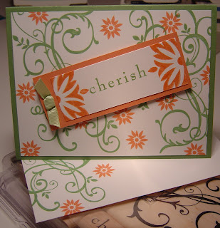
Groovy Wasabi Baroque to Cherish
This card reminds me of a summer garden, and I'm again surprised by how much I like the new In Colors. This one features Wild Wasabi--the green--and Groovy Guava. The little spot of ribbon is certainly celery grosgrain. This is going to be one of the cards in the August Stamp-A-Stack, so if you like it and want to reserve your spot now, please leave me a message in the comments! The charge for 15 cards is going to increase, due to an increase the company has made in the price of paper and ink pads, to $18 for 15 cards and coordinating envelopes from $15.
Thanks for stopping by!
Needing a Notepad...
I'm forever searching through my purse, the glove box of the car, above the visor, or even underneath the seats to try to find something to write on when an idea strikes me. I see a color combination I don't want to forget (I once wrote down the colors in the pattern of a woman's pants as I followed her through the parking lot after church), or I hear a good song on the radio (yes, I still listen to broadcast radio and I do not own an iPod!). Inevitably, I end up losing that piece of paper, and I'm frustrated later when I want to recall what I wrote down and can't.
Well, the problem has been solved!! Awhile ago, I found a tutorial for this nifty little notepad holder on Amy Celona's website, Ustamp4fun.com. It wasn't until we had this convenient rainy afternoon (after I'd found the little notepads at the Dollar Tree this morning)that I took care of my annoying problem once and for all!
This is super easy to do, and Amy's tutorial includes pictures. (Why should I reinvent the wheel?) I used the new In Color Blue Bayou and the new Level 2 Hostess Set Garden Silhouettes for this.
Hope this little "good thing" will make your day like it has mine! Now if I could only find a pen...
Let me know if you'd like to learn how to make this at an upcoming class or have me teach a group of your friends how to make it at your house!
Sunday, July 15, 2007
Quiet Sunday...good day for a BOOK!
It's a weird weather day here in GA--cloudy, so the temperature is low, but the humidity percentage almost matches the Fahrenheit. You can imagine what that means! We're indoors this afternoon, napping, playing a computer game, and blogging!
I mentioned 2 books that I might write about later, and later is now! The first is by Elizabeth Berg, a wonderful author from Chicago, and her latest is called Dream When You're Feeling Blue. It's set in Chicago during WWII, and centers around the lives of the sisters of the Heaney sisters. The 2 older sisters have beaus who leave them for service overseas, and each responds differently to the separation. It's a great, quick, escapist read.
The second book is by Ann Brashares (would love to know how to pronounce her last name!), author of the popular teen novel series Sisterhood of the Traveling Pants. The Last Summer (of You and Me)is her first adult novel, and in it she tells the story of three friends--2 sisters and the boy next door--who grow up together each summer at Fire Island off Long Island in NY. This is set in present day, and explores the tension that exists when the threesome try to keep things the way they were when they were kids, even though times and feelings have changed. This too is an engrossing read, and I found myself picturing the beach, the houses, and feeling the pull of the past against the present and the possible future right along with the characters.
Now that I've shared 2 of my recent favs, what about you? What are you reading this summer, fleeting though it is?
Friday, July 13, 2007
Cute, cute, cute!
This post is for all those out there who are engrossed in a good book right now! (I have 2 that I may have to blog about in a future post, as they were great vacation reads while I was away a few weeks ago. But that's another subject...)
Fellow blogger Amy over at http://gone-inkognito.blogspot.com posted a wonderful tutorial today for making this unique bookmark that holds your place by slipping over a page corner. This is what I came up with when I played around with her design.
The images are from a winter mini catalog set called Love Matters. I had a few scraps of the new In Colors Purely Pomegranate and Groovy Guava and had been inspired by a few other posts today that combined these colors. (Check out Taylor VanBruggen's http://tayloredexpressions.blogspot.com and Jenn Balcer's http://jbalcer.blogs.splitcoaststampers.com work.) The sentiment says "the best is yet to be", which I think any reader would love to believe as she's reading a favorite book. I accomplished this by simply masking the words I didn't want inked and then removing the tape (crucial detail!) before stamping the words where I wanted them.
This will be part of an upcoming class somewhere down the road, but you can head over to Amy's blog if you want to give this a try on your own. It's easy, as long as you make yourself slow down enough to do the math and follow the directions. Happy weekend!!
New Stampin' Friend!
Tonight I met Berna, a recent transplant from CA. She was a hobby demonstrator in CA and hadn't had any stampin' fun with someone who understands the exhilarating mix of creating and connecting through paper crafting since she arrived in March. So, last week she went to the SU! website and clicked on "find a demonstrator in your area" and my name came up! She contacted me, and tonight we got together at my house (she only lives about 10 min. from me!) and stamped and shared our opinions on the things in the new catalog.
Her husband was concerned about her going to the house of someone she didn't know. She told him, "How scary can she be? She stamps!" We hit it off right away, and I'm thankful she had the courage to seek out someone to share what she loves. I'm glad she found me! I hope she could tell how much she encouraged me.
Tomorrow will be more of the same with my regular monthly Stamp-A-Stack gals--I love hanging out with girlfriends! If you're interested in coming, get in the car and come on over...the more the merrier! I'll be here from 10a-12:30p.
Thursday, July 12, 2007
Beautiful New Sets!
I promised I'd share card samples using some of the new sets from the Fall-Winter Collection, and here they are! I have been very surprised by how much I like the new In Color collection, which will be available from now through next July 2008 only.
The first card is made with a Level 2 Hostess set called Garden Silhouettes. A gorgeous set with different floral patterns and 2 little words: "lovely" and "charm." I'm not quite as sold on the words, but these stamps help you create stunning cards! For this one, I challenged myself to use Groovy Guava. It may be hard to tell from the picture, but I'd describe it most like a terracotta. It's paired with Blush Blossom, another color I've never used before, since I'm not much of a Soft Subtles kind of gal!
The BB base is stamped with BB ink to create a background, designer paper sort of look. The whisper white is stamped first with BB and then with GG. You should see the envelope! Those who are attending my open house tomorrow night and Saturday will get to make this card. After the open house, it will be in the mail to my great aunt who just had knee replacement surgery at the age of 83! She's a great woman, and I hope it will brighten her day before I can get over to see her.
This card is made with another new set--although not one only hostesses have access to--called Baroque Motifs. It is very difficult to make an ugly card with this set! I love the large swirl, and there are 3 other pieces and the words "cherish" and "kind" included. I chose Purely Pomegranate as the next color to experiment with. Love the fruit, so why did I think I wouldn't like the paper? It's RICH and made this card quite elegant.
The swirl is stamped first with PP, and then overlaid with craft white ink. It creates a great shadow effect, which I hope to perfect as I get more chances to work with it. This card style is one I found from another demonstrator at her blog, and you can get 3 cards out of 1 piece of 8 1/2" x 11" cardstock. This also fits in the medium sized envelopes, but it also slides in nicely in the short end envelopes SU! sells.
Well, I hope those attending the open house enjoy making these samples. Now I need to go order more paper and a few other goodies for upcoming workshops this month and next month's Stamp-A-Stack!
Tuesday, July 10, 2007
FINALLY!
OK, so I went on vacation and thought I'd have wireless internet access to post while I was away. You guessed it--I didn't! Some of you may think I'm pretty pathetic to be lamenting about something like this, but this is who I am, and I'm an internet junkie! Then, I return from vacation and can't get to my blog to post! But, thanks to my wonderful tech savvy husband, I'm BACK!!
Obviously, the latest stamping news is that Stampin' Up!'s new Fall-Winter Collection catalog has arrived. I was conservative in what I chose, and now I'm sorry I didn't purchase more of the In Colors paper! With names like Groovy Guava, Wild Wasabi, Purely Pomegranate, Soft Sky, Blue Bayou, and River Rock, it's hard to not enjoy just saying them. I'm not trying new things because I don't want to run through my stock too fast! Lesson learned...
For those who haven't made up their minds yet about what their weekend's plans are, let me reiterate my invitation to come to my open house and check this new catalog out!!! This Friday evening, July 13, from 6:30-9p, and Saturday morning, July 14, from 10a-12:30p, there will be
free cards to make with new sets using the new In Colors, and have plenty of time to pore over the pages of the new catalog!
Hope to see you then! Look for samples in the coming days. Thanks for sticking around during the hiatus!
Subscribe to:
Posts (Atom)