
This is not something I normally do at this site, but I wanted to make you aware of an opportunity you have to be part of the caring global community today. If you visit this site and take the 4 minutes necessary to view the video, you'll help fund the research that's being done to solve the mystery of autism.
By simply watching this video, not only will you learn more about what autism is and how if affects kids, but the band, "Five for Fighting," will donate $0.40 cents to Autism Speaks each time this video is viewed. The funding goes toward research studies to find a cure.
One out of every 150 children--many more boys than girls--is being diagnosed with this disorder, and yet insurance companies are not covering intervention therapy that can make a huge difference. I have a friend in California whose son received early treatment, and I want the same availability for all kids and their families who are affected by this puzzling disorder.
Take a few minutes and go to the site. It's really such a small thing to do, but it could help change someone's life, even though you'll never meet them.
One other option you have for being part of this effort is purchasing a stamp set from Gina K. Designs. She has a special line of stamps, the sales from which support various causes. Autism research is one of them. Click here to see this set.
Thursday, January 31, 2008
The Winner is...
Thanks so much to all who weighed in on which of the four layouts I posted yesterday you liked best. I hadn't known some of you were out there reading, so it was a pleasant surprise! Please keep commenting--I truly relish your feedback. BTW, it was unanimous, actually, that #4 was your favorite, so that's the one I went with!
 I wasn't sure about the addition of the ribbon, especially since it doesn't go all the way through the card, but I didn't want to overpower the delicate rub-ons on the sides of the Groovy Guava lattice, and I think this achieves the balance.
I just really appreciate how SU! has taken the time to put color families together. It enables me to focus on creating instead of being distracted by figuring out what goes and what doesn't. The colors used in this card are all those in the In Color Collection, which is a limited edition set available until August of this year. Plenty of time to enjoy them, and you can purchase a multi-pack of the card stock for $7.95 and get 6 of each color to experiment with!
The details you see on the Soft Sky flower, the Wild Wasabi circle, the Purely Pomegranate flower, and the Blue Bayou circle are all Eastern Elegance rub-ons. These really are fun to use...something different that adds a quick, delicate embellishment to a card.
I hope the recipient likes it as much as you all did!
Wednesday, January 30, 2008
Decisions, Decisions!


 I was putting together another card today, and the layout just wasn't gelling. My digital camera was right beside where I was working, so I decided to take pictures of several layouts just so I could fool around with all the pieces and not have to remember what I'd done after I moved them!
The problem is I'm still not sure which one to use. I'd love your feedback. Just count down from the top and let me know which one you like best and why. I'll post what got the most votes tomorrow, and which one I went with.
Tuesday, January 29, 2008
Sympathy Card
 I learned yesterday that the man who was my pastor for the first 20 years of my life passed away. He died of a brain tumor and wasn't much older than my parents. While I haven't had contact directly with the family for years, my parents have, and have kept my sister and I appraised.
I wanted to communicate with the wife and her children what he meant to me, but I can't seem to put it into words even though the card's complete. I'm not sure why words are failing me, but they are. He has such a place in my heart because he shepherded me, taught me, influenced me, and was my friend from the time I was little until the early years of my adulthood. I don't think we are supposed to forget the people who introduce us to Jesus, and I certainly can't forget Pastor Mark.
His life was not perfect and he made some very poor choices in the middle of it that had huge consequences. Still, he leaves a legacy that includes some very good results, and I'm thankful for his life. I hope others will remember him with grace too.
Monday, January 28, 2008
Sparkling Rub-ons!
 Saturday afternoon I got a notion in my head. I wondered if the rub-ons could be colored with markers, so I decided to give it a whirl. Here's the result!
I started by counting the number of petals on this large rub-on from the Eastern Elegance set--10. I went to my bold brights color family and chose 10 markers that would create a rainbow of petals. I colored on the sticky side and then positioned it on a piece of Whisper White card stock. I really liked it, but I wanted it to have even more pizazz.
 So, I used my Versamark ink pad to completely cover the base. Then I covered it with Heat and Stick powder which, when heated, becomes sticky so that glitter will adhere to its surface. Did that ever turn out cool! So much sparkle on top of the color and the detail of the decal--awesome! I thought it needed more contrast than being on a white base, so I cut the flower out and mounted it on Basic Black card stock using Stampin' Dimensionals.
The sentiment also was glitterfied because it was part of the original design before I decided it needed more pop. The saying is from the recently retired Sidekick Sayings Level 1 Hostess set, and was perfect for the recipients of this card. I used my Basic Black marker to ink up just part of the saying for the outside, then stamped the rest on a piece of card stock for the interior. I applied a large piece of Whisper White to the back of this card so that I would have enough room to express my thanks.
Perhaps other stampers already know that rub-ons take color, but for me it was a fun experiment with dazzling results. I hope you like it! There are 5 different packages of rub-on patterns here on page 182 of the main catalog. I will also have available, beginning Feb. 1, a special package of rub-ons as part of our special promotion called Sale-A-Bration. I can't show you a picture of them yet, but I will Feb. 1! They are not available for purchase, but may be selected as your FREE item when you buy $50 in merchandise. This special pack has 4 sheets (the normal packages only have 2) and contain 4 colors--white, black, brown and olive. They are going to be a popular choice, I'm sure!
I hope you'll decide to purchase some rub-ons! They're versatile and fun.
Saturday, January 26, 2008
Rub-ons are rubbing off on me
 Rub-ons are a new item that Stampin' Up! is carrying in the Spring-Summer Collection catalog. I've had a package laying around for almost a month, and I wasn't quite sure what to do with them. I did use them on one project, and the results were satisfactory, but they didn't evoke a wowed response, as in, I have to have these! But, when I saw these heart-shaped clear glass votive holders at Target, I thought I'd give them another try.
 They come in white and black of the same pattern (there are 5 to choose from), and I was right in my hunch that the white ones would show up better than the black on the glass. Still, I like the look of each and the way they snaz up what was a plain item.
If you've never worked with rub-ons before, the name explains how they are applied. These are patterns that are sticky, and are sandwiched between two layers of plastic. The backing peels off and allows you to position the detailed decal where you want it. The plastic layer on top serves as a transfer mechanism. You rub on that layer with a popsicle stick (a crude, but effective tool) and this releases the decal from the plastic and makes it stick to your surface. These stick to almost anything--paper, chipboard, ribbon, wood, glass, ceramic, plastic--so they're very versatile.
In the upcoming Sale-A-Bration mini catalog (available Feb.1), there is a set of 4 sheets of these in 4 colors--white, black, chocolate chip, and olive--and there's a project shared that utilizes the rub-ons and a ceramic mug. I'm going to investigate that more, because I think that may be a cool project to add to February's SAS! The catch is that this set of rub-ons can only be procured--notice I didn't say purchased because they're not for sale--with a $50 merchandise purchase. If you have had your eye on some items in the new S-S Collection, February will be THE time to take advantage of the FREE set with every $50 purchase! Consider hosting a class at your house to introduce your friends to stamping...and rub-ons!
Thanks for stopping by! Don't forget that if you're interested in attending the Hershey Kiss Treat Party night, or in ordering a packet of everything you need (except stamps and ink) to make these little goodies, you can let me know by leaving a comment here!
Friday, January 25, 2008
In the Name of Research
 It all started this morning when I spotted these in the candy aisle at Target. What was I doing in the candy aisle at Target, you ask? I have to have a reason? I was researching the prices of various quantities of Hershey's Kisses for the Hershey Kiss Treat making party I'm hosting Friday, Feb. 8, from 6:30-10pm. That I happened to notice a full bag of these Hershey's Extra Creamy Nuggets with Toffee and Almonds couldn't be helped. (I have Lydia in Austin to thank for yet another addiction.) Anyway, I began to wonder if these little morsels would fit inside the cutie patutie little treat container, so I had to buy some. In the name of research...
  I am very pleased to announce that "yes" Hershey's Nuggets also fit inside this little treat favor! I also wanted to make another sample of these WITHOUT using the "i love you" stamp, which some were concerned was the only sentiment option I'd have available. They didn't want their children conveying "those three words" to their classmates, and I wouldn't either, if I was their mother! So, here's the second version. Of course the first can be made without said saying and still be adorable.
  AND, in case you weren't aware, you can order a special stamp set that celebrates Valentine's Day (my favorite holiday) to have for your very own, and it includes a special "Happy Valentine's Day" stamp, sized to fit the small tag punch used on the treat sample in my earlier post.
If you do any research and find some other delectable treat that will fit in this little holder, feel free to share...the chocolates. I prefer dark chocolate, even though this post would leave you thinking I like milk. Just this one kind...
One last thing...my boss chose the present card and the beautiful thing card for his wife, and a coworker bought the love card for her husband. They were all winners, I guess! Thanks for giving your opinion! I love hearing from you.
Thursday, January 24, 2008
Paper...the romantic gift. HUH?
My boss and I were talking at work the other day, and he asked my opinion about what he could give his wife to celebrate their anniversary. I asked which number they were on, and he shared this was their first! He and she are wanting to follow the list of gifts that someone with more blue blood than I came up with who knows how long ago that corresponds with each year you've been married. The first year's gift is PAPER. What's up with that? I never understood that list. Anyway, he was wanting my opinion on a book that Starbucks is selling, and I said that would be perfect, since it's made from PAPER! Then a light bulb went off in my brain and I said, "Would you like me to make you an anniversary card?" He was very excited by this idea, and so I asked him what his wife's favorite color is. He hemmed and hawed between sage and red, so I incorporated both.
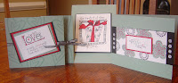 I had several images and sentiments that would be appropriate for an anniversary card, so I put three together for him to choose from.
Here are closeups of each card:


I have had this first stamp for such a long time that I'm not even sure where I bought it. I know it's not SU!, that's for sure. I love the sentiment, and it can be used for birthday, anniversary, friendship, etc. The biggest thing I did to this to make it special was to use heat and stick powder to adhere Dazzling Diamonds glitter to the package. Simple to do: just used the Versamark marker to put sticky ink where I wanted it, sprinkled the H&S powder, heated it with a heat tool, then added the glitter while the powder was still shimmery. Cool!
The second card uses the new A Beautiful Thing set, and it's sweet sentiment "You make my life a beautiful thing." What wife wouldn't want to hear that from her husband? I didn't do anything special here either. Just took the color scheme and created a piece of background paper. I used my Stampin' Write Markers in Real Red, Sage Shadow, and Basic Black to color the sentiment. I also used some white rub-ons, and I like how they add to the overall scheme. I really like this color combo--it's so elegant somehow.
The third card uses the z fold layout and another non-SU! stamp for the background. The sentiment here was the one we originally agreed on because it was one of two that I could remember off the top of my head when we talked through the card idea! It's from the Love Matters SU! set that was featured last year in the Spring Mini Catalog.
I'm taking these in to work tomorrow so that Clay can choose from them for his sweetheart. I hope he likes one of them, and I'll let you know which one he chooses. Which one would you pick?
Wednesday, January 23, 2008
You're Going to Love THIS!!

You are not even going to believe how ADORABLE today's project is! I found it at fellow blogger/fellow demonstrator Nancy Morgan's blog, Paper Smiles. There she credits the gal who came up with this--Silke Ledlow. I rise up and call this woman blessed, I tell you! These little things are just the solution for what to send with your child to the school Valentine's Day party!! And they go together quickly once you have the pieces cut.
 In the picture, they look ginormous, but in real life they're petite and perfect. They are made using a 1.5" x 4.5" strip of paper, scored at 1.75" and 2.75". The small tag punch is used for the white part, and the large tag punch is for the mat behind it. Mount it to the base strip, snip off the corners of the base with scissors, lay down a bit of mono adhesive to hold the kiss in place, punch a hole with your Cropadile, thread the ribbon (bow optional!), and you're done! To and From could be done on the back.
 Here's a side view.
 EDITED TO ADD:
 If you don't have the two punches, you could make these pretty simply. Use the same base of 1.5" x 4.5", scored at 1.75" and 2.75". The white focal point is 1 1/8" wide by 1.5" tall. The mat is 1.25" wide by 1 5/8" tall. Mount it and punch a 1/8" hole and finish it off with ribbon. The examples shown here use the retired Love Matters stamp set, but any stamp set with hearts would do.
Let me know if you'd like to organize a group of moms and daughters to make these, and I'm there!
Thanks for stopping by today...now go find some chocolate--I know you're drooling!
Wednesday, January 16, 2008
Scrap Card for SAS
Something about cutting paper all day didn't make me feel all that excited about prepping the materials for this card I was planning to include in the stash. So, I rewarded myself for all my hard work by going blog surfing. I found this card at Amy V.'s blog and thought that punching a bunch of squares with my 1 3/8" square punch would be preferable to measuring and cutting a bunch of smaller squares for the other one.
 So this is what we're going to be making instead! It's cheerful, it uses up scraps, it showcases the beautiful, new 5/8" grosgrain ribbon SU!'s now offering, and it's quick.
 Weather update: it's now sleeting--freezing rain--and is expected to do so most of the night, so perhaps I was a bit premature in mocking the school administrators for closing school. Note the snowball in the boy's hand and the accompanying grin. It's not like getting a true snow, but it still packs and it still throws!
A Taste of Winter


 I love watching snow fall at night. The lazy drifting down of the flakes captured by the light of the streetlight is simply elegant. The really beautiful thing about this is that it's not sticking to the roads, so the kids will have school tomorrow (I hope).
Just a gorgeous, rare site.
EDITED at 9:09pm: Amazing. The schools are already closed for tomorrow and there's about 1/2" on the ground. Life in the South...makes this Midwesterner born and bred, survivor of the blizzard of '78 and numerous other true winters with real snow days, feel like a wuss!
Scoring Points...

I learned a new way to create a background over the weekend, and I want my stampers on Saturday to learn it too! It may be a bit hard to see (and, of course, I didn't take a picture of it by itself!), but the mat underneath the main image is scored in a diamond pattern. This is really easy to do, provided you take it slowly and keep your head about you.
First, insert your card stock into your paper cutter and make sure the scoring blade is in place. (For those unitiated to scoring, a paper cutter comes with an accessory blade that doesn't cut paper, but creates a wonderful crease, depending where you place the paper!) Score the entire card base at the 1/2" mark on all four sides. Then you put the card on the diagonal, align the points, and score down the middle. Then you move that line 1/2" to the left, make sure that line is straight, and score again. You repeat that until you get to the edge of the interior square or rectangle created by the initial scoring. Half of the interior space should now be scored. Flip it around so that the remaining blank side is to your right and repeat the process. I promise it's not as hard as it sounds. I benefited greatly from a visual tutorial done by Debbie Olson at Thinking Inking, so if you're confused (sorry!) check out the link. The dots in the corners are added using the Cropadile. Another fun tool that does unexpected things!
Well, I need to get some lunch and get back to cutting paper! Have a great day!
Monday, January 14, 2008
A Beautiful Thing for Stamp-A-Stack


This card was the most difficult one to photograph! I know other blogging stampers have shared similar challenges with this year's In Color color River Rock, and now I'm going to add my voice to theirs. This paper is like a chameleon! It can look like tan or green, depending what you put it with! That doesn't mean it doesn't make a pretty card, though!
This is pretty straightforward. I wanted the Bali Breeze dp to shine in this layout, so I didn't put anything on the front to detract. I did stamp the flaps in RR ink with my linen background stamp, and although it's hard to tell in the picture, it addes a nice, soft dimension. I also scored the paper to give it some dimension, since the inside is very minimalist. That's really easy to do, and it adds a nice touch.
The same is true on the interior. The center is stamped with the linen background, and the paper adds a simple, elegant touch to the message: you make my life a beautiful thing. Who wouldn't want to receive that in a card?
This is one of the SAS cards, so those signed up will see this in real life!
Saturday, January 12, 2008
Wanted...A New Technique!

I saw this card by a stamper named Lauraly as I was blog surfing, and I thought it was beautiful! Not only did I think it stunning, I thought it was something I could do, once I read her explanation of what how she did it. I made one and was so pleased with how it came out that I made a second one, photographing each step, just for you!
 The image is stamped on Sahara Sand with Versamark.
  This ink is sticky and I sprinkled it with embossing powder and heated it. This sponging is a layering technique, but it is based in what's called emboss resist. The melted powder creates a barrier that maintains the color of the original cardstock base, so you can layer color over it. Note how dark it looks right now. I was skeptical that it would turn out, but you'll see what happens.
 I used the same color palette Lauraly did--Creamy Caramel, Close to Cocoa, Chocolate Chip, and Blue Bayou. Notice that there are little pieces of sponge in front of each pad. These are cut from 1 large sponge (see reference size in the middle of the photo). Very economical and since the ink is classic and therefore water-based, the sponges can be rinsed out and reused multiple times!
 This is the first layer, using CC. I went from lightest to darkest ink color, centering the lightest color around the main image. Not much contrast yet.
 Second layer...still not much change.
 Third layer...something's beginning to happen.
 Fourth layer...wait! Where did the horse go?
  I went back and added some more CChip and some more BB, until I was pleased with the contrast. The image wasn't being covered by the ink; there just wasn't enough there to make it "pop."
 I roughed up the edges of the focal image with the edge of my scissors and matted it with layers of BB and SS. I had this other piece of BB with a pattern that I had saved, and I thought it went well with the overall look I was going for. Some twine finished the look.
I hope you'll give emboss resist a try! If you do, send me a link to your creation. I'd love to see what you come up with using this tried and true, easy technique.
Time Well Spent...But Not.

This card is headed to my parents to thank them for the generosity they showed us at Christmas, so it was worth the time investment to make. But sheesh! I saw this basic design online at SCS by Lynn Mercurio, and I thought it would be a piece of cake. NOT!
Not that it was hard to make, but just time consuming. Cutting out the large flowers twice, snipping the leaves, stamping a background onto both the Wild Wasabi base and the Barely Banana accent strips, doing the coloring (which is made more challenging by the fact that SU! doesn't offer SU! markers in the InColor collection colors), and the layering. Why can't I just keep it simple?
Well, not everything works out as you intend, but that doesn't mean it wasn't worthwhile.
Friday, January 11, 2008
150th Post--Congrats!

This is my 150th post and since I have lots going on today, I won't take any more time than that to note it. (Did you hear my small "YAY!" though?)
I designed this card because I needed to create one that would come together quickly. I had that criteria not only because my schedule is packed with fun stuff on my day off (haircut and a massage and dinner out with my husband), but because the gals who will be crafting 10 cards at the Stamp-A-Stack shouldn't get bogged down by any one card.
This uses new designer paper called Bali Breeze, and a set that carried over from the Fall-Winter Collection called Fun and Fast Notes. The sentiment goes with the star image, but I mounted them separately on the block so that I could do just what I did--stamp them separately! I like the repeating "congratulations" stamped on the dp!
Gotta go! Have a great day and a great weekend. Thanks for sticking with me for 150 of these entries...
Wednesday, January 9, 2008
Finally! A Card for the Stamp-A-Stack!
Sometimes you just need to walk away. After last night, I wasn't so sure about returning to the craft room this afternoon, but I was drawn by the seed of a design I had in my head.
 Mark the Date is a new set from the Spring-Summer Collection, and I knew it was my style as soon as I saw it. Not only does it come with the circles for a blank calendar, but it has 7 little decorations that either surround or fill in the circles. One of them is a heart, and this was the seed for the design.
I'm tired of the same ol' folds, so I went back to one I made quite awhile ago and revamped it. The "z" fold is simple and I like the way it reveals the sentiment. The card looks like this open:
 Originally, I intended to put the message on the left side of the fold when you open it, but that didn't seem to look balanced.
 The other problem that presented itself was that these kinds of cards don't like to stay closed. I needed some sort of tab, and that's when I added the third red heart on the lower right of the card. A glue dot was necessary to make sure it had the staying power, and it works like a charm! I had to make sure the placement was such that it didn't block any of the sentiment when the card was opened.
 Speaking of the sentiment, it's from a retired set called Love Matters, which was featured in last winter's mini catalog. I think it's perfect for this card, and is also the reason why there's no month listed at the top of the calendar: "I love you more today than yesterday, but not as much as tomorrow." Awwww....
Hope you like it as much as I do! Remember, you can register your attendance for the SAS by leaving me a comment!
Tuesday, January 8, 2008
Arrgh...
I want to post photos of cards that will be featured at my upcoming Stamp-A-Stack, so I was pleased to have a chunk of time this evening while Bob was with a client from work to craft. Well, it didn't go the way I'd hoped.
I'm putting together a variety of cards, since this isn't a thematic SAS. I did realize, however, that I won't be hosting another SAS until AFTER Valentine's Day, so then I needed to come up with a Valentine's Day card to put in the mix. I experimented with a few layouts, but one seemed way too bland and the other WAY too complicated.
 Scrapping those, I salvaged the focal image from the complicated one and tried again for simple. Well, this is what I ended up with. I don't like mixing sentiments from sets, and, in hindsight, the sentiment I used on my last card--"too much of a good thing is a GOOD THING"--would probably fit here better.
 ANYWAY, I'm getting frustrated, so I'm done for the evening. Bob just walked in, and I'm taking him up on his offer to watch the James Taylor dvd he bought me for Christmas. Here's what the card looks like on the inside, and why you see a knot at the top of it in the previous photo.
Potholder Plaid Take 2

After I posted last night, I went back to my favorites file at SCS and looked again at the card that had inspired me. This morning, I returned to the "drawing board" and came up with something that I think is a little better.
I had made 2 of the 3"x3" "plaid" squares, and so I cut that one into four segments. Then I layered colors from the In Color Collection behind each and went with a different base color altogether, leaving River Rock out of this card design. The sentiment is different too, and I like that this set comes with a choice!
I still don't know if it's going to make the cut for the Stamp-A-Stack, but I like it much better than yesterday's design.
I've been speaking of Stamp-A-Stack, and I should share the details:
Sat., Jan. 19
10a-12:30p
10 cards with coordinating envelopes for $25
RSVP by Sat., Jan. 12
You can RSVP by leaving a comment here, or contact me privately. Hope you're having a great day! It's 68 degrees here; how could I even think of complaining?!
Monday, January 7, 2008
Potholder Plaid

When I was in elementary school, a crafty gift my sister received was a potholder maker. Remember those? Loops of varying colors that you stretched on a frame and wove together? Well, that's what came to mind as I was making the focal point for this card tonight.
The idea came to me after I'd seen this photo on splitcoaststampers. Of course, I have trouble keeping it simple, so while this card started out as a possibility for my upcoming Stamp-A-Stack, I will probably rethink it to try to simplify the design.

I started with a 3"x3" square because the image--which is the stem from the Time Well Spent flower set (genius!)--is 3 1/8" long. Then I tacked it down on my grid paper and counted the squares down the side--12. That meant I could stamp 2 of each of the In Color colors and create a plaid pattern. I like how that turned out. The rest of the card didn't come together quite as easily. I wanted to include all the colors from the plaid in the card, and thus the layers under the sentiment. Then I had trouble getting it all to tie together. The flower border along the top and bottom again utilized the grid paper, and the DP is coordinating River Rock stripe from the recently retired Dashing set. If I'd had the River Rock double-stitched ribbon, I think I would've gone with that, but I don't, so...
what do you think?
Saturday, January 5, 2008
Merry Christmas to ME!
EDITED TO ADD: Many of you want to know where my savvy husband purchased this way cool storage unit. I pointed him to Storage Units Ink and he took it from there. There are many options to choose from, but mine is the Wall Unit. Glad this post brought some of you out of hiding! Nice to hear from ya'll!
 Oh, happy day! I worked at Starbucks this morning from 6a-noon, and then went to a family lunch. When we came home, a beautiful box from FedEx ground was waiting on my porch. What was inside transformed what my craft table looked like (above--excuse the poor quality), to this:
 I LOVE storage that's so well thought out!! This one holds all 4 SU! color families, as well as the coordinating marker and reinker for each color. This was my fantastic husband's gift to me, and it's just right! The In Colors are on top, and now the makeshift boxes are going in the recycling.
The only downside of getting this is that I'm tired from getting up so early, so I'm going to have to nap before I can "break it in". It's also going to have to be polyurethaned to protect the wood from stray ink, so I'll have to unpack it next weekend. Still, it was worth waiting for!
 Oh, happy day! I worked at Starbucks this morning from 6a-noon, and then went to a family lunch. When we came home, a beautiful box from FedEx ground was waiting on my porch. What was inside transformed what my craft table looked like (above--excuse the poor quality), to this:
 I LOVE storage that's so well thought out!! This one holds all 4 SU! color families, as well as the coordinating marker and reinker for each color. This was my fantastic husband's gift to me, and it's just right! The In Colors are on top, and now the makeshift boxes are going in the recycling.
 The only downside of getting this is that I'm tired from getting up so early, so I'm going to have to nap before I can "break it in". It's also going to have to be polyurethaned to protect the wood from stray ink, so I'll have to unpack it next weekend. Still, it was worth waiting for!
Subscribe to:
Posts (Atom)


