Thursday, April 30, 2009

Stationery for the 'Rents

When I was in high school, someone came up with a nickname of sorts for the term "parents". It was "'rents". Not exactly disrespectful, but, as I look back on it now, a bit too casual and sort of crass. Aren't you glad that the brain you had as a teenager didn't STOP growing? I AM.

My folks are coming in a week to spend some time with us. Both their birthday were in April, but I'm too pragmatic (and cheap) to send their presents when I could just wait and give them to them a few weeks late. Besides, then I get to see the reaction on their faces when they open them (and they get to cart them back with them in their car, saving me the postage)!

My PArents are "old school". They like to send physical mail. I like that and want to encourage it, especially if some of it ends up in my little black box at the end of the driveway. My parents also share the same initials (my sister and I do too, so we all four have the same three--follow that?), so it was easy to design a set for both of them. The trick was making the cards not too feminine so that my dad would be inclined to use them. The desktop organizer is from a template by Lauren Meader, who is selling her creations with Papertrey Ink, one of my favorite companies. You can download it for $5 and use it as many times as you want! It's really well done.

The color scheme I chose is one of my favorites and inspired by a pair of men's underwear that I fold regularly: Bashful Blue, Real Red, and Night of Navy. Classics, right? This card's pattern could go either way, right? I think it's bold, yet not too frilly. I'm not a baroquey kind of person--I know some people have this kind of wallpaper in their homes--but I like this pattern, which was created by stamping the NoN outline and then filling it in with that "thing" using RR.

The next one is may be a bit too feminine for dad, but I know my mom will like the buttons on it. This is one of 5 patterns you can make with this set. It reminds me of something old-timey from my grandma's house. Simple embroidery. Don'tcha wish times were as simple now as they were back then? I'm not sure I do, because there was no internet, no Tivo, no answering machines, and no microwave ovens. Progress is good, but so is simplicity.

You know how I love circles, so I had to incorporate this pattern into one of the cards! The larger circle on either side of the monogram is also in the set. It's quite the bargain at $24! (Please don't tell me if a certain body part comes to mind when you look at this one. It wasn't intentional or Freudian, I promise!)

This last card is SOOOOO retro, don't you agree? I could've spent all kinds of time coloring in those diamonds, but I only allowed myself to do so on the envelope.

The monogram letters are also from PTI, from a set called Fresh Alphabet. I think I used a 3/4" circle punch, which actually cut it just a tad close. They're just the right size, though. Those who know me from way back may realize that the monogram's not in the right order, i.e. first name initial, last name initial, middle name initial. We just never did it that way, so I know mom and dad will get it. We're not that formal a family, and none of these notes will ever land on Martha Stewart's desk.

I hope you enjoy all this card candy today! Thanks for stopping by! I love it when you, and when you comment so that I know you did.

Tuesday, April 28, 2009

Spring Brings Babies!

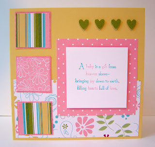
Friends of ours had their second daughter just before Easter, and this is the card I sent them. I used a layout from Jen del Muro (I think), and I made it a square card instead of the usual 4.25"x5.5" size.

Not much to say, really. This one's pretty straightforward. I used some retired DSP and added 4 little hearts up at the top, since the arrival of London made them a family of 4.

The base is So Saffron, and the hearts are in Old Olive, done with my 3-Heart Punch. You may be able to tell, if you look closely, that the mats of the DSP squares look colored. That's because they ARE! I didn't have any Pretty in Pink card stock, so I used Pink Pirouette. It turned out to be too light, so I colored around the edges with my PiP marker!

Since we're talking babies, let me share with you a mock-up of an invitation I made for one of my newest customers. She has a friend who wants to make baby shower invitations, but is convinced they won't be any less expensive than the ones she had made with a printer.

She shared that she wants to use the nursery's colors of lavendar, deep purple, olive green, light yellow, and a touch of pink in the invitations. She also wanted something that wasn't cutesy, but more contemporary. What do you think?

The supplies for 50 of this invite will cost under $100 and she will have 2 punches and enough card stock left over to make matching place cards and thank you notes for the expectant mom. You tell me where you're going to find 50 invitations for that price that look THAT CUTE!

Monday, April 27, 2009

Inspired by my Grocery

As I was checking out a few weeks ago, I looked down and saw this WAY COOL reusable bag. Does your grocery do this good a job of enticing you to bring your own bags to its grocery? I really loved that bag, but instead of buying it, I took a picture of it and used it as inspiration for a card! (I know it was only $1, but I'm stupidly frugal that way. I reasoned that I already have 10 boring bags, so why should I get another?)

ANYWHOO...I don't have a way cool, funky tree like this one, but I used what I had on hand, Season of Friendship. I hope you are getting the concept that these stamp sets have many uses in creating a variety of cards! If you're new to my blog or just a little slow on the uptake this Monday morning, click on "Season of Friendship" in the labels section of the sidebar and you can see different examples of cards I've made with this set.

I chose Baja Breeze--I will be VERY sad when this color retires--and Kiwi Kiss for the leaves. I had a scrap of BB sitting on my table, so I stamped several greens with my leaves stamp in order to determine which one would be the closest match to the bag. I realize it doesn't quite look like the leaves and the ribbon match, but in real life, they do. I'm not real stoked about the white bird but, again, I had limited options. It's good not to overanalyze things...

The sentiment is on a banner that I curled slightly by running the strip of Whisper White over my finger a few times. It's tacked in place with a glue dot on the end and just after the curve. I tried regular adhesive, but it didn't stay. The card base is Pacific Point.

I have the day off today, after a busy weekend, so I'm going to get after my house's furry tumbleweeds and laundry. There's always laundry. We're saying goodbye to a Starbucks partner who's moving to CA, so I'm having sushi for dinner!

Saturday, April 25, 2009

Stairstep Card

I have lived in a ranch style house for almost 3 years now, and I have to say that I don't miss having to trek up and down stairs to go to the bathroom, retrieve and deliver laundry, get a midnight snack...After making cards for about 15 years, though, a card involving stairs intrigued me. From the side view, this certainly looks different, doesn't it?

I had seen several of these cards on SCS (splitcoaststampers.com, for the uninitiated), so I thought I'd give one a try. I'll try most anything once. (After learning today that Guinness beer is filtered through fish bladders, I don't think I'll be tryin' that!)

These can create a really cute scene, if you have stamps that lend themselves toward scenes. I don't have a plethora of those, so I chose Party Hearty, since it has plenty of different images and sayings to work with.

This is how it turned out! Here are the dimensions:

Start with card stock that's 5"x10.5". Score it at 1.25, 2.50, 4.25, 6.0. and 8.25. Fold it like an accordian, and you have the stairsteps. Then you can decorate them any ol' way you like! I used some retired DSP, can't remember the name of it, to create panels on each stair, then I used those same colors to color the stamps. It's a bit time consuming, but I consider my cards part of my gift, and I know they'll be appreciated and kept far after the birthday has passed. This one went in the mail very shortly after it was finished. A side note: MAIL YOUR CARD CREATIONS and SPREAD THE LOVE! This has been my little soapbox rant.

Chicken's on the grill and I'm hungry, so I'm off! Enjoy the rest of the weekend.

Friday, April 24, 2009

Cheater Watercoloring...Just in Time for Mother's Day

Editorial Note: Since posting, it occurred to me that I didn't give props to Laura Fredrickson for her inspiration for this card. Check out her blog--it's AMAZING! Also, the Red used for the flower is NOT Rose Red, but Ruby Red.
I have a group of stampers I'm meeting tomorrow, and my hostess asked me to put together a mini Stamp-A-Stack. Instead of making 10 cards, I'll be teaching them how to make 4 cards. It's going to be a fantastic affair; women eating lunch and spending 2 quality hours in each other's company being creative. In my mind, it doesn't get much better than this.

My hostess also asked me to come up with a Mother's Day card that could also be a general use card, since some of those coming don't have mothers who are still living. I came up with this beautiful watercolored three-paneled version of my much-used Wonderful You flowers and leaves. This is so easy, I'm afraid you won't believe me. I can provide references who will vouch for me that I never lie.

Here's the skinny:
1) Stamp the image on watercolor paper using Black Staz-on ink. This ink doesn't run when it gets wet. Key. Very key.

2) Choose Stampin' Write markers--mine are Rose Red, Summer Sun, and Old Olive--and lay down some color along the edges using the brush tip. Don't color the whole thing in. Really. Don't.

3) Take an Aquapainter or a thin-tipped paint brush and pull the color away from the lines you've created to blend them and fill in the empty spaces. It's just that simple!

After I finished coloring and blending, I cut the panel in three equal sections and double matted it. The base is Cameo Coral and the mats are Rose Red and Very Vanilla. I used Old Olive 1/4" grosgrain ribbon, and, in case you're wondering where the "Happy Mother's Day" message is, it's inside the card.

Think you could do watercoloring this way? Show me. I'd love to see a card you've made using this technique. Try it. You'll like it.

Gotta run. Happy weekend! Get OUT and enjoy the SUNSHINE!!

Thursday, April 23, 2009

Creating a Ghost

I don't believe in them, except on paper, so don't worry about my state of mind. This card harkens back to my blogfast and a technique I found in a past issue of Stampin' Success (August 2008, for those of you who have a stash in your closet--you know who you are!).

It's a simple way of bringing an image "to life" on a piece of vellum. Simply choose the size panel of vellum you desire, a solid stamp and a coordinating one that has a line art image (I used Wonderful You), and a dark color of ink. Also grab your brayer and a dark colored ink pad, and get ready to see your creation appear out of thin air (out of thin paper, really, but that didn't sound as dramatic).

Ink up the brayer and roll it on the vellum until it is the desired depth of hue. A hint: it needs to be relatively dark, so don't be afraid to go darker than you think you should, because it'll dry lighter than it appears when wet. While the vellum is still wet, stamp the solid image. This will REMOVE ink from the vellum, so be sure to press firmly. Repeat the stamping with the line art image, slightly askew from the first one.

The hardest thing to do now is NOT TOUCH IT! It will need about 5 min. to dry. If you're impatient, you can wave a heat tool over it, high above so as not to curl it, to expedite the process. Once it has dried, use glue dots to adhere it to a piece of Whisper White card stock and mount it on a card. In case you're wondering, this color combo is Baja Breeze, Chocolate Chip, Tangerine Tango, and Old Olive. The ribbon is striped Pumpkin Pie, but it's close enough.

I have a parting question for those of you who receive this blog via email: do you receive it the same day I post it (this one is going out Thursday), or the following day?

Tuesday, April 21, 2009

A Simple Stationery Note of Sympathy

It's not often that I feature cards stamped with images by other companies, but I am a fan of Papertrey Ink, and one of the newer releases, Simply Stationery, has proven to be very versatile in the short time I've had it.

This was a quick creation for friends of ours whose uncle died. I wanted something that was masculine, because it was the husband's relative who had passed away. I went with Chocolate Chip as the base, and used Really Rust, Baja Breeze, CC, and So Saffron to create the focal image. I cut a slit in the design to thread a strip of Silver Metallic card stock with the sentiment (from another PTI set, With Sympathy).

There will be more posts featuring this set forthcoming. I'm going for short and sweet today, after yesterday's post. Happy Tuesday!

Monday, April 20, 2009

Austin in Review

I hardly know where to begin to share all that I did with Lydia and Neelam this weekend! I'll explain this WAY CUTE card later, but I wanted to post it up front for those who want to see paper art and move on.

I guess a chronological blow-by-blow would be easiest, so grab a chair and a snack or a drink to sip. This is gonna be a LONG one. Here goes...


I arrived Friday afternoon just about 20 min. late, due to a thunderstorm in Austin. The weather had been forecasted to be quite treacherous, so I was grateful to get out of Atlanta on time and have only this slight delay. Lydia picked me up at the airport and took me home to freshen up. This ADORABLE top note box full of Bit o Honey candy (we both adore it!) was perched on my nightstand. This was her first, less than subtle attempt to persuade me that the Big Shot die cutting machine was worth the investment. That is a cute container, is it not? There's a slender acrylic box that is sided by the Top Note, which has that distinctive curvy shape.

The lavishing of gifts continued when I turned to my bed and saw a lovely gift bag full of...gourmet chocolate!, carmelized pecans!, truffles!, and a hanging toiletry bag! Lydia has a generous heart, and I was quite touched.


We didn't have long at the house because we had to make our way to Uchi for dinner. Those who read Lydia's blog have heard her expound on the marvelousness of sushi in general, and this dining establishment in particular. When we were setting up the weekend's itinerary, I told her I was not going to be denied experiencing the #2 rated sushi restaurant in the country, and Uchi delivered! It was Happy Hour, so appetizers were half price. John, Lydia's regular waiter, convinced us to get the maguro sashimi and goat cheese. This was AMAZING! Buttery raw tuna medallions, paper thin slices of Fuji apple, and goat cheese, drizzled with pumpkin seed oil.


The rest of the dishes were our individual selections--Lydia's zero sen (yellowtail tuna with avocado, crispy shallots, yuzu kosho, golden roe, and cilantro with a lovely chili oil), my hakujin (salmon with grilled asparagus, rolled in tempura flakes), and Neelam's spicy tuna (bigeye tuna, english cucumber, and black and white sesame seeds. We also had a wala walu, a hot dish of oak grilled escolar in an AMAZING citrus broth with yuzupon and myoga. I don't know what those last two things are, but they sound cool, so I wanted you to know I had them!


Dessert was a coffee panna cotta filled with a mango sauce "yolk", with white chocolate sorbet and coffee "soil". It had crushed coffee nibs, but I have no idea what else. Didn't stop me from putting it down the hatch!

Saturday the gastronomical tour of delights continued. Highlights were a stop for coffee at Summermoon Cafe, a great independent coffee shop with a peaceful, soothing atmosphere. The perfect start to the day.

Then we went driving around and saw the sites: the flagship store for Whole Foods (Retail Church), the University of Texas campus, the pink granite Texas Capitol building, a local artisan shop, as well as a lot of other eateries that we didn't stop by, but which Lydia casually mentioned as, "oh, that's a great place for [fill in the blank]." I was stunned by the LACK of national food chains present in this town. We drove by a Pizza Hut and a Chili's that had gone out of business. It was so refreshing to be in a town where food is celebrated, and where local businesses are fanatically supported by those with truly educated palates!

After all this, we stopped by Sugar Mama's, a local cupcake shop, for post-lunch dessert. Lydia had tortured her blog readers with her eye candy from this place as well, so I requested a visit. Oh my! Too many to choose from, but I turned a blind eye to the James Brown, chocolate cake with chocolate buttercream frosting, for a French Toast, a maple cupcake with cinnamon cream cheese frosting. Fantabulous! It was really hard to stop with just one! My friend Darcie would've loved this little offering--frosting shots, little cups of just frosting, for those who know purport that the cake is really just a holding device for the true piece de resistance.

After this sugar coma, we had to do something to wake ourselves, so we went back to Lydia's to make cards. This is the card at the top of this post. We didn't come up with this ADORABLE creation. Laurie Froehlich of Inspired Designs created this chickie, and Lydia and I had a BLAST CASE'ing it! Follow the link to see her details for materials. It uses quite a few punches as well as the Big Scallop Die for the Big Shot. This is the BEST baby card I think has ever been created! Hop over to Lydia's blog to see her bluebird of happiness and sassy cardinal.

Saturday night I took my camera but didn't take pictures of my plate! We dined at Lambert's, a BBQ place. I had Frito Pie and we shared family style side dishes of cheesy jalapeno grits and lemony spinach that were fantastic. I know I'm using many superlatives as I describe the food, but it truly was a treat for the tastebuds. It has been quite a culinary challenge, being away from Chicago.


Sunday morning, we again ventured out for coffee, this time to a place called Halcyon Coffee Bar Lounge. A coffee shop by day, a bar/lounge by night, this place had a lot of character, and fantastic tasting espresso. Yes, it was better than Sbux! When I asked Lydia what Halcyon means, it became clear why she wanted to visit. Halcyon means BLUE, and the sky was beautifully so! Hang with me, I'm almost done...

We finished up the day by making another card that I'll show you soon, and dined at Matt's El Rancho, a very good Tex Mex place. I didn't take my camera, but I had tacos al pastor, and the interesting ingredient in my dish was grilled pineapple mixed in with the pork. The guacamole salad was yummy too!

Rain bookended the start and end of this trip; my flight was delayed 1 hour in boarding. We sat on the tarmac for another 30 min, and this resulted in a 30 min. late landing in Atlanta. I was happily exhausted. What a fabulous weekend! Thanks gals, for a MARVELOUS time.

Thursday, April 16, 2009

And the Answer Is...Also, If May Flowers Bring Pilgrims, What Do Paper Flowers Bring?

Yesterday I posted the picture of my prettily painted toes and asked you to guess where I might be going. Nadine hoped I'd be going out with my man on a date. Nope. I'm going solo. Melissa thought it was hilarious that I'd post a picture of my toes, but all she hoped was that my feet would have some freedom from their Crocs for a few days. Oh, believe me, they will! Not even takin' 'em along...

So, where am I headed? AUSTIN, TEXAS, baby! I invited myself to spend the weekend with Lydia Fiedler of Understand Blue and Neelam Kulkarni, fellow stamper and my roomie from SU! convention last summer. They were so excited about my wanting to come, and we're going to have a great time together! I'm sure there will be stamping, so I'll post whatever we create.

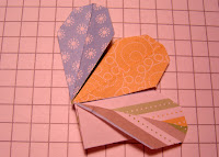
Today's card is another that came from my perusing the SU! publications I had stashed in my stamp room closet. Those folks at HQ are so innovative! The flower was made using the small tag punch and it's SO easy. Let me explain.

Choose your favorite DSP (I chose a stash I got free during Sale-A-Bration) and select 4 patterns. Punch 2 of each pattern with the small tag punch. Fold each one in half vertically, making sure that the pattern you want showing as a "petal" in the end is INSIDE.

Placing the seam to the right, peel back the right half of the punched piece to the seam to create what looks like a wing for a paper airplane, making sure the bottom edge meets with the bottom left edge in a point. I'm not good at explaining this--just look at the pictures below and try it. You'll get it.


That's all you do in the folding department. Repeat 7 more times.

Next, you have to attach the petals to each other. It's as easy as using that little tab that's sticking out at the bottom right. Put some mono adhesive on that, and align the left side of the next petal with the right edge of the petal that has the adhesive on it. It's critical that the points at the bottom of the two match. (Again, a picture is worth much more than this explanation.) The last picture shows what the flower looks like before the last petal is added. See how the center has no hole in it? That's just how you want it. You'll know if your petals haven't been folded correctly at this point, because you'll think you need more petals. You shouldn't.


The rest is fairly straightforward. After the flower is completed, punch a 1.25" circle with a 1.25" punch, punch two holes in the middle so that it looks like a paper button, thread ribbon through, and tie it in a simple knot. That is the center of the flower.

Plaster the back of the flower with lots of mono adhesive and stick to the card base. It really makes a great card!

Wednesday, April 15, 2009

Bold Birthday...Another Study in Contrast

I wanted to design a bold, masculine birthday card using a set that was part of this year's Sale-A-Bration special offerings. I wanted to pair it with Party Hearty, a set I really think has lots of potential, although I struggle with it for some reason. I settled on an InColor color combination: Pacific Point, Riding Hood Red, Tangerine Tango, and Kiwi Kiss. After all, if someone else has already done the coordinating work, why shouldn't I take advantage of it?

Since I wasn't reading blogs or looking at SCS, I had to find a layout that would work. I'm not really good yet at making them up from scratch. So, went through the Stampin' Success magazine that demonstrators receive monthly in search of inspiration. Why I hadn't done that before, I'm not sure! What I like most about this layout is the slit in the card at the right where the KK striped ribbon ties. Never would've thought of that in a million years...

While the result was a good first effort, it was very challenging to read the message, which says, "congratulations on getting a little older". It was so not popping like it should. In fact, it was kinda dead.

So I started again (something I really don't like to do) and created a second version, this time using Versamark and white detail embossing powder to create more of a contrast. MUCH BETTER, don'tcha think? This was super crazy challenging to pull off, though, since every little teeny tiny speck of white EP wants to show up on that PP base. It'll make you want to cuss. And the placement of the "congratulations" REQUIRED the Stamp-A-Ma-Jig. (Can you guess why the stripe of KK card stock is running across the top of the first card? Crookedly stamped word!) Really, you have to get one of those if you don't have one. It just elmininates so many stamping headaches.

Speaking of bold, check out this lovely pedi that I received today! My feet spend many hours in the dungeon of my crocs, and this weekend I'm going to be sporting sandals, so...where do you think these feet are takin' me? I'll tell you tomorrow!

Tuesday, April 14, 2009

Sweet Stems for Spring...Two Ways

Hi there! At this very moment, the sun is shining, but we have had a lot of clouds and rain the past week. All necessary, I know, but the sunshine so lifts my spirit.

While I was away, I hosted March's Stamp-A-Stack. This is the early version of the card I made using Sweet Stems. I chose the emboss resist technique, stamping each of the delicate line art floral images in Versamark on Whisper White card stock and then heat embossing them with white detail powder. Then I inked up my brayer with Pretty in Pink, Barely Banana, and Bashful Blue and stroked it over each panel until I achieved the color saturation I wanted.

When I was done, I was really pleased with the look, but it was going to take too long for the SAS. So, I went back to the drawing board and recreated the card using the same three colors of card stock as the base, instead of the WW. It's not quite as eye popping, but it's still beautiful.

The Certainly Celery mat onto which the panels were mounted with dimensionals is also stamped in CC with the largest flower stamp in the set to create a subtle background. The base is Lovely Lavender. I really like the white satin ribbon that is running through the middle.

The sentiment at the bottom right is from Absolutely Fabulous, a sentiment only set in Kristina Werner's handwriting. (She is no longer at SU!, so a set of this type will not be produced again. Sad.) It too is stamped in Versamark and heat embossed with white detail powder. The embossing buddy, which eliminates static electricity, was critical here, so that no stray dots of powder were embossed accidentally.

Hope this card brightens your day. What favorite flower of yours is in bloom in your garden or around your neighborhood? I'm waiting for tulips, but I'm enjoying the budding trees.

Wednesday, April 8, 2009

Shhhhhhhhhhh...I'm Back Early

Truth be told, I abandoned the Lenten fast last week. I don't believe God loves me any less because of this decision. I chose to end the fast because I didn't feel it was helping me. I was obsessing about what I was missing, instead of directing my thoughts elsewhere. Still striving to find center when it comes to desiring community and how to find it.

I've been told by a few of you that you miss my posts. Thanks...that meant a lot. But I'm going to ease back into sharing. It may not be daily, but it will be regularly.

Without further ado, here's a card I made today for the production director in our children's dept. who had her second baby this past weekend. The sketch was designed by Jen del Muro, and it's a 5.5" square card. Probably could've been a bit smaller, but I wanted to test myself to fill that much space.

The sentiment is from God's Blessings, and the DSP is retired stuff. I just used my 1 3/8" square punch for the small ones, and matted them with Pink Piroutte that I had to color over with Pretty in Pink because I am out of that color. (How can a woman who doesn't like pink be out of that card stock? It's a mystery.)

The sketch didn't call for anything in the upper right corner, but I thought it looked a bit bottom heavy without anything. Since this baby makes the family a foursome, I broke the rule of odd numbered embellishments and put the 4 together. That three-heart punch is just the best!

We're in the middle of spring break here, and today the weather is starting to match the season. We had snow flurries yesterday, and it was windy and COLD! By the time we head out to hike Jacks River Falls (again) tomorrow, it's supposed to be a high of 70. Go figure...

Leave me a comment and let me know what you've been up to while I've been away. I missed y'all!