Saturday, July 31, 2010

Simply Stunning Friends Never Fade

Some things are so good, they don't need to be improved. Such is the case with this card from SCS. Isn't it elegant?

The Vintage Wallpaper Textured Impressions Folder really shines here, and I love that I now know you can dry emboss only a portion of a card front using it in the Big Shot. The image is from Friends Never Fade, and was colored direct to rubber using the Pacific Point, Daffodil Delight, and Old Olive Stampin' Write Markers.

For the sentiment, I inked the image that goes with the set that includes the wording using PP ink. I just cut out what I wanted and left the rest behind! I highlighted the word "never" with my DD marker. The piece is popped up on Stampin' Dimensionals.

The ribbon is DD 1/4" grosgrain. I wrapped it around the card and tied the bow separately. There's a 1/8" ribbon in this color, and I think I'm going to have to include it in my next order. Still, I don't think the 1/4" is too substantial for the card.

I'm off to the Farmers' Market this morning--I have a whole Saturday to do whatever I want! I'm hoping for sweet corn for dinner this evening.

Friday, July 30, 2010

Woven Paper Hydrangea + FREE Money!

Earlier this month, I saw a card by Dawn Olfchefske with a woven pattern on it, and I thought it added so much visual interest to the entire layout that I made a mental note to try it the next time some creative time presented itself. As you can tell from the date of my previous post, this was a busy week. I decided this afternoon that I had enough energy to try this, and here's the result!

I chose white on white because I'm a coward and didn't want to limit myself to a color scheme until I knew what I was going to do! The strips are 3/8" wide and 4.25" in length. There are 14 of them.

The most challenging part of the entire process was keeping the strips square. The folding over of the excess at the top was the culprit, so I was very careful as I went along, checking against my SU! grid paper to make sure it didn't end up cattywampus. Yes, that is a word.

When I was finished, I thought it would be best to capture the country basket effect it evoked in me by pairing it with Crumb Cake for the card base and the stamp set Because I Care (Level 1 Hostess). To me, hydrangeas are old-fashioned flowers, so I inked up my clear mount stamp with Regal Rose and Old Olive and held my breath and stamped it on the woven pattern. Love it! I kept the rest really simple. I'm surprised how much I'm enjoying using the new 1/8" ribbon!

In case you didn't know, there is an archive on the side column of this blog where you can look at all the cards made with a certain set, like Because I Care. Just click on the set name and you'll get to see how this set has inspired me.

I'm featuring this set today because SU! is extending a great offer to hostesses who partner with me between now and Aug. 31.

If you host an event that has orders that total $350 in merchandise, you'll be eligible for this set (or any other from Level 1 Hostess Set offerings), a set from the Level 2 Hostess Set offerings, AND $65 in Hostess Dollars to spend however you want! That's $25 more than usual, and that total in orders is so achievable! Let's work together, shall we, so that you can have more play money for stamp supplies. Contact me about partnering together to have a great private class. We can even weave some paper, if you're so inclined!

Saturday, July 24, 2010

Need Coffee?

Since I started working at Starbucks, I've developed a taste for coffee. Naturally, when I saw the new set called Morning Cup I ordered it immediately.

For once, I had no preconceived notion of how I wanted the card to look. I just started experimenting with the different elements. I stamped the percolator and stack of cups and saucers using one acrylic block onto Watercolor Paper. Using my Aqua Painter with the fine tip, I colored the images. It was a bit tricky, since the ink I'd used to stamp the images, Soft Suede, is not waterproof, and SU! no longer carries Brown Staz-On. I used Basic Grey and Garden Green, the closest green in any of the color collections to Starbucks green. I grounded the images using Crumb Cake.

Then it began to get interesting. I wanted a coffee ring as part of the design so that the sentiment didn't look lost above the images. I experimented with an actual cup, but wasn't pleased with the result. So I pulled out a small metal lid from a tin of espresso cookies--how appropriate--and inked it using Early Espresso, which is a shade or two darker than Soft Suede. Once I'd stamped it, I applied water with my Aqua Painter and achieved the look I desired. I even created some drops off to the side!

I inked the sentiment using my EE and GG Markers and stamped it in between the visuals. Isn't it hilarious? Since I drink coffee solely for the taste--caffeine does not effect my alertness at all--I can't relate, but I know many who do.

Then I got the idea to play off the sentiment by anchoring the whole card with some z's. I ran some tiny scraps of EE through my Big Shot multiple times and punched out some 1/8" circles. It helped to use tweezers to apply glue to each letter and position it.

This set also comes with a single cup and saucer and a mug, as well as a tea kettle and a tea bag, so you can make cards for both kinds of caffeine addicts in your life. If you'd like to order it, click here!

Friday, July 23, 2010

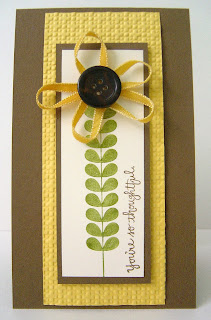
Ribbon Button Sunflower

I was so pleased with the outcome of my experiment with the button daisies (see yesterday's post), that I wanted to play some more with this technique. I pulled out a random button from my stash, along with the Daffodil Delight ink pad and began again.

I took the same 1/8" Whisper White ribbon and pulled it across the surface of the pad, using a scrap of sponge to hold it down and keep my fingers from turning yellow. Then I dried the ribbon with my heat tool. Then I started making loops.

Instead of using one long strand of ribbon, this time I made a petal, attached it to the button, then cut off the rest of the ribbon length before making another loop. I used glue dots again as my medium of choice. I was still challenged by the amount of ribbon on the back of the button when I was done, and some were already trying to come undone. So I used some Tombow Multi-Purpose Adhesive, a strong, sticky glue, and held everything in place until it set. Then I put a scrap of card stock on the back and held it tightly for another length of time until I was sure it was going to stay together. Then I put Stampin' Dimensionals on the back and plopped it down quickly on the card.

The stem is from Apple Blossoms, and the sentiment is from Absolutely Fabulous (retired). Again I used the Square Lattice Textured Impressions Folder for the Big Shot to up the visual interest. The base is Soft Suede, 3" x 11" scored at 5.5".

Thursday, July 22, 2010

Pretty Ribbon Daisies

My very creative crafty friend Lydia posted this card with fabby flowers awhile back, and ever since I have been thinking about them and scheming how I would make them.

Today, I was in the mood to create (translation: not do laundry or housework) after work, and again these flowers came to mind. I pulled out my little container of Brights buttons and my glue dots and the same silver cord she used, when I was practically mugged by my mojo. SU! is offering 1/8" ribbon in 13 colors (!), and I purchased Whisper White.

So I pulled it out and began looping and sticking and petals emerged from my buttons to form daisies! It takes quite a few glue dots, and the ribbon builds up on the back, so I may go back and re-engineer this, but I like how the first attempt turned out!

Then I had to figure out how to create a scene adorable enough to stand up to these cuties. I punched out 3 scalloped edge circles, cut them in half, and created my own clouds. I started AT THE BOTTOM OF THE CARD and sponged around them using Tempting Turquoise. Then I moved up a little bit, staggered my template, and repeated the sponging. Such a pretty sky! I was so NOT a Brights gal before the Color Renovation, but now I find myself going to this collection all the time.

I stamped the stem from Apple Blossoms, one of the new Hostess sets, in Old Olive. I had some left over Designer Series Paper in OO that was solid on one side, so I made my own little grassy patch for the bottom of my scene.

I adhered the daisies using Stampin' Dimensionals and matted the entire scene on Daffodil Delight. The base of the card is Tempting Turquoise.

There's a great saying in Apple Blossoms that I wanted to incorporate into the design. I didn't have enough guts to stamp it in the clouds for fear I'd boff it somehow and render my card unusable, so I stamped it on a .5" strip of Whisper White in Pumpkin Pie, unstacking the sentiment and making it into a single sentence.

Now if I could only figure out a way to make them smell like real flowers...

Wednesday, July 21, 2010

Just One More...

I know this is the third origami shadow box card I've shown you in a week, so I promise I'll stop now. I did use some new items from the catalog for this baby girl card for one of my customers...does that help?

See the sweet little half pearls around the shadow box? They are the second smallest size of three sizes in the package of 150 for $5! I used the Victoria Crocheted Trim again too, and I must say it's just one of the best ribbons SU! has ever offered.

I chose the "small wonder" sentiment from Whimsical Words because little Jordan entered the world weighing 4 lbs. 13 oz., three weeks premature. I'd say the phrase fits, wouldn't you?

The base is Very Vanilla, impressed with the Square Lattice Textured Impressions Folder, and the Designer Series Paper is retired Candy Lane. I used my Big Shot and the Billboard Sizzlits Decorative Strip alphabet to customize the card with the baby's name.

More new stuff to come!

Tuesday, July 20, 2010

Just a Note from the Aviary

Aviary is my favorite new set from the 2010-2011 Big Idea Book & Catalog, and Friday afternoon I had a chance to ink it up. My inspiration was this card by Twila Mooneyham, but once I started more ideas came to me!

There are four birds and four cages (aviaries) in the set, as well as a stand stamp to make some of them taller. It's just so whimsical and FUN that I can't stop using exclamation points at the end of my sentences when I describe it! Okay, I'll try to refrain going forward.

I inked up the cages in Staz-On black and followed Twila's suggestion of using the Stamp-a-ma-jig to place them, even though I purchased the acrylic clear mount option. When I was done putting the birdies in their places, I had one cage left uninked. Well, that wouldn't do!

So I created a z-fold, scoring a 5.5"x11" piece of Whisper White at 4" and 6.75", which resulted in a 5.5" square card with a nice sized interior for writing a short letter.

I also spied the rhinestones (Basic Rhinestone Jewel Accents, if you want to be technical) I'd purchased and thought they'd add some nice bling to this card. These babies come in three sizes and there are 150 for $5.

Now to figure out who I want to jot a note to. Oh, that reminds me! The only thing this set is missing is a sentiment. I have a non-SU! stamp that has some musical notes on it, and I inked that up and added it to the card, and used the "just a little note" (get it?) from the Level 2 Apple Blossoms Hostess Set. YAY!

One last non-bird-related thing: does this happen to you when you're using your laptop? My poochers are jealous and not subtle about telling me they'd like me to be doing something else, like playing fetch!

Hope you're liking all these cards using the new products. I'd love to help you get your hands inky and let you try the Big Shot! Let me know if you'd like to partner together to have a fantastic get-together before summer's over and we're back in the routine of school. I'm still looking for hostesses who want to have a great time with their friends and get FREE stamps...could that be you? Contact me!

Monday, July 19, 2010

More New Products--Friends Never Fade

One of the items available for pre-order from the new catalog was Friends Never Fade and the coordinating Designer Series Paper, Greenhouse Gala. I didn't jump on the bandwagon. I wanted to see what else was in the catalog before I decided. Well, I decided, and here's the first card with the set and the DSP. I have to thank Marie for inspiring this look.

I used Cajun Craze, a new core color in the Regals Collection, as my base, and I paired it with now-retired Dusty Durango (gotta use it up!). I used my Big Shot to create a stunning embossed background using the Vintage Wallpaper Textured Impressions Folder. I'm tellin' ya, those TI folders are really great!

I added a 2.5" strip of the GG DSP, matted it on more CC, and then turned my attention to the main image. The colors featured in this piece of GG DSP are Pear Pizazz, Daffodil Delight, and Pumpkin Pie. (Click here to see the rest of the patterns in this package.) I don't have the Pear Pizazz ink pad yet, so I pulled out Certainly Celery and discovered it was its Dynamic Duo. I stamped it on Whisper White and then stamped it again on a scrap so that I could color the flower with my markers. I adhered it with some Stampin' Dimensionals after I cut it out. I tied some WW taffeta ribbon around the whole panel just to give it a little somethin' extra.

I'm tellin' ya, this is THE BEST Big Idea Book & Catalog I've seen since I became a customer over 10 years ago. If you don't have a copy of your own already, you can shop online by clicking here. I'd also love to partner with you to provide a hands-on experience using these fantastic new items. Interested? Contact me and let's get a date on the calendar. There's so much I can't profile here on the blog, and you need to see it ALL for yourself.

Saturday, July 17, 2010

Revvin' up a Customized Bike Card

When I was stamping with Nina Wednesday evening, we decided to make a separate card inspired by the interior of the motorcycle card I profiled a few days ago. It was really fun to create because we made it using the colors of her husband's motorcycle. Brilliant Blue is now retired, but she was tickled that I had some scraps available so that we could customize the card to match her man's wheels.

The technique used to create the main image may have some name, but I don't know what it's called. It's supposed to create the look of motion, and I think it's effective. To achieve this, simply ink your stamp well, start at the right of your card stock and stamp once. WITHOUT reinking, inch the image backward and stamp again. Repeat this until you can't get an image to print on the paper. That's matted on Basic Grey card stock that has had its edges roughed with a pair of scissors.

Nina took home a stamped image that she's going to color using her BB marker (I sold her husband my entire Bold Brights family of markers and inks for Nina's Mother's Day present!), cut out, and mount on top of the first image. (If you follow the link above, you'll see what I mean.) I think Scott's gonna love it!

The Square Lattice Textured Impressions Folder was used to create the BB large mat as well as the faux chrome strip--it's heavy duty aluminum foil! We decided to give it some grit by stamping the Wonderfully Worn background stamp on it with Basic Grey. Then it was cut in half and one edge torn and inked with BG. So grungy! Everything's mounted on a Whisper White base, which may be hard to see in the photo.

Motorcycle is an a la carte stamp; one of very few that SU! offers. What I think would be fantastic--are you listening, SU!?--is to carry it over to the next catalog (it's in the Summer Mini until Aug. 31) and create a set with some good sentiments. Here's a few I'd suggest: "You get my motor runnin'..."; "All revved up over you."; and "Born to be WILD".

What saying would you want for this image?

Friday, July 16, 2010

Amped Up Origami Shadow Box

I liked this look so much that I decided to play around with it again for a private class I hosted Wednesday night. I wanted to see if I could make the card more masculine, and when I presented it for the class, it didn't have the new Victorian Crocheted Trim. But then I added it today before I took the picture, so I guess it's not masculine anymore, is it!

I cannot believe how much the look of the card changed when I dry embossed the Very Vanilla card front with the Square Lattice Textured Impressions Folder for the Big Shot. Oh my--it just has so much more depth and visual interest. I think this would be an adorable baby card for a boy (with a different sentiment, of course).

Now for a closeup of that new crocheted trim! It lays beautifully and is delicate without being fragile. It has just the right body. You can also see the detail the Square Lattice added. Great combo!

I'm really feeling like I'm on a tear with my creativity, so I'm off to make another card. If you love what you see here, remember that you can click the 24/7 Shop Online button in the upper right corner and have anything you want delivered right to your door! Happy Friday!

Thursday, July 15, 2010

Origami Shadow Box Card

Nancy Riley is one of my favoritest stampers, and a few days ago she posted a card featuring a technique for an origami shadow box that she saw on LeAnn Greff's blog. I loved the look, so I decided to continue toying with the things I already had on the table from yesterday's card to see what I could come up with.

This is SO easy and looks so cool! The interior will hold a 1 3/8" square, so that sort of limits what you can do. I am one who is not easily thwarted, however, so I stamped the "Thinking of You" stamp from Kind and Caring Thoughts in three steps using Tangerine Tango ink so that it would fit on my small square! The little leaf is from Great Friend, stamped with So Saffron.

The ribbon was a bit tricky, but I like the placement at the top. It sort of makes the square look like a picture being hung by the ribbon knot, don't you think?

I'm not sure who will receive this card, but it's a good one to have in the stash. It's always good to try out a new technique. Give this a try and let me know what you think! Thanks, Nancy!

Wednesday, July 14, 2010

The Card I Always HATE to Make

A new friend of mine experienced the sudden loss of her dad last Friday, so I had the unenviable task of creating a sympathy card. I think these are very important to send, but I do not relish making them. The process turned out to be more cathartic than I thought it would; it gave me a way to reach out to her and feel less helpless.

Part of the reason I don't like making sympathy cards is that I don't have a "go-to" set. I've not liked anything I've seen by any stamp manufacturer, so I start from ground zero every time. Well, not every time. This time I used a stand alone stamp I've had for a long time that has one of my favorite Bible verses on it. I knew it would resonate with the recipient, so I started there.

I know she likes bold color--she has a room painted red--so I was drawn to some retired Haiku DSP I have and that determined the color palette of Tangerine Tango and So Saffron and Whisper White.

I created a funky fold using a 2"x5" rectangle. I folded it in half both ways and then scored the angle from the middle to the outside corner of the upper left and lower right portions of the rectangle. I folded those and then folded the tips back. I mounted the verse on it with Stampin' Dimensionals and mounted the whole thing to another coordinating piece of DSP from the same package.

I found some old SS DSP scraps in with my SS card stock, so I used some to further carry forward the color scheme. I mounted all of that on a large piece of TT that I scored at the top and the bottom, .25" in from the edge. The whole thing is mounted on a WW base, which is hard to see in the picture.

I do not know how long it will take this card to reach Iowa from here. I do not know when the funeral is, but I know she's not going to be able to attend, due to severe health issues. My heart is so sad for her, so I'm doing the only things I know to do: praying and stamping. Hopefully some good will come from both.

Tuesday, July 13, 2010

Vroom, Vroom!

I have raised (well, almost) a boy, and that noise was one I heard a lot when he was little (he's not so little anymore). I really never thought I'd be using the sound to describe one of my newest stamps!

Motorcyle is one of the a la carte stamps that SU! is offering this summer in the Summer Occasions Mini for only $7.95! At first I thought I could do without it, but the more I thought about it, the more I realized that this stamp would work well for manly cards for boys of all ages.

I've been waiting for my first order from the new 2010-2011 Big Idea Book & Catalog to arrive before I inked this stamp, and I'm THRILLED with this first attempt with it! Perhaps that has to do with some of the other stamps and accessories I coordinated with it to make it really pop. I showcased the new Wonderfully Worn background stamp and the Square Lattice Textured Impressions folder for my new Big Shot die cutting machine for this card.

What really makes this card cool is the textured treatment I gave heavy duty aluminum foil. This really helps convey the feel of chrome. I also ran Bermuda Bay through the Big Shot using this same folder. I stamped the cycle in Basic Grey and used my .75" square punch to cut the image apart after I colored the fenders and gas tank with BB Stampin' Write Marker. I mounted each little square with a very tight mat of Basic Black to help it stand on its own against the foil. I also popped it up on Stampin' Dimensionals.

The sentiment is an old standby from It's Your Birthday...sure wish SU! would come out with another set that has a variety of birthday sentiments. Not wild about anything in the catalog.

While I was playing around with this stamp, I wondered if I could simulate movement by stamping the image from right to left (backwards) without reinking. I think it worked! But, since I tend not to leave well enough alone, I added another image that I'd cut out on top of the main cycle, again popped up. This motorcycle's all but doin' a wheely on the inside of the card!

This will be one of the cards I feature at my Stamp-A-Stack later this month. I have SO much new stuff, it's going to take awhile to highlight it all for you! Stay tuned! I'm just gettin' my crafting engine revved up!

Monday, July 12, 2010

Celebrating a CANCER-FREE Life!

My friend Holly was diagnosed with breast cancer almost a year ago. I serve with her husband at church and really did not know her all that well when Brad shared this life-altering news with us, but over the past year we have forged a friendship. Saturday night she and her husband invited everyone who had helped them in the past year to celebrate the END of her cancer treatments (she had both chemo and radiation, even though surgery "got it all") with a Texas-style BBQ.

I wanted to make something that would commemorate this occasion, and so I went WAY BACK to perhaps the oldest set I own, All Year Cheer II, to grab the "Celebrate!" stamp. For some reason, I'm leaning toward the Brights Collection right now, so I emptied my rack of all the ink pads in that group and created a simple background pattern using the stamp. Holly's not really a PINK gal, or I would've gone that route! I sprayed the whole piece with Vanilla Smooch Shimmer Mist to give it some bling.

Once I was done with that, I pulled out Live Like You Mean It, which has the perfect sentiment for this project. I stamped it in Basic Black so that it would contrast boldly from the background. Then I got a wild hare.

Have you ever seen a framed picture of a newlywed couple that's surrounded by signatures of those who were guests at their ceremony? I think it's a much more practical and lovely way of remembering who shared in that special day with the couple than a traditional guest book.

I thought it would be very appropriate to create a unique "guest book" for last night's party that she could frame to remember this special day. So instead of making a card, I placed the front in the middle of an 8"x10" sheet of Whisper White card stock. I took it to the party mounted on a clipboard and everyone who was there signed it.

I'm grateful for the opportunity life presented me to get to know Holly. She is a lovely person and a gifted writer. You can meet her here on her blog. Congrats, girlfriend! Spread your wings and FLY!

Saturday, July 10, 2010

More Paper Bargello

After I posted the paper bargello card on Monday, I pulled out another sheet of striped DSP I had laying around (from retired Cutie Pie, if you're interested), and tried this technique again.

I think making bargello with paper works best if the stripe pattern is simple and repeats exactly. The one I used didn't do that, and it made things more challenging. The exercise in pattern matching was a stretch for my brain, though, so it's all good.

This card was patterned after someone's layout sketch I saw this week, and I liked that it was simple. I'm not one for a ton of layers. I wanted the bargello to shine, so I used a sentiment instead of an image so that the focus could remain on the pattern.

I pulled out the very old Art of Life set because I wanted to create a pattern on the strip of Wild Wasabi and because I love the sentiment included with the images. If you hadn't guessed already, I'm a words person, and this statement by Thoreau is fantastic.

I stamped it in all three colors that the DSP contained: Purely Pomegranate, Wild Wasabi, and Bashful Blue, and finally chose BB because it didn't dominate everything else going on. The ribbon is some I've been hoarding since WW retired, so I'm thrilled that it's back in the core line of colors so I can put it to use and not worry about not being able to get more!

This card served as a belated birthday greeting for my friend Pam (please forgive the horrible photo--I need to go see her again so we can get a better one), who personifies Thoreau's words. She gives so much of herself to others through her hospitality, time, and listening ear, and I wanted the card to be an affirmation of this quality that I see in her.

Have you missed someone's birthday? Why not send them a card that encourages the qualities you see in her life that she may not see in herself? You never know what kind of effect on her day you might have. Happy Saturday!

Monday, July 5, 2010

Bargello with Paper

Have any striped Designer Series Paper laying (lying?) around that you don't know what to do with? Then try bargello, a needlepoint technique that uses thread to create patterns that we paper crafters have adapted for our own uses.

Dawn Olfchefske did a great tutorial on this, so I'm not going to reinvent the wheel here. The pattern I did she demonstrates near the end of the video, about 6:52 in. The skinny? Take 2-6"x6" squares of striped DSP. Line one up with the stripes running vertically and cut diagonally from the upper left corner to the lower right corner. Then cut .5" strips. Take the second piece of 6"x6" striped paper and place the stripes running horizontally. Cut again from the upper left corner to the lower right corner and then cut .5" strips.

This will allow you to create this wavy pattern! It's so cool to watch it come together as you mount it on a piece of card stock. I've had this sitting on my desk for several weeks, just waiting for enough time to finish it properly for the right occasion. Kelly is a partner at Starbucks who was only with us for a short time. She's leaving because her full-time job will take her out of town too many weekends for her to continue working at the store. This card is for all of us to sign to wish her farewell.

Want to know how I found matching thread for my buttons? It's not thread; it's PAPER! I learned this trick somewhere on the internet, but it's not really all that tricky. Just cut a thin thin thin strip of card stock and use it like thread on your button. Voila--matchy matchy!

I tried my hand at pleating some ribbon and this time I used double-sided Scotch tape, and it worked fairly well. I had to reinforce the pleats with some glue dots, due to the heft of this ribbon. Still, it adds some nice texture and visual interest to the card.

Figuring out how to put a sentiment on this card without detracting from the patterned paper was a challenge. I chose something small from Best Yet and punched it with the Modern Label Punch.

Give this a try and let me know what you think! I'd love to see yours--link me to a picture!

40--It's Just a Number, Right?

Former Starbucks partner and fellow displaced Chicagoan Sandy turns the BIG 4-0 on the 13th. My boss asked me to put together a card for her that we could all sign. FUN--just the kind of request I love to fulfill!

I wanted to use the new Builder Wheel system as the centerpiece for the card. In case you don't know what this is, it's a series of smaller wheels that are coupled together with a special spindle on the Jumbo Wheel Handle. They can be mixed and matched, and this set is featured in the Summer Mini Catalog, which is available through Aug. 31. The new 2010-2011 Big Idea Book & Catalog features several more, and each wheel is an inexpensive addition to your stamping toolkit at $4.50 each.

I also wanted to incorporate all the colors of one of the newly organized Color Collections into the design, so I chose the Brights Collection and got to work. I inked the wheel in Basic Black and rolled it out its full length--11 inches. This gave me the full message and some repeat in the pattern to work with. Then I pulled out all my Stampin' Write Markers and colored the candles. The colors I used included: Real Red, Pumpkin Pie, Daffodil Delight, Old Olive, Tempting Turquoise, Pacific Point, Pretty in Pink, Melon Mambo, and Rich Razzleberry. It's a more muted version of the old Bold Brights color family, but I like it.

Once I was done with the coloring, I wanted to figure out a way to incorporate the number 40 into the design. I pulled out my retired Headline Numbers, stamped them in Basic Black, and then created a tag using my Extra Large Tag punch.

I wanted some sparkle, so I used my Versamark Marker, Heat and Stick Powder, and Dazzling Diamonds Embossing Powder to gussy it up. All you do is ink up the letters/numbers with the Versamark, sprinkle on the H&S powder, heat it with a heat tool until it begins to melt, sprinkle on the DDEP, then finish setting the H&S powder. The glitter won't go flake off because it has been "glued" in place with the melted powder!

When I put it with the other image, I realized I was going to need to add the same bling to the letters of Happy Birthday. The coordinating result looks great, dontcha think?

I mounted the HB panel on Basic Black--after all, it's #4-0--and created a 5.5" square card with Metallic Silver card stock. For the finishing touch, I added some Whisper White taffeta ribbon that I scrunched across the top. Want to know how I did it?

It's really easy! Just apply some Mono Adhesive or Sticky Strip along the back side of the ribbon, then create small loops. These will scrunch together as you press them onto the card stock, creating the look. Be sure to start off the edge and finish past the edge so that you can make a clean cut that is fully stickified to the card.

Lastly, I used my Cropadile to punch out the holes to tie the 40 tag to the image. The Silver Chord is a little temperamental, but I tamed it into the bow I wanted.

Wanna see the Builder Wheels in the new catalog? Click here! If you want to place an order, just identify me, Jenn Nahrstadt, as your demonstrator. Feel free to contact me if you have any questions!

Saturday, July 3, 2010

A Flowery Card for my Gardener Friend

My dear friend Mary and I lived next door to each other for 15 years. She has quite the green thumb. I.DON'T. The fern in the picture? Her housewarming gift to us when she helped us move here from IL 4 years ago. (I killed it; don't tell her or I'll blame it on the drought we had that year.)

When we were "side by side friends", I helped her weed, and we would chat while we pulled and check the progress of all her different specimens. She tried to get me to love gardening like she did, but I like foliage (variegated leaves and coleus) better than flowers. Thank goodness she didn't let it come between us!

Her birthday was yesterday. She's gone until early next week, so the card may still make it to her house before she gets home. This means it's not a belated birthday card, right?

In homage to Mary's gardening skills, I used A Flower for All Seasons and copied the layout from the new Stampin' Up! 2010-2011 Big Idea Book & Catalog. I stamped 2 of the images on scraps of Whisper White card stock, colored them, and then cut them out. It was time-consuming, but worth it. I popped them up on Stampin' Dimensionals to give the appearance on the card that this was a 3D grouping of flowers.

Mary's husband Dan has this saying about flowers: "A CUT flower is a DEAD flower." Well, at least Mary will have these flowers to enjoy without being concerned about them drooping or dying!

I wish I could be there to meander through the grove with my dear friend and sit on her screened porch and chat over a glass of iced tea. As they say, "Next year."

Thursday, July 1, 2010

The Time Has Come--2010-11 Catalog LIVE!

You can order ONLINE right now by clicking here! So many cool things being offered that I placed my biggest order EVER as a demonstrator.

Check it out for yourself! Here's the link to download the PDF; be patient--it's 31 MB, so it'll take about a minute.

Can't WAIT to hear what you think!