
Wow! It has been 4 days since I posted last?!? How did that happen? Well, I had Stamp-A-Stack on Saturday, church on Sunday, and I have worked like a crazy woman yesterday and today at Starbucks! Sorry for the silence. I am off tomorrow, so I plan on posting some things.
In the meantime, Lydia tagged me and here's what I have to do:
I have to share 7 random facts about myself and tag 7 people. Okay, I don't know if I know 7 people to tag, but I'll share 7 random facts bout myself.
1) I'm the oldest daughter of 2 oldest children. That sort of makes me warped, but all the perfectionistic, anal things we did growing up seemed normal to me. I perpetuated the cycle by marrying a firstborn and having only one child. Three firstborns in one household can make for some hilarious control-freak situations!
2) I'm from Indiana and I'm proud of it. When people ask me where I'm from, I assume they want to know where I grew up, not just where I've spent the adult years of my life. I grew up in Fort Wayne, and only lived in 2 houses from the time I could remember until the time I left home. My parents have moved 2 times since I left home, and I haven't had to help pack or unpack boxes either time.
3) I have a degree in journalism from Taylor University, a small Christian liberal arts college in Upland, Indiana. My first job out of college was as the lifestyle editor of a small weekly newspaper called the Glen Ellyn News. I love to hear people's stories and ask them questions!
4) I have one sister who is 2.5 years younger than I am. She is the perfectionist I never was, the valedictorian of her high school class, a fabulous pianist and organist, and one of my best friends. What stumps me is that she doesn't really like making cards!
5) I believe in God and know that He created me to have a personal relationship with Him. I believe in the power of prayer, Heaven, Hell, and forgiveness. Knowing God brings much peace to life for me.
6) I met my husband on the steps of a church, and he was the third "blind date" I had in the course of 3 months after I moved to Wheaton, Illinois. We dated 3 months before we got engaged--freaked my parents out--and were married 8 months after that. That was 18 years ago. I am very blessed.
7) I don't really like steak. If I do eat it, I like A-1 sauce on it, which makes my husband crazy.
Let's see, who can I tag? I tag YOU, my readers, especially you lurkers out there who never comment. Share something!
Tuesday, September 30, 2008
Friday, September 26, 2008
Season of Thanks
 Autumn is my favorite season. I love the colors of the leaves, and the crispness of the air. The fragrance of wood burning in fireplaces is a scent I wish Yankee Candle would make...it's all good. Because I loathe the over commercialization of Christmas, Thanksgiving is my favorite holiday. There's not much that can be done to distort being thankful, and I like that.
I bet you're wondering what this picture is of. It's a Decor Element. What's that, you ask? Well, it's something I haven't talked much here (although SU! added them to its line earlier in the year), mostly because I didn't know how to describe it. I wanted to show it to you. And I was waiting for this design to debut in order to do that. This is what a Decor Element is: a vinyl, self-adhesive design that can be added to your household to bring style to your walls, windows, and mirrors--pretty much any flat surface will receive them. It looks pretty boring as is, but it's FAR from it. Let me show you just one of the gazillion things you can do with it.
 What do you think? I love this! The shadow box was purchased at Hobby Lobby. I removed the protective backing from the vinyl design, applied it to the glass, rubbed over the lettering to transfer it. Then I added some Autumn Vine DSP and fake leaves, and created something beautiful for my walls.
 Would you like to make this for your home, or as a gift for someone you are thankful for? I'm going to host a class at my house, and I'd be willing to mail all the elements to anyone who'd like to make this but who doesn't live in my neck of the woods.
The Decor Element will be available beginning Oct. 1, and the cost is $14.95, plus taxes and shipping & handling. If you aren't inspired by this project, but have other designs for this Decor Element, know that it is temporary. It can be removed from anything you apply it to without damaging the surface. It just can't be reapplied. With this in mind, wouldn't this make a great greeting for a front window or glass door? Other designs will be available that celebrate the holidays.
Please leave a comment if you'd like to order one or want more information.
Wednesday, September 24, 2008
Live Life...for Rocky
 Over the past year of serving customers at Starbucks, some have become friends. One such woman is Rocky. (That's her nickname because her last name is LaRocca.) She comes in daily for either a mocha with whipped cream or a mocha frappuccino without whipped cream, depending on the weather. Right now, I have to ask, "Hot or cold?" because the weather's not sure what it's doing in Georgia.
Rocky is one amazing woman. She has a heart condition that requires her to wear a fanny pack that administers medication to her around the clock. She travels regularly to the Cleveland Heart Clinic to get the best care available in this country for her condition. Still, she goes about life, drinking coffee with her friend Marie, gambling a bit, visiting her new granddaughter.
Rocky came in on Monday and stopped to have a brief conversation with someone else she knows in the cafe. I was busy making her drink, so it took me a minute to notice that she wasn't her usual self. When I paused from my activity to engage her, she blurted out, "They think I have liver cancer." WHAT?!? This can't be happening. Rocky has already fought HARD to live the life she's living, and now THIS?
We chatted and she shared that she was on her way to get bloodwork done that would determine if the suspicions of her oncologist were correct. She was a bit shook up, so we hugged and I tried to bolster her with a pep talk about how strong I know she is and what a positive attitude she's had through all she's been through. She agreed with me, but we both knew we were pretending to be tough. Because here's the kicker--the medication she's been on for her heart is what's CAUSING the cancer. So, if she has cancer, and if they've caught it in time to eradicate it with surgery, she STILL will have to get OFF the medication she's on for her heart. It's crazy.
I wanted to DO SOMETHING to encourage Rocky, so I sat down tonight to make a card. I chose the Level One Hostess Set, Live Life Like You Mean It. It's a simple set with a flower, a flower outline, the word "LIFE", and the set's namesake phrase. I have Laura Fredrickson to thank for the layout. I didn't want to mess with figuring that out too. I just wanted to craft.
The details of this card are pretty easy to figure out. Haiku DSP, Very Vanilla card stock, So Saffron mat, More Mustard mats for the DSP, and Old Olive grosgrain ribbon.
I really hope Rocky's spirits are lifted by this. And I really hope and pray that she doesn't have liver cancer.
BTW, the woman who is a caregiver for her mom was very touched by the card I gave her yesterday. She said it made her day. That's what this hobby is all about for me. Spreading encouragement, one person at a time.
Tuesday, September 23, 2008
Christmas Cards Completed

 Recently I posted some cards that were in process for a Christmas Stamp-A-Stack that I'm doing in November. Remember? Well, today my order came from SU!, and I finished what had been in my brain waiting for supplies.
The first card is the "before" version, and the second is the final. I didn't end up liking the ribbon that I had picked out for this card. It doesn't contrast enough with the Chocolate Chip mat, so I went another direction. Instead of a bow, I tied two smaller pieces and added a tag greeting.

 The second set of cards shows the addition of stamped snowflakes from the Snow Burst set. I used a Sahara Sand Stampin' Write Marker, and I think I like how it turned out. The ribbon is from the Holiday Mini Catalog, which debuts Oct. 1. I'm debating between this ribbon and a 1" red and cream striped ribbon. Decisions!
Thoughts? Reactions? Thanks for weighing in. It's really helpful!
Monday, September 22, 2008
Another Birthday Card and a Card for an Excellent Cause
Hey friends! Happy Monday evening! I had a great finish to my birthday yesterday because I spent it with new friends eating chocolate cake and hearing the stories of how they grew up and met. Fun times! This card came in Saturday's mail from Nicole Cooke, a blogging friend I've never met face to face, who shares a September birthday with me.

 It is simple, but so cute! I love the "magnifying glass" detail in which she stamped part of the sweet little bird from Fun & Fast Notes. She colored it in the same colors as the retired Cutie Pie DP, one of my favorites from the last catalog, and created a wonderful focal image. Thanks, friend!
 EDITED TO ADD: Nicole wrote me a little email this morning in response to my post, asking if I'd seen what's UNDER the birdie! I ran to look, and found this! Isn't that great?
 Now onto a card I created for a great cause. Yesterday was World Alzheimer's Day, and a Carolyn King created a stamp set in honor of her grandmother, who died from the disease. The stamp set was produced by Gina K. Designs, and 100% of the proceeds Carolyn earns from the sales will go to the Alzheimer's Association.
She challenged the stamping community to make cards for those we might know who are caregivers to those with Alzheimer's, in order to encourage them. (You can read about her efforts HERE.) My mind went immediately to one of my customers. Pam and her mom, who suffers from Alzheimer's, come into my store every day. They get 2 short coffees in tall cups and a pastry. They come, Pam has told me, because her mom finds the banter behind the counter among the partners humorous, and because it gives their day some structure. Pam is caring for her mom at home because it's too expensive to have her in a facility. She is shouldering this tremendous burden with only one day of relief a week, when a hired nurse comes to spell her from her duty of love and honor. So, I made her this card. Her mom can't thank her, but I want her to know that I think what she's doing is wonderful and heroic, even though I can tell it's really hard.
If you want to participate in this challenge, please feel free! If you don't know someone personally who's caring for someone with Alzheimer's, do a little poking around to see if there's a facility in your area where you could drop off a card. Here's a list of places in my area in GA. If you go to the home page, you can choose your city and state.
Yesterday my pastor challenged me in his message by saying that reaching out to others in life is not a matter of being qualified or equipped, but simply responding to God's invitation to do what I know I can do, and then watching what He can do with that willingness that I give Him. I don't know if this will mean anything to Pam or not, but I'm going to take the risk and give God the opportunity to do with it what He chooses. I challenge you to do the same.

 It is simple, but so cute! I love the "magnifying glass" detail in which she stamped part of the sweet little bird from Fun & Fast Notes. She colored it in the same colors as the retired Cutie Pie DP, one of my favorites from the last catalog, and created a wonderful focal image. Thanks, friend!
 EDITED TO ADD: Nicole wrote me a little email this morning in response to my post, asking if I'd seen what's UNDER the birdie! I ran to look, and found this! Isn't that great?
 Now onto a card I created for a great cause. Yesterday was World Alzheimer's Day, and a Carolyn King created a stamp set in honor of her grandmother, who died from the disease. The stamp set was produced by Gina K. Designs, and 100% of the proceeds Carolyn earns from the sales will go to the Alzheimer's Association.
 She challenged the stamping community to make cards for those we might know who are caregivers to those with Alzheimer's, in order to encourage them. (You can read about her efforts HERE.) My mind went immediately to one of my customers. Pam and her mom, who suffers from Alzheimer's, come into my store every day. They get 2 short coffees in tall cups and a pastry. They come, Pam has told me, because her mom finds the banter behind the counter among the partners humorous, and because it gives their day some structure. Pam is caring for her mom at home because it's too expensive to have her in a facility. She is shouldering this tremendous burden with only one day of relief a week, when a hired nurse comes to spell her from her duty of love and honor. So, I made her this card. Her mom can't thank her, but I want her to know that I think what she's doing is wonderful and heroic, even though I can tell it's really hard.
If you want to participate in this challenge, please feel free! If you don't know someone personally who's caring for someone with Alzheimer's, do a little poking around to see if there's a facility in your area where you could drop off a card. Here's a list of places in my area in GA. If you go to the home page, you can choose your city and state.
Yesterday my pastor challenged me in his message by saying that reaching out to others in life is not a matter of being qualified or equipped, but simply responding to God's invitation to do what I know I can do, and then watching what He can do with that willingness that I give Him. I don't know if this will mean anything to Pam or not, but I'm going to take the risk and give God the opportunity to do with it what He chooses. I challenge you to do the same.
Sunday, September 21, 2008
Birthday Gifts
I promised you another post last night, but I got too tired to do it. This isn't card related, but I thought you might be interested in what my boys got me for my birthday.
 The first surprise waiting for me when I arrived home from a 7-hour shift at Starbucks was a mission style coffee table for our living room. My DH found it on Craig's List and went to pick it up while I was gone. Isn't it gorgeous? We love the clean simple lines of the arts and crafts movement, and this piece matches all our other good furniture.
The other gift they gave me was Adobe Photoshop Elements, a software package that will help me enhance my pictures on this blog and be able to add a watermark to my photos to identify them as mine. They were particularly impressed with themselves because they came up with this gift idea when they overheard a conversation I had with Lydia about sizing and watermarking my work. I'll have to sit down and really read the manual, but hopefully you'll see the changes soon!
 The rest of the afternoon was filled with errands, and we decided to order in for dinner. I wanted sushi from the same restaurant we went to for our anniversary. I decided not to get the same thing I had before, but to branch out and try some of the other offerings. I had shrimp tempura roll and a unagi roll, which features BBQ eel. Bob chose a bagel roll, which has smoked salmon, cream cheese, and cucumber, topped with masago. Bob didn't like his at all, and picked out the salmon and heated up leftover pot roast for his dinner. I didn't find mine as wonderful as the one I had before, but I still joined the Clean Plate Club at the end of the meal!
Tonight we'll be getting together with some new friends we're in a group with. I'm taking chocolate cake with chocolate frosting for us to enjoy, and that'll be the day. Birthdays aren't what they once were, but this one was really nice.
Saturday, September 20, 2008
Great Cards, Great Friends


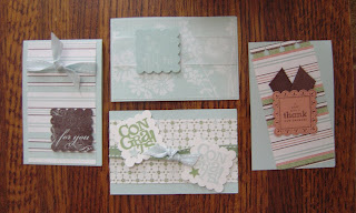
 Tomorrow is my 42nd birthday. Here are several cards that I received from friends! The first is from Connie, who lives in Wheaton, IL. We've known each other for about 14 years, and I was WAY into stamping before she discovered it! Now her collection surpasses mine. When we lived in the same town, Connie would freely share her sets so that we both didn't have to own the same ones. I miss that!
Her card features the new Party Hearty set, and her favorite color family, Bold Brights. I love how the background panels utilize the different elements--party hats, a large "b", a present, and a candle--from the set! Those cupcakes are so festive too, and are coordinated in such a cool way. The word window punch made quick work of the sentiment, I'm sure!
Connie makes cards for her church to use to send to shut-ins and those who are convalescing after illness or surgery. She has also made cards for a local crisis pregnancy center for several years. This shared hobby has kept us close across the miles. Thanks for your friendship, dearheart!
The second card is from fellow former Illinoian and SU! demonstrator Nadine Amy. Nadine moved to GA not long after I did--or was it before?--and she has used SU! as I have, to meet new friends and share what she loves with them! I really like the unique use of a classic, but retired set, Wonderful Words, as the stem for the flower from Embrace Life. I'm not exactly sure which Designer Series Paper this is, but it coordinates beautifully with the simple, elegant design of the card. I so love it! Thanks for remembering...we really do need to get together SOON!
The third card is from my convention roomie, Neelam Kulkarni. It uses Pocket Silhouettes, one of the first sets we both knew we HAD to have when we saw it in the catalog! The design is classic Neelam: clean, simple lines, and elegant always. The colors used are Baja Breeze and Sahara Sand, some really pretty but unknown to me DSP, cream satin ribbon, and our new collection of buttons. It's so beautiful in real life. Isn't amazing how God brings new people into your life to enrich it? It's hard for me to believe that I didn't know her this time last year. Thanks, girlfriend, for the lovely card.
My boys really went all out this year to make me feel special. Tomorrow I'll share what they did...complete with photos.
Good Things Come in Small Packages
As you know, I get great ideas and inspiration while reading blogs of other stampers. Michelle Wooderson, aka MishMash, posted about a mini card holder. She'd found it on Becky Robert's blog, Inking Idaho. I thought these would be a really cute gift for someone who did something special, so I set about to making it.

 Oh my! I LOVE the result! The cards are 2 5/8" x 8", scored at 4". I haven't measured the holder, but you will see when you follow the tutorial that it's made from a sheet of 7" x 8.75" card stock, so the final product is little and sweet! I used retired Afternoon Tea--wish I'd bought more of it!--and let myself play.
 The cards feature the 4 stamps from Say It With Scallops, since I thought the size of the squares was perfect, as were the sentiments, for a series of all-occasion cards. The only challenge this project presented was that I didn't have envelopes that matched the size of the finished cards. I decided to try to make my own, and one I'd seen Mary Jo Albright make a LONG TIME AGO came back to my mind as I started to work on it. Amazing! I'm thrilled to be able to present my friend with this complete set to express my appreciation.
Thank you, Becky, and thanks, Michelle, for sharing your talents so freely! Stay tuned...there's another post to come tonight.
Wednesday, September 17, 2008
White Pencil Technique and O MY Chocolate!
 I started fiddling around with the idea for this card a few days ago after seeing a few card blogs featuring images stamped on Basic Black card stock with Whisper White ink and colored with a white pencil to shade, highlight, seem to reflect light...in short, make way cool. The one that really stuck in my brain was this one by Ellen Hutson. Take a minute to click over and view it, and you'll know what I was inspired by! Go on...I'll wait.
 Okay, having seen this work of ART, you now understand my challenge. I wasn't trying to be as awesome as Ellen is, but I wanted to figure out how to do this. The problem is that I little artistic knowledge about how light creates highlights and shadows, and I have even less of an idea how to translate that to the image I chose.
Not to be put off, though, I decided to start simple with the outline flower image from Wonderful You. Okay, I know it's not as 3-D as Ellen's image, but I'm tryin'! I guessed where to color so as to create the highlighting/shadow effect. I'm not sure I guessed correctly. I know Ellen described how she did hers, but it didn't really fully translate to my image. So, did I do it right? Does anybody besides me care? I was having trouble with the circular nature of the petals.
Still, the card was fun. I went with a gate fold, in order to feature the image. I love black and bold colors together, so I used this scrap of Tempting Turquoise that was on my desk and went to town. I combed through my stash of stuff and found a partially used, retired Simply Scrappin' Kit that had a strip of TT with white flowers, as well as the cute little photo corners. Black gingham ribbon and eyelets and it's complete!
 And now something to warm your heart and make you drool...Last night my dear husband went to dinner with an old friend from Chicago who was in town on business. They went out for steak near Perimeter Mall, which is about 30-35 miles from our house. As he was contemplating the specific restaurant, I casually shared, "I think there's a good restaurant near Alon's." He didn't seem to take the bait, or even acknowledge my comment.
 What's Alon's? Why did I want him to go there? Alon's is the MOST AMAZING bakery, delicatessen, gourmet food store, espresso bar, and general foodie heaven we have found in Atlanta! We had gone there on a date this spring, and it was there I tasted Chocolate Louise Cake. Bob had chosen it as his dessert after our wonderful lunch, and he was kind enough to let me taste it(I'd chosen chocolate gelato that didn't even begin to compare). He's such a good sharer.
I'm not sure words adequately describe this fantasmic palate pleasure. The pastry chef and owner Alon Balshan uses his Aunt Louise's recipe for a dark, dense without being the slightest bit heavy, chocolate cake that's topped with a silky smoother than smooth chocolate hazelnut cream. The band with the gold stars? That's chocolate as well, and it's topped with unsweetened whipped cream and some really nice delicate chocolate stick. It's almost a religious experience. Enough to make your mouth swear off all other food for the rest of the day.
ANYWAY, I was jonesin' for that taste again, and I was hoping that Bob would get my hint or receive my ESP and get me one of those cakes just because. He texted me during dinner to tell me that the steak was great. I asked what he was doing for dessert. He told me they were skipping it because they were too full. I thought he wasn't getting my signals and there would be no oh my goodness cake for me.
I WAS WRONG!!! Today was the first day of you know what, and the perfect time to enjoy such a treat! I reveled in this delicacy so much that Michael told me to go away so that he didn't have to watch me while he was working on his homework. It's so rich that I almost couldn't finish it...BUT I DID! Not only did my DH bring one home for me, he brought one home for each of us. No sharing! Isn't he the BESTEST husband ever?!
Tuesday, September 16, 2008
Monochromatic Marvelousness
 You'd think that working within just one color family would be boring. Shade gradations shouldn't excite, right? Well, this card, made using So Saffron and More Mustard, really jazzes me!
Haiku Designer Series Paper was the basis for this card, and I was also inspired several weeks ago when I was putting together my first order from the catalog and saw a monochromatic card among the samples. The base is SS, and the 5/8" SS twill ribbon is a perfect match!
I had to fuss with the ribbon a bit to get it to do what I wanted it to in terms of how it lays, but it ties so nicely. I started out thinking I wanted a notch in the right side of DSP, but I ended up putting one on both ends of it, which helped the ribbon somehow. I used my Coluzzle Circle Cutting System and scooped out just half of the smallest circle to achieve this look.
The Scallop Square Punch is 1 3/8", which is pretty petite, so in order to give the stamp which coordinates with it from the Say It With Scallops set some umph, I mounted it on a MM square of the same size. It was a complete accident that it mimics the diamond pattern in the paper--I'm not that amazing when it comes to designing! I love it though!
The size is 4" x 8.5", which provides just enough room to express your thanks to someone without having to either write BIG or go on a bit too much in order to fill the space. I have quite a good stash of thank-yous now, so I hope to have need to give thanks soon.
Monday, September 15, 2008
It's Beginning to Look a Lot Like....
I can't really bring myself to think about Christmas yet. Fall is just arriving here in GA, and it's my favorite season. Christmas is, however, getting closer every day, and I have a Stamp-A-Stack in November that my hostess wants pictures of the cards we're going to be making by next Friday. She's going to send them out to further entice those uncommitted to firm up their RSVPs for her event. Wise lady!
That meant, though, that I had to get in the mood and begin humming Christmas carols so that I could create samples! Today's efforts aren't final--in fact, they're waiting for some elements that I ordered today that will not arrive until sometime late next week. Letting ideas percolate is good, and getting feedback from fellow stampers is helpful.
So, here's what I came up with today:
 This one is the most complete, so I'll start here. I like this color combo of Kraft, Chocolate Chip, and Baja Breeze. It's non-traditional and clean lined. That 1" double-stitched chocolate chip ribbon is just THE BEST! There is, though, an alternative ribbon selection in my order. It's made with FELT, which will introduce a great tactile feature to this card. Do you like the 2 on top, 3 on bottom present circles? The main image is from Season of Joy, which was stamped entirely with BB and then a CC marker selectively colored some elements. The present image is from Party Hearty, punched with a 3/4" circle punch.
 This card is a re-do of the splattered image I posted about yesterday. I've added the ribbon, and now I'm not sure if there should be a greeting on the front of it, or if it should go inside. The colors in play here are Old Olive, Baja Breeze, Real Red, and Chocolate Chip. The set is Party Hearty, and the swirls are from Season of Joy. Do you think this could benefit from some DP? I do, and I have some on order. I also have another ribbon choice I'm toying with here. It uses three of the four colors and is quite yummy, in my opinion. Any other suggestions would be welcomed.
 This third card is the least complete, and is a CASE from Debbie Olson. As I was downloading this from my camera, I turned it so that the scalloped edge was at the bottom, and I got a whole new perspective on this card. The colors used here are Real Red, Sahara Sand, and Whisper White.
I'm waiting for a new stamp set of snowflakes called Snow Burst to arrive so that I can decorate the front panel with various sizes of flakes in Sahara Sand and Whisper White inks. I also think that wide red ribbon would look great, but I'll wait to see how it looks with the striped one I ordered. Sort of wished I'd expedited shipping so that I'd have it in 2 days after it is picked, and not 6! Can you tell that there is glitter on the center snowflake? That image is from Season of Joy, and the Scallop Square Punch got a good workout, as well as the Scalloped Edge Punch, the Paper Piercing Mat Pack, Heat and Stick Powder, Dazzling Diamonds, and my heat tool. I'd love feedback on the orientation issue. Vertical or horizontal?
Thanks for weighing in. I really appreciate your comments!
That meant, though, that I had to get in the mood and begin humming Christmas carols so that I could create samples! Today's efforts aren't final--in fact, they're waiting for some elements that I ordered today that will not arrive until sometime late next week. Letting ideas percolate is good, and getting feedback from fellow stampers is helpful.
So, here's what I came up with today:
 This one is the most complete, so I'll start here. I like this color combo of Kraft, Chocolate Chip, and Baja Breeze. It's non-traditional and clean lined. That 1" double-stitched chocolate chip ribbon is just THE BEST! There is, though, an alternative ribbon selection in my order. It's made with FELT, which will introduce a great tactile feature to this card. Do you like the 2 on top, 3 on bottom present circles? The main image is from Season of Joy, which was stamped entirely with BB and then a CC marker selectively colored some elements. The present image is from Party Hearty, punched with a 3/4" circle punch.
 This card is a re-do of the splattered image I posted about yesterday. I've added the ribbon, and now I'm not sure if there should be a greeting on the front of it, or if it should go inside. The colors in play here are Old Olive, Baja Breeze, Real Red, and Chocolate Chip. The set is Party Hearty, and the swirls are from Season of Joy. Do you think this could benefit from some DP? I do, and I have some on order. I also have another ribbon choice I'm toying with here. It uses three of the four colors and is quite yummy, in my opinion. Any other suggestions would be welcomed.
  This third card is the least complete, and is a CASE from Debbie Olson. As I was downloading this from my camera, I turned it so that the scalloped edge was at the bottom, and I got a whole new perspective on this card. The colors used here are Real Red, Sahara Sand, and Whisper White.
 I'm waiting for a new stamp set of snowflakes called Snow Burst to arrive so that I can decorate the front panel with various sizes of flakes in Sahara Sand and Whisper White inks. I also think that wide red ribbon would look great, but I'll wait to see how it looks with the striped one I ordered. Sort of wished I'd expedited shipping so that I'd have it in 2 days after it is picked, and not 6! Can you tell that there is glitter on the center snowflake? That image is from Season of Joy, and the Scallop Square Punch got a good workout, as well as the Scalloped Edge Punch, the Paper Piercing Mat Pack, Heat and Stick Powder, Dazzling Diamonds, and my heat tool. I'd love feedback on the orientation issue. Vertical or horizontal?
Thanks for weighing in. I really appreciate your comments!
Sunday, September 14, 2008
Not in the Cards...
My very wonderful friend, Lydia, asked me if I'd stamped this weekend. Well...I inked MANY stamps yesterday, but I didn't really come up with anything I was happy with. In fact, I was a bit perturbed with some of my attempts. But, I decided to share anyway, in the spirit of creative transparency.
 I saw a beautiful example of a technique called emerging color while surfing SCS in the Eastern Blooms gallery. It is by Julie Davidson, and I wanted to CASE it to see if it might work as a card for my upcoming Stamp-A-Stack in two weeks. It turned out to be very easy, until the last step. I couldn't get my brayered layer dark enough to block out the original pattern I had created underneath! I also had trouble with stray Clear Embossing Powder sticking where it shouldn't. After two tries, I was done with that. Julie, yours is BEAUTIFUL, though.
In the middle of the day, I went to Patti Montijo's house. She's a fellow demonstrator I have sought out because I want to try to find some other stampers in this area. Patti lives about 20 min. from me in a beautiful house with a beautiful craft room that makes you feel like you're in a treehouse! There's no way you couldn't find that space inviting and inspiring. Patti's workshop featured an extensive comparison of the different coloring options that are available, both with SU! products and other tools. There were 7 of us there, and we had such fun!
 The stamping community is so warm and welcoming, and this group of gals is no exception. Patti and three of her friends that were there make up the group the Stamp Maniacs. They gather once a month, have lunch, and spend the rest of the afternoon teaching each other how to make a card each has designed. Patti showed me some of the samples of their work. Jaw dropping creativity, I tell you! There were also 3 gals there who had very little stamping experience. They loved it, and we whiled away a few hours in the best way possible. It was a great experience.

 Before going to Patti's, I had also played with one of the chipboard frames in my collection of accessories. Again, I was trying to come up with a simple, elegant design for SAS. I really like the Haiku Designer Series Paper I purchased, and I also have a bunch of rub-ons that were gifts from convention that were begging to be put to use. So I inked the frame and then began to ponder the options.
Sometimes, I think I think too much, and this is one of those times. I couldn't decide about the sentiment, so I'm giving you a chance to speak your mind. Which one do you prefer? Sentiment or no sentiment? With it, I think it makes the knot of Whisper White satin ribbon look like it's sandwiched. Must be that time of the month...
 Before dinner, I ALSO played with a new stamp set that I purchased on my last order. It's called Party Hearty, and I bought it because some really creative gals saw the image of the party hats in a row and immediately transformed them into Christmas trees. A set that does double-duty? LOVE that. I colored my hats using the new Christmas colors of Kiwi Kiss, Real Red, and Baja Breeze. I didn't get the entire card finished before I went out with my dear husband, so when I went back to my craft table this afternoon, it was sitting there minding its own business when I squeezed the last drops of Old Olive out of the reinker, splattering them onto this card-in-progress.
I know when to walk away, and that was the sign to do so. So, even though I'd like to be creating, it's not in the cards (HA!) today. Guess I'll go to the grocery and try to make some decisions there. Wish me luck!
 I saw a beautiful example of a technique called emerging color while surfing SCS in the Eastern Blooms gallery. It is by Julie Davidson, and I wanted to CASE it to see if it might work as a card for my upcoming Stamp-A-Stack in two weeks. It turned out to be very easy, until the last step. I couldn't get my brayered layer dark enough to block out the original pattern I had created underneath! I also had trouble with stray Clear Embossing Powder sticking where it shouldn't. After two tries, I was done with that. Julie, yours is BEAUTIFUL, though.
In the middle of the day, I went to Patti Montijo's house. She's a fellow demonstrator I have sought out because I want to try to find some other stampers in this area. Patti lives about 20 min. from me in a beautiful house with a beautiful craft room that makes you feel like you're in a treehouse! There's no way you couldn't find that space inviting and inspiring. Patti's workshop featured an extensive comparison of the different coloring options that are available, both with SU! products and other tools. There were 7 of us there, and we had such fun!
 The stamping community is so warm and welcoming, and this group of gals is no exception. Patti and three of her friends that were there make up the group the Stamp Maniacs. They gather once a month, have lunch, and spend the rest of the afternoon teaching each other how to make a card each has designed. Patti showed me some of the samples of their work. Jaw dropping creativity, I tell you! There were also 3 gals there who had very little stamping experience. They loved it, and we whiled away a few hours in the best way possible. It was a great experience.
 Before going to Patti's, I had also played with one of the chipboard frames in my collection of accessories. Again, I was trying to come up with a simple, elegant design for SAS. I really like the Haiku Designer Series Paper I purchased, and I also have a bunch of rub-ons that were gifts from convention that were begging to be put to use. So I inked the frame and then began to ponder the options.
 Sometimes, I think I think too much, and this is one of those times. I couldn't decide about the sentiment, so I'm giving you a chance to speak your mind. Which one do you prefer? Sentiment or no sentiment? With it, I think it makes the knot of Whisper White satin ribbon look like it's sandwiched. Must be that time of the month...
 Before dinner, I ALSO played with a new stamp set that I purchased on my last order. It's called Party Hearty, and I bought it because some really creative gals saw the image of the party hats in a row and immediately transformed them into Christmas trees. A set that does double-duty? LOVE that. I colored my hats using the new Christmas colors of Kiwi Kiss, Real Red, and Baja Breeze. I didn't get the entire card finished before I went out with my dear husband, so when I went back to my craft table this afternoon, it was sitting there minding its own business when I squeezed the last drops of Old Olive out of the reinker, splattering them onto this card-in-progress.
 I know when to walk away, and that was the sign to do so. So, even though I'd like to be creating, it's not in the cards (HA!) today. Guess I'll go to the grocery and try to make some decisions there. Wish me luck!
Thursday, September 11, 2008
Preppy Happy Bling
 I was in high school during the '80s, so I know a thing or two about being a prep. Polos worn with the collar turned up. Izod crocs and Ralph Lauren ponies gracing those shirts, if you had money. The hottest color combination? Pink and green. I don't remember having any wardrobe pieces with this combination, but perhaps I'm blocking the memory.
 This afternoon I had an '80s flashback of sorts when thinking about a card I could make using the InColor Collection. It occurred to me that I hadn't used Pink Pirouette and Kiwi Kiss together--like, DUH!
I wanted to use the Wow Flowers set that I have, which coordinates with the Power Flower Card Elements Kit that I highlighted here last week.
I pulled out KK first and found a large scrap. Using my scalloped edge punch, I created an 8.5" length. I cut it .5" thick and set it aside. I decided to use PP as the base, so I stamped the Wow Flowers flower in the same ink as randomly as I could. Then I went back and did the same with KK.
Then I needed a focal point. After toying around a bit, I stamped the happy birthday circle three times, punched it out with my too big 1.25" circle punch (1" circle punch is preferred, but I do not own said punch), and punched out three more circles using my 1 3/8" circle punch so that they could be matted. Although not perfect, still rad.
 Back to the scalloped edge. I wanted to add some totally awesome bling to this preppyness, so I put Sticky Strip along the bottom edges, removed the covering, and sprinkled liberally with Dazzling Diamonds. This turned out, like, so, like cool! I had added some silver brads to the centers of the flowers in the middle of the birthday circles, so I whipped out my 2-Way Glue Pen and sprinkled again, and spread a little more pixie dust.
This was as girly as I could get (I was NEVER an all-out prep or a Valley Girl, and I'm SO not a girly girl), so I finished it off by adding some KK double-striped ribbon.
Hope you enjoyed the flashback!
Wednesday, September 10, 2008
Time Well Spent? You Be the Judge.
 I was flipping through an unsolicited catalog that came in our mail the other day and saw this picture of storage boxes. Aren't they cool? Instead of thinking about purchasing them, though, I thought to myself, "Could I create a similar look for a card?"
I thought about how I might do this and decided the only way to accomplish it would be to stamp on Whisper White and do a LOT of coloring with SU! Stampin' Write Markers. I took my Time Well Spent set, since it was the one with multiple flowers that mimicked the style in the picture. I stamped them all with Versamark and heat embossed them with White Embossing Powder. Then I set about the task of coloring the 3.25" x 3.5" piece. It took me over an hour of meticulous coloring, switching between my fine tip and the brush tip, to complete this small square!
 Then I had to figure out what kind of layout to incorporate this into. I'm not sure I'm really pleased with the final outcome, but I think it has more to do with the bow than the rest of the layout. Don't think I'll try this again, but it was a good challenge to see if I could make something "come to life" using my supplies, my skills, and my creativity.
For the record, I used Pink Passion and Rose Red, Pumpkin Pie, Green Galore, and Taken with Teal, besides the obvious Chocolate Chip.
Tuesday, September 9, 2008
Late Breaking NEWS!!!
 Ever ordered anything online? Don't you just LOVE the convenience of being able to do it whenever, wherever? Well, now online ordering is now available with me!
 Stampin' Up! has debuted a new system that allows you to go to my SU! website, justforyoubyjenn.stampinup.net, click on the SHOP NOW button in the upper right hand corner, and everything from SU! that your little heart desires will be delivered directly to your door!!! AND, I'll get credit it for it as your demonstrator! This icon will be ever-present on my blog homepage, so you don't have to remember the address of my website. Just click on it, and it'll take you where you want to go!
As my son would say, "That's uber-awesome sauce!" I couldn't agree more. Check it out and start thinking about your Christmas wish list!
Inspiration is Everywhere!
Last night I was relaxing with my husband and watching Designed to Sell on HGTV. On this episode, the only real help the couple needed was redecorating a guest bedroom and fleshing out a living area on their large back deck. What surprised me was the colors the designer chose to pair with the goldenrod wall color that has been popular for almost a decade.
She chose a patterned fabric that was off white and a blue that immediately made me think of Baja Breeze from this year's InColor Collection. The room also featured an area rug at the foot of the bed that pulled some brown in with these two colors, using a floral motif.
I was intrigued, so I made a mental note to check this out IRL to see if my eyes would confirm what I'd seen work onscreen. I pulled out More Mustard, Baja Breeze, Very Vanilla, and Chocolate Chip. It looked good! I had Pocket Silhouettes on my desk, and it hadn't seen much ink. I wanted the VV to play a dominant role in the design, in order to keep it light and airy. That meant that the ink was going to be what I used to portray the color combination.
 The first card is minimalistic. The images and the petite font used for the phrase "friend to friend" really pair well. I added some texture by stamping the grass from Inspired by Nature on the More Mustard mat, but it's pretty hard to tell it's there. The weaving of the 5/8" Chocolate Chip grosgrain brought this card together. I figure that I don't need to make something complicated. Simple works!
 This second card was inspired by some I saw in the SCS gallery for this set. I layered the stamps and the colors using the same three images from the first card. This created a sort of "meadow". I used the second sentiment stamp in the set, "thanks so much", for this card's message. I had fun using a tiny detail from each of the three stamps on the sentiment strip, further tying everything together. The ribbon is Close to Cocoa 1/4" grosgrain, and I like the more muted color within the same palette. The stripes at the bottom repeat the stripe element.
I think this is a very striking, yet soothing color combination. Be on the lookout for colors that work well together. I suggest keeping a notebook so that you don't forget before you get a chance to try them out.
She chose a patterned fabric that was off white and a blue that immediately made me think of Baja Breeze from this year's InColor Collection. The room also featured an area rug at the foot of the bed that pulled some brown in with these two colors, using a floral motif.
I was intrigued, so I made a mental note to check this out IRL to see if my eyes would confirm what I'd seen work onscreen. I pulled out More Mustard, Baja Breeze, Very Vanilla, and Chocolate Chip. It looked good! I had Pocket Silhouettes on my desk, and it hadn't seen much ink. I wanted the VV to play a dominant role in the design, in order to keep it light and airy. That meant that the ink was going to be what I used to portray the color combination.
 The first card is minimalistic. The images and the petite font used for the phrase "friend to friend" really pair well. I added some texture by stamping the grass from Inspired by Nature on the More Mustard mat, but it's pretty hard to tell it's there. The weaving of the 5/8" Chocolate Chip grosgrain brought this card together. I figure that I don't need to make something complicated. Simple works!
 This second card was inspired by some I saw in the SCS gallery for this set. I layered the stamps and the colors using the same three images from the first card. This created a sort of "meadow". I used the second sentiment stamp in the set, "thanks so much", for this card's message. I had fun using a tiny detail from each of the three stamps on the sentiment strip, further tying everything together. The ribbon is Close to Cocoa 1/4" grosgrain, and I like the more muted color within the same palette. The stripes at the bottom repeat the stripe element.
 I think this is a very striking, yet soothing color combination. Be on the lookout for colors that work well together. I suggest keeping a notebook so that you don't forget before you get a chance to try them out.
Monday, September 8, 2008
Urgent Need...and You Can Help!
Dear Friends,
I don't use my blog to make Public Service Announcements, but with what has happened in New Orleans from Gustav and could happen again this weekend with Hurricane Ike bearing down on the Gulf Coast, I thought this was appropriate. Ya'll are generous people; I know that.
Please follow this link to the blog of a pastor I know who's trying to help a fellow pastor in Baton Rouge get tarps to cover home roofs for folks in his town and region before the next wave of water hits this area.
This is not a hoax. And religion has nothing to do with this. There are folks who are facing WEEKS without electricity and their belongings are exposed to the elements. This is just the plea of someone who's on the ground, at ground zero, who can get help to them quickly.
We can band together and get things done faster than either the state or federal government can. So, if like I, you often feel helpless during situations like these, this is something tangible you can do to help. It isn't cheap, but wouldn't you want someone to do it for you, if you were in this situation?
If you choose to purchase some tarps, let me know, and I'll make it worth your while. Thanks for considering this...
Friday, September 5, 2008
Inside My Mind
 This card has been coming together in my mind and on my desk for a few days now. Here's the thought process I went through as it evolved.
WEDNESDAY EARLY EVENING: 1) What would it look like if I stamped just the smallest flower bud from Inspired by Nature? (If you're sick of this set by now, I can understand. I can't explain why I keep being drawn to it, but I just am.) Get out a piece of scrap Very Vanilla and give it a try.
2) Cute, but how do I keep them going along said strip looking random, i.e. not getting two going in the same direction. That's much mental math for you--quit that!
THURSDAY AFTERNOON: 3) I really want to do something using the new Haiku Designer Series Paper. Kristina Werner really created some beautiful stuff! How many sheets of So Saffron do I have? Only 1? Well, I'm going to use it anyway.
4) I'm going to stamp the sponged flowers in the corners of a larger piece of VV and see what that looks like. I like that! Back to the Haiku. Which two do I like? Oh wow, it's 4:00 already! I need to go fix dinner now. (Leave it all on the table and walk away.)
FRIDAY AFTERNOON: 5) I'm tired after opening at the store. I really should take a nap. But I want to post a card today so that my readers don't think I'm neglecting them. Let's see...I need a focal point. What if I cut out the entire second smallest flower? (Do this.) Nope. Too small. So ink up the largest one and cut it out the same way. OK.
6) Time to mount everything. Why must the DP be symmetrical? Other people don't do this. They just cut into the stuff and are done. Can't do that. It must be a complete pattern. (Painfully slice off small slivers of DP from the OO piece so that the pattern is perfectly symmetrical.) Ooooh and aaaaahhh at the lovely geometry of circles intertwined on the larger piece.
7) What about a sentiment? You could try the "for you" from Say It with Scallops. Nope. It's too big. It'll be fine as a blank card, or with the message inside. Leave the front alone.
8) Should the cut out flowers be adhered with mono adhesive? Dimensionals would be better. Those edges of the dimensionals would work for stem support.
9) Done! Time to photograph and blog. I can still get 30 min. before Michael comes home.
Wednesday, September 3, 2008
PJ Day Card
I'm having a PJ Day today. I had a long, physically demanding day at work yesterday, so today I decided to lounge all day. I've read email, surfed blogs, eaten, and brushed one dog, but other than that, I've done nothing. Partly that's because my right wrist is bothering me. Too much repetitive motion in the past few days--lifting and shifting coffee urns with coffee in them multiple times during a shift--and not enough icing and stretching.
 I couldn't stay away from the craft room, though. I've already admitted how good I am at doing nothing, so this should be no surprise. I wanted to create something using a stamp set that hadn't seen ink yet. I also wanted to experiment with Tangerine Tango, Pacific Point, and Baja Breeze, three of the 2008-2009 InColor Collection I hadn't used in concert.
Little stamp images are a popular trend right now, and creating "inchies" with them is all the rage. Inchies are just what they sound like: 1" squares featuring tiny images or partial images. The stars that create the background and which are popped up on the scallop squares are from Bitty Basics, a Level 1 Hostess set, a 10-piece coup! Images include a leaf, a heart, a butterfly, a flower, a star, a cupcake, a coffee mug (!), and the words smile, thanks, and hello. That's a lot of stamping booty for FREE, just for being a hostess with a $150 qualifying workshop!
I also worked with the Say It with Scallops set, which is SU!'s Ronald McDonald House charities set. A portion of the sale of each set goes to the Ronald McDonald House, which provides housing to families with sick children all across the US. The Congrats! stamp made a perfect feature image. The PP scallops you see at the top and bottom of the card's center panel are made with the scallop square punch, and the images in this 4- piece set are designed to coordinate with this tool. Originally, I had the Congrats! punched out with the scallop punch, but wanted to incorporate the frame. More on that in a minute...
To get all three colors on the stamp, I stamped the entire image in PP, then used a blender pen to REMOVE ink from the star and the exclamation point. Then I inked the blender pen and applied BB and TT inks where I wanted them.
The chipboard frame is the element that I think really ties this whole design together. I used the reinker from TT and a sponge dauber to transform it from the dull chipboard neutral color. Just a drop or two did the trick. I dried it with my heat gun, because I'm impatient.
Okay, I have to go now and rest my wrist. Hope you enjoyed this creation!
 I couldn't stay away from the craft room, though. I've already admitted how good I am at doing nothing, so this should be no surprise. I wanted to create something using a stamp set that hadn't seen ink yet. I also wanted to experiment with Tangerine Tango, Pacific Point, and Baja Breeze, three of the 2008-2009 InColor Collection I hadn't used in concert.
 Little stamp images are a popular trend right now, and creating "inchies" with them is all the rage. Inchies are just what they sound like: 1" squares featuring tiny images or partial images. The stars that create the background and which are popped up on the scallop squares are from Bitty Basics, a Level 1 Hostess set, a 10-piece coup! Images include a leaf, a heart, a butterfly, a flower, a star, a cupcake, a coffee mug (!), and the words smile, thanks, and hello. That's a lot of stamping booty for FREE, just for being a hostess with a $150 qualifying workshop!
I also worked with the Say It with Scallops set, which is SU!'s Ronald McDonald House charities set. A portion of the sale of each set goes to the Ronald McDonald House, which provides housing to families with sick children all across the US. The Congrats! stamp made a perfect feature image. The PP scallops you see at the top and bottom of the card's center panel are made with the scallop square punch, and the images in this 4- piece set are designed to coordinate with this tool. Originally, I had the Congrats! punched out with the scallop punch, but wanted to incorporate the frame. More on that in a minute...
To get all three colors on the stamp, I stamped the entire image in PP, then used a blender pen to REMOVE ink from the star and the exclamation point. Then I inked the blender pen and applied BB and TT inks where I wanted them.
The chipboard frame is the element that I think really ties this whole design together. I used the reinker from TT and a sponge dauber to transform it from the dull chipboard neutral color. Just a drop or two did the trick. I dried it with my heat gun, because I'm impatient.
Okay, I have to go now and rest my wrist. Hope you enjoyed this creation!
Tuesday, September 2, 2008
Rudbeckia hirtas...Inspired by Nature!
 I hope you're wondering what the heck a Rudbeckia Hirta is, because, in the interest of accuracy in blogging (old habits of former journalists die hard), I had to make sure what the proper genus and species of my focal image was before I titled my post today. No, it's not a code name for some rude girl named Becky that I want to hurt (insert Mom humor courtesy laugh here). It's the scientific name for Black Eyed Susans, and I have a simple, cool technique using the stamped version to share.
 While I was unwinding over the holiday weekend, I came across this blog, which highlighted the work of Kim Teasdale for her amazing ability to create dimension using stamps. I loved the idea and was intrigued but a bit intimidated; still, I wanted to try it. I decided to start simple and chose Inspired by Nature.
 I inked the entire image in Garden Green and stamped it on Very Vanilla card stock. Then I used sponge daubers and inked up just the flowers in Summer Sun and More Mustard and Chocolate Chip. After stamping them on scraps of VV and cutting them out, I popped them up on dimensionals. I like how the GG serves as a sort of shadow for the flower heads while completing the image as well.
The last element I decided to add to this was the 5/8" double-stitched chocolate chip ribbon. It's FABULOUS!! One of the make and take projects at convention used this, incorporated into the card at the top as a major design element, and I really liked the effect. Now it's gracing a card I designed!
The sentiment at the bottom is another from Heard from the Heart. This works for lots of different occasions, but this is going to be a birthday card. One last thing: when I pulled out my stash of GG card stock, this 7.25" x 8.5" was on top. I was going to cut it down to make it into a standard size, but the more I played with the main image, I decided to leave it. The mat is Summer Sun and I roughed up the edges with my scissors. That's for you, Melissa!
This is MUCH cheerier than my previous post, and I hope you enjoyed seeing another way to use this versatile set. I'm off to take a short nap before heading back to work!
Monday, September 1, 2008
Modern Friendship and Wonderful You
 Our son has a friend named Tristan. They like to get together and hang out. This is what they do when they're together. They sit side by side and play an online computer game. They talk back and forth, sometimes verbally and sometimes using the online chat option. They did this for about 5 hours last night and had a great time. I really don't get it, but I'm not 14. I didn't grow up surrounded by technology that let me type messages to friends and send them through cyberspace, to be received moments later. I wrote letters and waited days and weeks for them to be delivered, read, and responded to.
I didn't grow up with an answering machine on any telephone, so the phone just rang and rang and rang if they weren't home. I had to wait to connect with them until they were home. Not so now; Michael received a cell phone with a texting keyboard so that he can communicate without speaking a word to the person he wants to connect with. While it's convenient, I think there's something sad that it's perpetuating. Communicating without connecting. But he doesn't see it that way. It's just his old Mom who's bothered by it. I'd love your thoughts about this.
 Okay, enough of that. Here's the card I made last night. It showcases a technique of dry embossing that doesn't require a brass template, but vellum, stamps, and Versamark ink. I stamped the outline leaf branch image from Wonderful You with Versamark on the vellum, traced it lightly with my dry embossing tool, and had this cool design element to work into a card.
I pulled out the Urban Garden Designer Series Paper--again--and was drawn to the stripes. The color that the vellum was matted to had to be dark or the design wouldn't show. I incorporated some mulberry paper, along with a Going Gray card stock mat and the a Basic Black base. I attached the vellum with silver brads to the DSP. This is a very muted card and I think I'll use it if I need a sympathy card. This card was hard to photograph so that it didn't look washed out.
This was a very busy weekend. Lots of work at Starbucks, with more to come. Don't know how much I'll be able to post, but keep checking back!
Subscribe to:
Posts (Atom)


