Have you ever met someone and wondered how it is that you've not known them your whole life? This happened to our family last fall when we met Allison and Kyle from IN. Allison and Kyle came here for a bloggers' party and stayed with us.
Well, today is Kyle's birthday. I love that this man is a thinker and that he's striving, struggling, and wrestling with making his life count for Jesus. So, the same sentiment I used for the card for Larry was the one I chose for Kyle. He's all about making the years count, so I knew he would resonate with this quote.
Not sure why I went with the western theme, but this retired Outlaw Designer Series Paper sure fit the bill. The gate fold is a 4.25" x 11" scored at 2.75" in from each end. I chose Very Vanilla for the base, layered on Really Rust card stock and some more of the Outlaw DSP to create some panels. I stamped the sentiment, which is from the retired set It's Your Birthday, in RR and crumpled it to get a worn looking focal point. I also frayed the edges with scissors, then used my Creamy Caramel marker to "age" it a bit more.
Kyle, I know you're not one to enjoy the spotlight on your day, but Happy Birthday! We Nahrstadts are proud to call you friend. By the way, be on the lookout for something in the mail. I'll give you a hint: it's brown.
Monday, August 31, 2009
Friday, August 28, 2009
Over the Hill...Way Over.
One of our regular customers, Larry, turns 50 tomorrow. He's a flirt and a schmoozer, and I've called him out on it. He says he's "charming" and there's a difference. I disagree. For example, yesterday he told me and fellow partner Abi that we like flowers in bloom, getting prettier every day. And he says stuff like that every day. We're giving him this card and serving him his coffee in a grande cup I blackened with a wide tip Sharpie. He'll love the attention.
I was going to make a sassy humorous card that poked fun at the death of his "youth", but I'm just not funny and I didn't have what I needed to pull it off at the 11th hour this morning. So I went serious and basic. I used the patterned interior of a security envelope I'd saved to cover the 50 chipboard numbers, and used my classic sentiment from It's Your Birthday.
I love the community that coffee creates.
Thursday, August 27, 2009
Another Celebration
Today is the 15th birthday of my only son. He shares this day with Emily, one of his best friends, whose parents were (and still are) dear friends when we walked through pregnancy together the summer of 1994. Our due dates were 2 days apart, and we promised each other we'd call when we went to the hospital. But we were only 2 days late, and they were 5 days late, so we didn't call and they didn't either. We found out we were both in labor when we arrived on the labor and delivery floor at the hospital and saw each other's names on the wipe board listing who is in what room. I'm sure they don't do this today, due to privacy issues, but we may have not known otherwise!
Our labor rooms were separated by only a thin wall, so Brad and Darcie could hear my dear husband shouting the numbers 1 through 10 as I pushed, so they knew where we were in our delivery process! We chose not to find out what sex our child would be, so we were thrilled to let them know that we'd had a little boy. Darcie delivered Emily Joy few hours later, (they hadn't found out either)and we shared a recovery room. To say these two are friends since birth is true. They literally have never known life without each other.
So, until 3 years ago, they celebrated their birthdays with each other. Separate friend parties and all, but at least a cupcake or ice cream dessert (Michael doesn't like cake) and a gift were exchanged. Moving changed the face to face nature of the celebrating, but we do not let the day pass without at least a card being sent to let Em know we're thinking of her.
This year's card was inspired by the colors of her room--hot pink and orange. The simple color block design was what I chose to communicate a more sophisticated, growing up look. I utilized the Great Friend set and stamped the leaf image with Versamark on the Pink Passion and Only Orange blocks. I used a stamp from Flight of the Butterfly set which says, "one person can make such a difference and that person is you" as the trail from the butterfly.
I wanted a simple interior that would carry the theme forward. I used direct to rubber inking of the border image from Great Friend for message. The "happy birthday" is from Mark the Date.
Wednesday, August 26, 2009
YEE HAW--My Western Anniversary
Yesterday was my 19th wedding anniversary. I don't feel that old, and I'm not really, I guess. It just seems that almost everything I experienced before I met him is a fuzzy memory. Last night while we dined on sushi takeout, we reminisced about the past 19 years and picked a favorite event for each one. We have been so blessed. Many didn't give us a fighting chance when we joyfully announced our engagement on Jan. 1, 1990. We'd only been dating 3 months, so how in the world could we know enough about each other to make this kind of commitment. We knew. It was the second best decision I've ever made, and I would relive every day again. I'm not waxing sentimental--we just have had a very happy life together.
The card is one I've had in my stash for quite some time. I made it for him specifically, but, while he's VERY supportive of my interest in making cards for others, he could give a hoot about getting one! I just couldn't let the occasion pass, though, without letting him know how fond I am of him. The interior says, "For Life", in response to the "Wanted" on the front.
The card utilizes the Wanted set and pairs together some beautiful colors--Sage Shadow, Chocolate Chip, Very Vanilla, Creamy Caramel, and Really Rust. SS is the base, and the score is at 1.5" and 7 1/8". I used the ink pad swiping technique to create the RR layer, swiping my pad back and forth across the card stock to create texture while laying down pigment. I roughed up the edges and crumpled the CC layer to give it dimension. Then I colored each of the elements--medallion, star, and paisley--several different ways to create a collage.
The border along the flap that is held in place by the medallion was created using VV card stock, swiped with Creamy Caramel ink after I stamped the small elements. The lasso is courtesy of simple twine from the Ace Hardware.
Tonight I'm off to the Ronald McDonald House. Should be a good time! I'm not responsible for the card designs this time, but I've seen what we're going to make, and I think the families will love them!
Tuesday, August 25, 2009
Being Thankful
A few weeks ago, I sent out an email questionnaire to my customers to inquire about an aspect of my business I was thinking about expanding. I told them that if they provided me with feedback, I would give them a stamp. It took a little longer than it should have, but this past week I was able to get those women thanked appropriately.
For each one, I made a card. I used Haiku DSP, which is retired, and I used a layout I saw on Mary Brown's blog, StamperCamper.com. I liked the layers and the 5.25" square size. The layers ended up being 5" mat of DSP, a 2" x 5" strip of a coordinating DSP, 2 pieces of 2.75" x 4" of card stock, one as a mat with a ribbon and the other as a background for the focal image, which measures 2.5" x 3.75".
I chose More Mustard, Old Olive, Whisper White, and Tangerine Tango for bases, and coordinated card stock and ribbon accordingly. The focal image is from Kind & Caring Thoughts, a Level 3 Hostess Set from the new Big Idea Book & Catalog. I used direct to rubber coloring technique and sponged the highlight color around the edges.
The other two cards I made used OO as the base and the lovely large cabbage flower images also from Haiku DSP. It was so fun to make a card that was lovely without anything else but a sentiment! The gate fold is always a great layout to go with when you want something special, and the center mat from the original layout design fit this 4.25" x 11" card well too.
The packages should arrive early this week, so I'm hoping I've delayed the posting of this post enough so that they aren't seeing their cards here first! Expressing gratitude is becoming a lost art and I don't want to be party to this social tragedy. Thanks, gals, for taking the time to help me with my business by answering a few questions.
Who are you thanking today?
Labels:
Haiku DSP,
Kind and Caring Thoughts
Monday, August 24, 2009
Happy Birthday in BLUE
My dear friend and fellow blogger Lydia of Understand Blue is celebrating life today, and, to overstate the OBVIOUS, she LOVES blue. So, of course, her card had to be in shades of blue. I chose Pacific Point from last year's InColor collection because I know it's her most favoritest blue ever. I opted for a Flip Flop card, which does this seemingly magical "flip" when you open it. I"m not going to go into detail about how I made it; there's a great tutorial on SCS that I've created a link to. It includes step-by-step pics. Check it out.
Once I had the color scheme and the layout design chosen, I began hunting around for an appropriate stamp set. Along the way, I found these Eastern Blooms rub-ons, and the rest almost happened on its own! The center of the flip flop card has a double mat of Night of Navy and Bashful Blue--the more blue the merrier!--and the images are stamped in those two colors and PP. I used 2 additional sets, both retired Hostess sets Best Yet and Live Like You Mean It, to create my message for my favorite Texan.
Lydia is one of the most generous crafters I know, and she is among the wittiest too! If you don't subscribe to her blog, you should. Her approach to cardmaking is unique, and I always enjoy getting a slice of life along with the card (and cat) pictures. Girlfriend, I hope your day is fantabulous! You're the best and just getting better! Wish I was there to eat sushi at Uchi with you. Thanks for teaching me to embrace life.
Saturday, August 22, 2009
Celebrating Zachary
I've had all these cards made and photos taken for a few days, but I've been otherwise occupied with life, so I haven't had time to upload them and write accompanying posts. I finally got around to it on Saturday, so enjoy the next few posts!
A couple who are regulars at my store had their first child a few weeks ago. They didn't find out ahead of time what the sex of the baby was, and I was so thrilled for them when I found out they had a boy. I'm biased, so deal.
As I thought about what to make for our team to sign, I pulled out my stash of Bashful Blue card stock and found there a half sheet with the word "baby" stamped around the edges as a border. It was a long ago leftover from a consultation I did with a friend when she was considering birth announcements for her third baby, and when she chose something else, I kept it. And promptly forgot all about it.
I liked how it looked and decided I'd make something personalized for Rory and Anna's sweet boy. I used the Delicate Dots DSP from this spring's SAB promotion and created a large mat. Then I stamped each letter of Zachary's name with my Jumbo Outline alphabet on some coordinating DSP from that collection and cut them out. I didn't feel it needed anything more, and we'll all sign the back and give it to the proud parents the next time they're in.
I love personalizing cards for these types of special occasions. How do you celebrate people in your life?
The Card I Wish I Never Had to Make
When I was at work yesterday, one of our regulars came in and got his usual drink. While my boss Kimmy was making it, she asked him how things were going. He replied, "Okay." And then he said this: "Well, actually, Julie and I just found out last night that she has breast cancer." (Yes, he considered us important enough people in his life to share that information with. What a privilege.) As soon as he left, Kimmy shared this with me, and the next words out of her mouth were, "Would you make them a card?" Of course I would, but what kind of card should it be?
I decided it needed to be one that would encourage, yet not contain even a hint of triteness. I went online and searched for quotes about hope. I chose the beginning of one by Anne Lamott, and I think it's perfect. I trust they will too.
Where they are is, most likely, a dark place. I've not been there personally or with anyone in my immediate family, but that doesn't mean I can't imagine, and what I conjure up is a dark hole. That's why the quote by Lamott spoke to me. It doesn't pussyfoot around, acting like something isn't completely out of whack. But it does foster peace by pointing out (by what it doesn't say) that where they are now is not where they'll always be.
I created this using my favorite DSP of all time, Urban Garden. I matted a large piece on Not Quite Navy and cut the flowers out and mounted them so that they weren't completely flat. The ribbon is non-SU! that I found at Michael's. The quote was created by using the Fresh alphabet by PTI and NQN ink.
All of us at the store who know this family will be signing the card to let them know we are with them as they walk this journey. What a community is developing over coffee. I've said it before but it's worth reiterating: THIS IS WHY I CRAFT. Who can you minister to today with your art?
Friday, August 14, 2009
A Good Color Combination Goes a Long Way
I was casting about this afternoon for something that would move me to complete my prep work for my SAS tomorrow (ssshhhh....don't tell that I tend to work best under deadline pressure), and I saw this color combination on SCS. It's a Cameo Coral base, Whisper White, Apricot Appeal, Certainly Celery, and Lavender Lace.
I had also pulled out my Always stamp set. It's still in the catalog (which, news flash (at least to me), is the ONLY ONE we'll have this year), and it hadn't seen any ink in a long time. It's always--no pun intended--a good idea to go through your stash of stamp sets regularly to see if you can use one you haven't in awhile. Use a new layout. Use an existing layout. Use a new color combination. Any or all of these refreshes the set, making it seem "new" again. Try it!
The best detail of this card is the ribbon. It's threaded with two Flower Ribbon Slide Hodgepodge Hardware pieces that are retired, but that I never got around to using until today. When you cast your bread upon the water, good things happen. I'm not sure what that means, but my I'll leave that to your personal interpretation.
I laid down some adhesive to keep the ribbon in place after I threaded both slides and positioned them. They're the perfect touch that I was looking for!
I'm breathin' easy tonight; no early rising for me until Monday! Going to stamp tomorrow with the gals, eat lunch and go boating with the volunteers from church, and try to really relax. Be on the lookout for a way cool Christmas offering, coming soon!
Thursday, August 13, 2009
What I See Each Day
I drive to work in the dark each morning, so there's not much to revel in but the worship music on the cd player. On the way home, though, I enjoy observing the roadside foliage as it flashes past my window while I speed down 400. To many, it may seem to be just weeds, but not to me. I love ornamental grasses, even wild ones, and for the past few days, I've been noticing these short grasses that have the most luscious shade of burgundy. (Yes, I stopped by the side of the road and snapped a photo so that you could enjoy their beauty!) I love that they're just there, shouting with vibrant color, and only those who are observant will have the opportunity to revel in their fantastic beauty.
If you're wondering why I'm going on about this nature observation, behold the resulting card. I started with a 3.5" x 11" base of Bravo Burgundy. I inked up the grass stamp from Inspired by Nature with So Saffron ink. When you look at the photo, you'll see that the grass is a mixture of green and burgundy, but when I see it as I'm driving down the road, it's interspersed with a wheaty yellow, so that's why I started with SS. I took my SU! Stampin' Write BB marker and streaked it randomly across the rubber. Then I stamped it on Very Vanilla card stock. I'm really happy with the result! I was so pleased that I reinked the stamp with SS and stamped it again on the SS mat. Aahhh...
The sentiments that go with the Inspired by Nature set weren't speaking to me, so I grabbed the one from A Beautiful Thing. It was the right size and expressed what I wanted to say, so there. Cut it out using my oval Coluzzle Cutter. I wish they hadn't retired this cutting system. It's so much easier to use than the Circle Scissors Plus, and, not to be obvious, but I can use it to create OVALS. The touch of linen thread creates just the look I want.
What do you enjoy seeing as you drive along your roads each day? Could you create a card or scrapbook page from your observations? I bet so. Tell me all about it.
Monday, August 10, 2009
So Long, Farewell
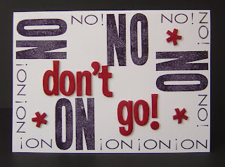
Katie is a fellow partner who is leaving my store this week. She is headed off to UGA and we need to say goodbye--but we don't want to! She's hilarious, fabulous, and quirky, and we love her to pieces and will miss her like crazy. That doesn't mean she's not going, though.
I found these American Crafts chipboard letters at Big Lots! for $2 a package. SWEET! The "NO!" border was created using Black Staz-on and a PTI alphabet and a retired SU! alphabet. I used my Real Red SU! marker to color the chipboard. It was quick, easy, fun, and it's a subtle nod to UGA, which has red and black as its colors.
The card is 5"x7", which will give everyone plenty of room to express their well wishes. Hope she likes it.
Friday, August 7, 2009
Distracted? Who's Distracted? I'm Cleaning. Promise.
My FB status says I'm cleaning house, and I am. I was picking up the clutter in the kitchen when I came across this nifty envelope that Kroger sent me for my faithful patronage. That corn on the cob makes me homesick for IN, where August is CORN month. But I digress. I need to get back to cleaning (wink, wink), so on with the project.
The envelope was sealed with some sticky substance that allows it to be opened and shut etc., so I not only opened it, but peeled apart the cool interior pocket to check out the dimensions. It measured 13.5", which is 1.5" too long for adaptation by me with Designer Series Paper into a neat little gift set for cards. I didn't want to lose the upper flap, so that meant I needed to shorten the interior pocket by 1.5". No problem!
I did a trial run with two cards and envelopes using the adapted Kroger version, and it worked! So I pulled out some DSP I was willing to part with, cut, scored, and strategically applied some Sticky Strip. Done!
I used minimal decoration, as is my style, adhering some wide Old Olive grosgrain ribbon with Sticky Strip, and in less than 15 minutes had a sweet little two-card gift set for someone special!
Would you like to have something like this on hand to give to someone when you need a hostess or thank-you gift? I'd love to give you and some of your friends personal instruction! Contact me to set up a date. It'll take less than 2 hours to make this and 2 cards, and we'll have a marvelous time together!
Tuesday, August 4, 2009
August is Kids Month at SU!
There are several specials that SU! is offering this month to highlight the "Growing Up" section of the 2009-2010 Idea Book & Catalog.
Purchase $35 in merchandise from this section of the catalog and receive a set of free designer buttons. The Playground, Sherbet, or Button Latte Designer collections are yours to choose from. Each package contains 30 buttons and is a $7.95 value. That's like getting a 20% discount on your purchase, but you walk away with great product!
Are you aware that SU! has designed the party kits, complete with invitations, for a princess or pirate birthday party? Like aliens and robots? There are now stamp sets featuring both! Have a tween or a teen guy you're trying to make cool cards for? We have 5 extreme images featuring a BMX rider, a surfer, a guitarist, a snowboarder, and a skater. There's the cutest little pony stamp that you can accessorize with wings, a party hat, or "brandings", like stars and rainbows, butterflies and flowers. Have a train lover in your house that you're making scrapbook pages for? We have a great set with an engine and 3 cars. If you're wanting to commemorate your athlete's activities, we have 6 sports sets with images for baseball, football, tennis, soccer, basketball, and BMX racing.
As you can see, the options are plentiful, not only for stamping cards or creating scrapbooks FOR kids, but for--have you thought of this--stamping cards or creating scrapbooks WITH kids! Why not take advantage of the sale, buy a set, and get something extra for FREE!
Another special SU!'s offering this month highlights the latest rage in home decor--vinyl wall appliques. Our Decor Elements line is fantastic for decorating a child's room and being able to change it next month, next year or in 5 years without leaving any marks on the walls! There are fairy tale castles with princesses and knights, flowers, butterflies, trains, boats, airplanes, and inspirational phrases. You can even create a custom monogram.
Besides all these fantastic decorating options, this month's special offer is a growth chart for keeping track of how your child's height! This isn't currently available any other way than through this special offer. The price is $24.95.
Think about how you can take advantage of these specials. One way you could get $35 of product FREE from the Growing Up section is to host a get-together of other moms with their children. I've helped several moms and daughters host their friends, and a good time was had by ALL! Contact me if you're interested in this or any of these other offers. If you're reading this in the wee hours of the morning because it's the only time of day you have to yourself, just click on my "shop online now" icon in the upper right corner of the blog and shop to your heart's content!
Monday, August 3, 2009
Welcome, little Amos!
A friend of mine and his wife had their first baby a few weeks ago. I wanted to do something special for this event, but I was not inspired. I think it was because I don't have a "go to" set that I use for making this kind of card, so I was stumped.
I had this tri-shutter card base sitting around that I'd decorated with retired Autumn Vine DSP, and I began playing with it last Saturday to see what I could come up with that would honor this little boy's birth. The nursery's colors are green and brown. Check. I had seen a picture the proud papa had posted on FB where Amos was wrapped in a blanket covered with elephants. AHA! Wild About You was the set I grabbed and began inking!
The colors of the DSP were Chocolate Chip, More Mustard, Sage Shadow, and Really Rust. So I stamped four elephants in those colors. I paired them with a sentiment stamp from a retired Hostess set, the name of which escapes me. "It's a boy!" was quite appropriate, and set the tone.
The other sentiment I employed in my design is from God's Blessings. I think it's intended for a wedding, but I like it for a new baby. For the proud parents, there's a new hand to hold, a new heart to love, and a new life to lead. What a joy and what a responsibility! I inked up each phrase separately and positioned them a bit more spaced apart than the original stamp design. I'm a person who revels in symmetry, so instead of using another verse on the panel on the other side of the little boy's name, I repeated the sentiment. I like how it frames his name, which I stamped using my Jumbo Outline Alphabet and then colored using my CC Stampin' Write! Marker. The other animals on the card are also from Wild About You, and I like how they complete the look and establish the theme.
I dropped this off today and got a text message several minutes later, exclaiming how fantastic it is and how he couldn't wait to show it to his wife. This is why I craft, friends! The opportunity that that little investment of ink, paper, and time afforded me to bless someone is the best feeling. Try it this week. Give one of your cards away, and tell me about the reaction. Spread a little love, friends...
Subscribe to:
Posts (Atom)