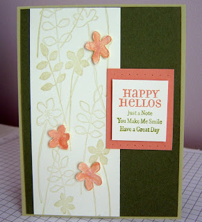
Kristina Werner has a wonderful blog, and every week she posts a color inspiration challenge. Didn't I just say yesterday that I was looking for inspiration? I love it when that happens. Kristina doesn't know it, but she's being doubly helpful to me, because I've been searching for blue and brown bedding for months now and have not found what I like! Perhaps my search is ended...
But I digress. Here's what I came up with. Since SU! doesn't make a Soft Sky marker, I had to improvise. I stamped the entire image in SS, then colored over the areas I wanted Chocolate Chip or Close to Cocoa for the flowers. After doing the largest one this way, I didn't add Close to Cocoa to any of the other flowers, because it was too difficult to differentiate between the two browns, seeing as they both were "diluted" by the SS already on the surface.
Originally, I had set out this morning to create a frame with my Dots jumbo wheel, which matches the Friendly Flowers set. This turned out to be a bit more challenging than I had anticipated. I ended up using it as the mat for the main image, but you can't see very many of the dots. Perhaps I'll attempt this look again another day.
Overall, I'm happy with it, and someone will be pleased to receive it. Don't know who it'll be, but that's why having a stash of cards is good! Thanks, Kristina!
Wednesday, April 30, 2008
Tuesday, April 29, 2008
Card Box #4--God's Gift Birthday
This card reminded me of a trellis in a garden, so you get an outdoor shot of my fourth card in the box set! I wanted to use up a bunch of scraps, and a quilt card is always good for that. Quilts also convey warmth, and remind me of a plaque a friend gave me a long time ago. It had a clothesline with quilts hanging from it with the message, "Old friends are like quilts. They never lose their warmth." True, that.
This stamp is the only one in the set that I cut apart, mounting "Happy Birthday" on the end of the wood block and the rest of it in the center. So much easier than masking, allowing me to easily place the words where I wanted them without worry of getting ink on words I didn't want inked. The HB in the middle is from the It's Your Birthday set, and I was exceedingly pleased that the letters in it were serifed like the greeting. I'm sort of a nut like that about fonts matching. Goes back to my days in journalism.
I really like the sentiment in today's card because it reminds me of the saying, "Today is a gift, that's why we call it the present." The message for this card is, "Today is God's gift to you...each day you are God's gift to me!" That would really make someone feel special.
If you'd like to see a camp with the box and cards in the near future, leave a comment! I could bring it to your house, or we could do it at mine. This is a great gift to have on hand. It would serve as a hostess gift, a birthday gift, a teacher gift, or a housewarming gift for a new neighbor. If you like what you've seen of this set and want to own it, contact me, and I can add it to my next order, which I should be placing Saturday. The cost to place an individual order is now an additional $6.95 for shipping and handling, instead of the 10% of your order charge that it is if you order through a workshop, so it would be in your best interest to tack it on to mine, or plan a class at your house and get it free! I have open dates available.
I've enjoyed being a more regular stamper here of late. I have tomorrow off, but then I'm working a TON Thursday-Saturday. You can hope I get inspired tomorrow, or you may not see anything until Monday! Thanks for your understanding.
Monday, April 28, 2008
Card Box #3--New Baby Wishes
This is a rarity, having 3 card layouts come to me so easily! This is how this one came to be...
I had large triangles of So Saffron card stock that I was trying to incorporate into the last card design. I cut them down and was left with this trapezoid (it has been quite some time since geometry class, but I think this is what this shape is called), and my mind immediately associated it with a boat hull. Add some cute stripy sails in boy colors, and I had all the makings of a baby card!
This saying is another reason I was drawn to this set. I've been on the hunt for a sentiment that wasn't too cutesy for baby cards, and couldn't find one. This one's very nice, don't you think? I don't believe babies to be accidents of nature--just the melding of biology. I do think they are sent from God, known by Him before they are born. So, these words express what I want to say when congratulating new parents.
The box is about full. The envelopes take up more room and force the cards to be placed at an angle. I'd like to try to make one more, though. We'll see what tomorrow brings! Thanks for stopping by...
Box Card #2--A Friend Is...
Working with designer paper is a challenge for me, because I'm such a hoarder! But, as this one came together, three pieces were used. My blogger friend Amy Westerman, the queen of designer paper usage, would be proud!
The sentiment for this card is from the God's Blessings set, and says: "A friend is someone who strengthens you with prayers, blesses you with love, and encourages you with hope." As I said this morning, who wouldn't want to receive this?!? I'm not sure why I didn't get this set before, but I can tell I'm going to be inking it a lot in the future.
The base is the other half of the Bashful Blue 8.5" x 11" sheet I started with this morning, and although it may look like the dotted paper is the next layer, it's acutally two strips I had been saving. The dotted Rose Red dp and the striped dp both remind me of wallpaper, so that's sort of what inspired this look. I like how the vertical RR stripes seem to add some depth of field, almost making it look like there are more "segments" of paper than there are. Of course, I enjoy coloring directly on rubber, and highlighting specific words by strategically placing RR, Certainly Celery, So Saffron, and BB.
This is a great card to have on hand! Stay tuned for cards 3 and 4.
Box Card #1--Count Your Blessings!
Last night I mounted a new set of stamps that I earned for reaching a specific sales plateau set by Stampin' Up! during Sale-A-Bration. The reward was my choice of any set that was $31.95 or below. What a choice! I decided to get a set that has been in the main catalog for several seasons, but which I've never wanted to spend the money on (remember--I'm a tightwad). It is a set of 8 sayings that cover a variety of occasions, and as soon as I read one of them last night, the idea for the card came to mind.
I grew up in church singing the chorus, "Count Your Blessings", so when I read "Blessings brighten when we count them!", I thought immediately of a number line. This morning, I took out my Headline Numbers and got to work. The color scheme was easy, and played off the striped dp. The numbers continue inside and set up the message: "Thank you for blessing my life in such a wonderful way!" Who wouldn't LOVE getting a card with these encouraging words?
Now I'm off to work. Today we have another staff informational/re-education meeting. This time it's about the proper making of frapuccinos. It DOES make a difference if the scoop of ice is level or not, and if the liquid is measured to the proper lines. It's only an hour, and then I get to do some cleaning while on the clock. An easy day...so I hope to have another card to share later.
BTW, if you haven't taken the time to clean your windows, do! Bob did them--inside and out and cleaned the pollen off the screens--while I was at work Saturday, and it makes SUCH a difference! I LOVE clean windows. They give the appearance that EVERYTHING in your house is that clean--HA! My inlaws arrive in a little over a week. Hope they're still spotless then...
Saturday, April 26, 2008
All Boxed Up...Sort of
I love containers, especially those that hold cards! While visiting Nancy Riley's blog, iStamp, yesterday, I saw her take on a box for cards that she'd found from another stamper, Jackie Pedro. Jackie, it turns out, had found the tutorial for this box from Holly McMillan! What generous women populate stamping cyberland! ANYWAY, I followed the links and got started.
I keep forgetting to order new designer paper, so I went with Cutie Pie. That meant I was going to use Rose Red card stock as my base. I chose Bashful Blue for the lid, and began playing around with the scraps I had stashed from this package of papers. It took two tries to get the lid to sit right on the box and not be too tight, but other than that the directions were crystal clear. Only one thing was unclear to me: I scored on both sides of the 7.25" side of the paper, when I only needed to do so on one side. Not a big deal! I also didn't have sticky strip--it's on order from here. The box really will just come undone quickly if you don't use this adhesive.
The handle swivels because it's installed with brads instead of eyelets, so the lid is easily removed by moving it out of the way. This box holds full-sized 4.25" x 5.5" cards, about four, if all that I've seen is any indication.
Here's how far I am on the cards, so you'll be seeing some next time! Too much looking down to count money, measure coffee, and make drinks today at Starbucks to allow me to do any crafting this afternoon. Stay tuned!
Thursday, April 24, 2008
Jump started...SCS to the Rescue!
Every week, besides all the fabulous, FREE glimpses of gazillions of cards designed by crafters around the world, splitcoaststampers.com provides its Weekly Inkling. An e-newsletter, it includes a tutorial. This week's was for a curved trifold pocket card. While perusing my email after work today, Connie, my dear friend and faithful reader of this blog (hi, Connie!), casually asked me if I had another card idea coming. This was the gentle nudge I needed, and I decided to try the tutorial included in the Inkling.
If you've never tried one of these tutorials, you'll be spoiled once you do! Beate's instructions not only include specific dimensions for all the pieces, but step-by-step pictures that help guide you through the construction and allow you to check yourself as you go to make sure you're doing it right!
Here's what the inner card looks like outside of its pocket. I used the Doodle This stamp set and stamped the swirls in Whisper White craft ink on Kraft card stock to create my own patterned paper. You could skip this step if you have a piece of background paper you like. I stamped the smaller of the flowers in the set on the Ruby Red belly band with WWC as well.
I copied Beate's design and mounted the RR on Chocolate Chip. I also noticed that Beate had paper pierced hers, so I pierced the centers of each of the flowers on the belly band. I wanted a nice finishing touch for the top of the card, so I stamped the large, pointed flower twice in RR, cut them out, and secured them together with an antique finished brad and a little mono adhesive. I learned from reading someone else's blog that you can gently curl the petals by gently rolling them over a pencil, so that's what I did with this, to give it some dimension. I'm curious to see what would happen to this when it goes through the mail, though.
If you choose to make one of these too, send me a link in the comments! I'd love to see what you come up with. There's a gallery at SCS as well, but I'd advise you not to go there until you've come up with your own version of this cute card. Thanks SCS, Beate, and Connie--I had a fun time stamping, thanks to your encouragement.
Monday, April 21, 2008
The End of an Era
Today is a day of mixed emotions for me. After almost 19 years of staying true to something I said, we are now like most every other home in America. We have cable.
Why does this evoke any emotion at all in me, you may wonder? Well, when Bob and I were newlyweds, we decided to get cable to improve our reception in our apartment. We called the local provider and were told that the installer would arrive sometime between 9a-5p on a specific day. I dedicated an ENTIRE DAY to being in my abode. I didn't even go to the basement to do laundry, for fear of missing the cable guy's arrival. After waiting the entire 8 hours, I called to inquire where the installer was. I was told that there was no way that they could get in touch with him in the field to find out where he was in his list of appointments for the day. I challenged this, asking what they'd do if there was an emergency and they needed to communicate with him (this was before the days of cell phones). I was not given a satisfactory answer.
It enraged me that I'd spent an ENTIRE DAY waiting for this guy to come and the company was unapologetic. So, I told them to get ahold of him however they could and tell him not to come to my house, and that as long as I lived in town, I'd NEVER HAVE CABLE. Bob supported this decision and, being the tech wizard he is, figured out how to pull local HD content (that flows freely over the airwaves) into our house for now charge! Back then, we could get the local ABC, CBS, NBC affliates fairly well, and most of the content we found interesting was on our fabulous PBS station.
We tried the same thing when we moved here--you should see the GINORMOUS antenna in our attic (subdivision covenants prohibit them on the roof) that was our attempt to boost our reception capability--but with no success. We're too far from downtown Atlanta to be able to get our TV for free.
So, we continued our pattern of not watching TV by subscription and for the last 18 months we've had no TV at all. This has disturbed some of our family, especially when they've come to visit and they're used to being able to watch the news. We told them that we use the internet to watch the news, when we want to, and have found our lives no less meaningful.
We had no idea who Food Network Chef Alton Brown was, who family and complete strangers tell my dear husband he looks like. Do you see the resemblance? It's much more noticeable when he's wearing his glasses.
But we remained staunchly committed to our decision. We also felt good about this choice because we believe it has helped preserve Michael's childhood because he hasn't been exposed to everything that's out there that's advertised on TV.
But today, all this came to an end. In a impulsive moment last week, Bob ordered the HD-only package from Dish Network to go with his new 58" plasma TV (his civic duty to boost the economy with our yet-to-be-received tax rebate check from the government), and the guys came (at the end of the 5-hour window the company rep gave him)and hooked us up for a 2-year contract. Although he is having a bit of "buyer's remorse," he and Michael are downstairs watching Animal Planet as I type this.
We've told ourselves that we're going to be very diligent to keep from becoming "couch potatoes." I hope we stick to it. I've liked the quiet evenings we've had, reading books, surfing the internet, writing blogs, walking the dogs, talking. At least we've stuck to our other resolution to not have a TV in our bedroom.
Dutch Delft Impression
For 17 years, we lived next door to the Sytsma family. Dan and Mary are both "blue bloods", which, to me, means they're full Dutch. While they were born in the US and are Americans through and through, they also embrace their heritage and ethnicity proudly. There's a saying they have: "If you're not Dutch, you ain't much." Well, they may be proud of who they are, but they are some of the warmest, most inclusive people I've ever met. Over the years we shared Washington Street, we became like family to them and they to us. We were invited to significant birthday celebrations and had many meals and cups of tea together.
All this to say that when Lydia left a comment that my card from Saturday reminded her of a Dutch plate she'd seen, I agreed completely and set about using a palette of blues today to try to evoke the famous Dutch ceramic art called Delftware. This stuff is WAY old--dating back to the 1600s--is handpainted and is available in a wide variety of items--vases, "wooden" shoes, candlesticks, clocks, dishes, etc. etc. etc. The most famous Delft are the tiles. Mary had her share of Delft, and I'm hoping she'll think this is a good impression of this art.
I used Night of Navy, Ballet Blue, and Brocade Blue from the Rich Regals color family, and added in Bashful Blue from the Soft Subtles. Again I colored on the large stamp with the brush end of my Stampin' Write markers. I didn't explain this last time, but the scalloped edge of the base is actually traced from the rubber left behind after I punched out the stamp. I just knew it would come in handy, since I don't have a punch that large!
After coloring the stamp and exhaling on it (just so I would insure that I wouldn't have to color it again), I traced the rubber outline and cut it out. Then I started thinking about creating a "tile" and the idea to cut the image in fourths came to mind. That accomplished, I knew I'd need something else to complete the look. I chose the smallest flower from the Flowery Friends set and colored it using the same palette. I then cut that into fourths and placed it in the corners. It wasn't until after I'd mounted everything on dimensionals that the thought came to me that I could've created a "glaze" for my tile by coating it with clear embossing powder. Oh well, next time...
I mounted it on Brocade Blue, after trying several different shades, and matted it with Night of Navy. The blue in Delft is very hard to match, but I think this is true to the spirit of the art.
I miss the times of tea with Mary at her house...we'd share news and commiserate and sometimes eat speculaas cookies, windmill shaped gingerbread snaps. Think I'll send her this little note just to tell her so.
Saturday, April 19, 2008
In search of relaxation...
Two nights ago, I sat down at my craft table around 9pm and began to color. I had finished putting together the supplies for today's Stamp-A-Stack--I missed all who couldn't come--and I needed to unwind. I spotted a scalloped circle in Whisper White on my desktop and decided it was time to do something with it. I went to the Friendly Flowers set and pulled out the largest flower. I had some Purely Pomegranate scraps on the desk and decided to use Rose Red (no marker for PP) as my jumping off point for creating a color palette.
I pulled out my handy SU! Color Coach wheel and pointed the arrow to Rose Red. The coordinating colors of Cameo Coral, Certainly Celery, Barely Banana, and Garden Green were listed. The flower that's the focal point of this card is the result. I really enjoy coloring on rubber. I didn't even moisten this by exhaling before stamping it. Great colors together, yeah?
The word "friend" comes with the Friendly Flowers set, so again I started with that and thought about what I could add to that on the Garden Green base. I have a stash of sayings that I attached to Jenga blocks (see this post for deets) and I combed through those and found "praying for you." This is not something I say lightly, so this card will be reserved for someone who truly needs to know they are being lifted up and for whom I'm really faithfully interceding.
I didn't want to put anything else on the card besides the main image, but it seemed a bit lacking. I didn't have ribbon that would complement, so I went with the little triangles that match the colors of the flower. Still not sure I really like these, but they're attached now, so they're staying.
I know I've been a bit lax in posting these past two weeks, and I don't want my faithful readers to be discouraged. I'm just suffering from a bit of creative burnout. I have 2 days off this coming week, so I'm going to see what I might do to remedy this. Thanks for your patience in the meantime.
Monday, April 14, 2008
Seeing Double...
Greetings on this rainy Monday! Seems the dreary weather we experienced while away the latter half of spring break last week followed us home! Oooooooh Noooooooo!! At least it's only supposed to last today and tomorrow, and then our sunny skies and warm temps will return.
Today I want to show you the difference a stamp set can make when duplicating a card. (I apologize in advance for the somewhat blurry picture, but I wasn't in the mood to try to retake it.) Back in February, I made the card on the left as part of a SCS color challenge. (Read this post for details.) Today, I wanted to use the same layout and colors but a different stamp set. (Actually, I subbed Green Galore for Certainly Celery. Forgot to pick some of that up at my upline's house when I saw her Friday! Drat...)
I pulled out Wonderful You and did the background the same as I did before, and the only change is the positioning of the panel on the front from horizontal to vertical. I think the change is noticeable, and that just goes to show you that simply by changing the stamp set, you have a unique look.
I've been doing laundry and putting away suitcases, so now I"m going to treat myself to some reading before Michael gets home from school. Days off go by WAY too fast...
Tuesday, April 8, 2008
I was perusing my bookmarked blogs and came across Beate's inspiration challenge. Sometimes you just need someone to do the thinking for you, don't you? Well, I was in one of those moods today, so I decided to participate.
The color scheme was So Saffron, Pumpkin Pie, Soft Sky, black, and white. I wanted to ink up my newest acquisition, Wonderful You, because of the flowers on the inspiration piece. I also wanted to "divide" the card visually like the dress is. Wonderful You is a 2-step stamping set, meaning that there's a solid image and a line art image that are supposed to be stamped together. I used Versamark to stamp the solid image of the flower and its stem in various places on the Pumpkin Pie card stock. I also stamped the solid leaves that come with the set in the same manner.
Then I stamped the line art image of the flower head in black on Soft Sky and in Soft Sky on white. Here's a closeup of the flowers, since it's hard to tell that the flowers that are white were stamped first in Soft Sky. They're mounted with dimensionals to take advantage of the shadow effect that the solid images underneath create.
Then I was in a quandary about what to put on the inside. I determined that this would make a lovely birthday card for my mom, whose birthday is in a few weeks. I chose the sentiment because it communicates what I want to say, and its style is complementary to what's going on on the front. The addition of the colors over the words was another thing I did to tie this in with the color scheme.
Today's Starbucks news is that we debuted a signature roast of coffee called Pike Place Roast, named after the first Starbucks location in Seattle that opened in 1971. You know I don't like coffee, but this one has been designed to please all palates, and I like it! It's a medium roast that has enough heft for those who like bold, dark flavors, and smooth enough for those who prefer a medium or mild taste experience. It's fresh roasted, which means it will be produced and delivered to stores within a 2-week time frame. We're grinding it fresh daily, and it'll be available all day, every day in all US locations. It's also available in decaf, so that makes Bob happy!
You'll also see a "new" cup design for this promotional period. We're returning to our roots and celebrating our heritage, so the company brought back the original siren logo in the original color--brown. There are many many many of our customers who have no idea that we ever had this logo, or that the company is 37 years old, and I'm going to be watching to see what the reaction is. Most people have said, "Oh, new cups?" and this has given us a chance to explain the history of the company.
I'm heading out of town tomorrow for a few days, so tune in next week to see what's new! Happy Spring--enjoy the dogwoods in bloom!
Monday, April 7, 2008
A Shameless CASE
Way back in January, I saw a beautiful card on Debbie Olson's blog. It used a wheel I didn't have, but I loved it nonetheless and put the wheel on my wish list.
This month, SU is offering a Free Wheelin' special--buy from a specially selected list of stamp sets and get the coordinating wheel comes along with the package FREE! There are several other sets being offered with this promotion, but I went for the Wonderful You and Stems and Silhouettes wheel combo because of Debbie's card.
While there are other ideas that I'm going to try with this combo, I had to try to recreate Debbie's to christen the wheel. Not much of what I did is different than hers; that's why it's a CASE (which stands for Copy And Share Everything).
I wheeled the Very Vanilla card stock in River Rock and Groovy Guava and used the aquapainter to watercolor the flowers. Then I cut them from that panel and popped them up with dimensionals. The mat underneath (is it a mat if it's underneath and not around?) is Always Artichoke, which I was surprised to find coordinated well with the other two colors.
Okay, I'm tired from my early early early morning shift at Starbucks, so I'm going to take a nap. It's spring break week here, so there may not be too many posts. Thanks for stoppin' by!
Labels:
Debbie Olson,
Stems and Silhouettes wheel
Saturday, April 5, 2008
Persistence Pays!
This is completely unrelated to stamping, but I just had to share this with you! This is a puzzle I purchased for Michael a few years ago as an after-Christmas diversion. He's pretty good at puzzles and I thought he'd find the extra challenge of it being holographic interesting. NOT!
Well, a few months ago I decided to challenge myself to finish it. It really did take at least 6 weeks, doing a little bit daily or every few days so I wouldn't go cross-eyed! It's not as hard as it looks, once you get used to how to look for pieces. My parents, who are puzzle people, did a bit while they were here, but couldn't stand the 3-D aspect of it either.
Now that it's finished, I don't want to take it apart. But what am I going to do with it? Maybe I'll take it apart and share it with another family we know that loves puzzles! Let it drive them crazy for awhile!
Friday, April 4, 2008
Box of Cards
As a Stampin' Up! demonstrator, I get a monthly magazine that has business tips and card creations to help support and inspire me. I like this; it helps when I'm lacking creativity. This month's cover art is of a box that holds 4" x 4" cards. I downloaded the instructions and this is what I came up with.
I used Palette of Prints designer paper in Rose Red for the box. Love how springy those little white flowers look! The container takes only a few minutes to assemble. Making the cards that go inside was a bigger challenge, as I wanted to expand on the flower theme using the white rub-ons I have left over. These really force me outside my comfort zone because I'm not secure in working with them, but the large flower on the front is from the set and it stuck where it was supposed to and not where it wasn't, so I was emboldened and pressed on (no pun intended!).
These four all use the color scheme of Soft Sky, Blue Bayou, and the Rose Red dp. The white complements these well. There are black ones in the set as well, but I don't think those work as well with these colors and the predominant white of the dp.
The first card came together rather quickly, as the little flower rub-ons looked just like those on the dp, and the sentiment "you are a breath of fresh air" also makes me think of spring! But the other three, they took longer. The rub-ons in the corners of the second card coordinate with the Beautiful Thing stamp set, so the same image--just a little larger--is stamped to create a background. The words I wanted to use didn't want to stick to the stamped flower at first, and this perplexed me! I think the ink just wasn't thoroughly dry yet, even though it felt so to the touch. The second attempt was successful.
The third card was interesting, as, at first,I really struggled with how to use these corner what I call "sunshine circles". Remember as a kid when you'd draw a scene, you'd draw the sun in the upper left hand corner? This is what these reminded me of, and I was stressing about how to incorporate them (my politically correct way of saying I was trying to get rid of them!). I persisted though, and I'm really pretty pleased with this one. I added the saying from Beautiful Thing to complete the look.
The last card is adorned with two long strips of rub-ons to create a wallpaper-like border on the top and bottom of the card. I went with white as a base for this last one, as I wanted variety in the set. Those little "photo corners" were the perfect little touch of the dp to highlight the sentiment without taking away from the pretty strips of rub-ons. It may be hard to read, but this one says "The Sweetest Thing". I hear that a lot in the South--"it was 'the sweetest thing'" or "you're 'the sweetest thing'". I think the phrase is lacking by just saying "THE", but they didn't ask me. Again, I just wanted to put these things to use so I could make room for other stuff in my craft room.
I think I may add a ribbon around this box to hold the cards inside. The dp isn't as thick as card stock, and the box is a tad fragile. Who will be the recipient of these? I'm not sure. They don't have matching envelopes because we don't sell this size, so they'd have to be tucked in a briefcase or a lunchbox or with a gift. This was a good exercise for me, though.
ON A COMPLETELY DIFFERENT NOTE: A few days ago I posted the card I made for the family of 3-month-old Joshua, who is in the hospital because his body can't regulate its blood sugar. He has been transferred to Children's Hospital of Philadelphia, where there is a team of doctors who specialize in treating children with hyperinsulinism. Here's a link you can follow to read more about Joshua's condition and how it's being treated. There's also an address there for the Ronald McDonald House where they'll be staying for the next 3 weeks. If you'd like to encourage them with a card, please feel free! Just mention that you heard about their situation from my blog, so they know how you found out about them.
I used Palette of Prints designer paper in Rose Red for the box. Love how springy those little white flowers look! The container takes only a few minutes to assemble. Making the cards that go inside was a bigger challenge, as I wanted to expand on the flower theme using the white rub-ons I have left over. These really force me outside my comfort zone because I'm not secure in working with them, but the large flower on the front is from the set and it stuck where it was supposed to and not where it wasn't, so I was emboldened and pressed on (no pun intended!).
These four all use the color scheme of Soft Sky, Blue Bayou, and the Rose Red dp. The white complements these well. There are black ones in the set as well, but I don't think those work as well with these colors and the predominant white of the dp.
The first card came together rather quickly, as the little flower rub-ons looked just like those on the dp, and the sentiment "you are a breath of fresh air" also makes me think of spring! But the other three, they took longer. The rub-ons in the corners of the second card coordinate with the Beautiful Thing stamp set, so the same image--just a little larger--is stamped to create a background. The words I wanted to use didn't want to stick to the stamped flower at first, and this perplexed me! I think the ink just wasn't thoroughly dry yet, even though it felt so to the touch. The second attempt was successful.
The third card was interesting, as, at first,I really struggled with how to use these corner what I call "sunshine circles". Remember as a kid when you'd draw a scene, you'd draw the sun in the upper left hand corner? This is what these reminded me of, and I was stressing about how to incorporate them (my politically correct way of saying I was trying to get rid of them!). I persisted though, and I'm really pretty pleased with this one. I added the saying from Beautiful Thing to complete the look.
The last card is adorned with two long strips of rub-ons to create a wallpaper-like border on the top and bottom of the card. I went with white as a base for this last one, as I wanted variety in the set. Those little "photo corners" were the perfect little touch of the dp to highlight the sentiment without taking away from the pretty strips of rub-ons. It may be hard to read, but this one says "The Sweetest Thing". I hear that a lot in the South--"it was 'the sweetest thing'" or "you're 'the sweetest thing'". I think the phrase is lacking by just saying "THE", but they didn't ask me. Again, I just wanted to put these things to use so I could make room for other stuff in my craft room.
I think I may add a ribbon around this box to hold the cards inside. The dp isn't as thick as card stock, and the box is a tad fragile. Who will be the recipient of these? I'm not sure. They don't have matching envelopes because we don't sell this size, so they'd have to be tucked in a briefcase or a lunchbox or with a gift. This was a good exercise for me, though.
ON A COMPLETELY DIFFERENT NOTE: A few days ago I posted the card I made for the family of 3-month-old Joshua, who is in the hospital because his body can't regulate its blood sugar. He has been transferred to Children's Hospital of Philadelphia, where there is a team of doctors who specialize in treating children with hyperinsulinism. Here's a link you can follow to read more about Joshua's condition and how it's being treated. There's also an address there for the Ronald McDonald House where they'll be staying for the next 3 weeks. If you'd like to encourage them with a card, please feel free! Just mention that you heard about their situation from my blog, so they know how you found out about them.
Thursday, April 3, 2008
My evening summed up: 1500 and ARGH!!
I strive to put forth my best work on this website, but tonight I thought you deserved to see what the best intentions can produce, just so you know that not everything I make turns out beautifully!
Here's the story behind this little rant: I finished the 50 "save the date" postcards for my clients this evening. Wrote the numerals 1-30 fifty times. WOW! My wrist is sore!
Earlier this week I'd seen another crafter post on her blog about some wedding invitations she made for her clients and how she packaged them. I thought that would be an excellent finishing touch and so I decided to try something similar.
I worked REALLY hard to measure all this out so that it looked balanced and followed the theme of their postcards. As I'm finishing Kimmy's name, I lose control of the "m" as I'm placing it! I decided that I could live with it, since I'd already finished Christian's name at the bottom. Well, when I finish getting their date placed in the middle of the piece, I look down at Christian's name and see THIS!!
ARGH!!! HOW DID THAT GET THERE!!! Now the whole thing's shot, and I'm in no mood to redo it. So much for beautious packaging for my couple's postcards.
I did start out intending to present these to Kimmy and Christian with a simple brown grosgrain ribbon tied in a bow. I think that'll look nice enough, even though they'll be in a bag to protect them. Serves me right, trying to be all fancy.
Here's what the postcard ended up looking like in its final form. These were a lot of work, as every single element had to be placed with the Stamp-A-Ma-Jig, but I think they'll be really proud to send them out to friends and family.
I learned from this process that mass producing's harder than it looks, and that I enjoy it more when it's less precise! Still, this was a great experience.
Subscribe to:
Posts (Atom)