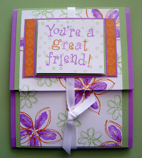
Wednesday, February 27, 2008

Always All the Rage

Today my email included the Weekly Inkling from Splitcoaststampers.com, and, as always, it featured a tutorial. This week's was for the chalkboard technique. I checked it out and it was easy peasy lemon squeezy, so I had to give it a try!

I was also influenced by this card over at Kristina Werner's blog. Circle cards seem to be "all the rage", and I wanted to do something unique for the last card I'm featuring at the Always Stamp Camp.

The picture shows some of the major elements used in this creation. In the upper left corner you can see part of a plastic lid. Circle cards are most commonly made using a tool called the Coluzzle Circular Cutting System which, you guessed it, I do not own. Did that stop me, though? NO! I was about to throw this lid out this afternoon when I realized that it was the size circle I was looking for. I traced it and had my base. The color is Apricot Appeal, which I used once before here and wanted to experiment with again.

The chalkboard technique uses Whisper White Craft Ink on dark card stock, Elegant Eggplant, in this case. Once the flowers were stamped, a sponge dauber was used to color them with chalks. (I chose Apricot Appeal, Pretty in Pink, and Lavender Lace, all from the Soft Subtles family.) The stickiness of the craft ink holds onto the chalk!

The Stamp-A-Ma-Jig was used to place the little flowers around the border of the card. Again, I cannot say enough about the versatility of this tool! I used EE ink, and I like the contrasting complement.

The ribbon at the top has a story. I had some snippets of white 1/4" grosgrain ribbon left over from another project. I hadn't been able to throw them away because, as you know, I'm a bit of a tightwad. Didn't want to waste them, dontcha know! Anyway, EE ribbon is not something I have in my stash, but with the help of the EE Stampin' Write Marker, I created it! I still the card could benefit from wider ribbon at the top, so I may order some 5/8" grosgrain in white and repeat the process of dying, only this time using the EE reinker. But for now, I'm pleased.

On the homefront, today was the day Michael took his first steps toward 22-24 months of braces. He had spacers jammed between his teeth that are farthest back in his mouth, and next week he'll have a full metal jacket on his teeth. The technician, Georgean, prescribed ice cream and Aleve, so he had as much as he could chew of our real dinner (chicken tacos), and then I made him a shake. Chocolate oreo mint...to invoke a Martha moment, "it's a good thing."

Starbucks Training Recap

I realize this is a crafting blog, primarily, but I said I'd share what I learned last night at the partner training that I participated in. It was very thorough, and some of it I shared yesterday when I educated you about espresso shots. Here's what else I learned:

1) Steamed milk must stay between 150 and 170 degrees in order to be used in beverages, and may NEVER be resteamed. This is new, because just 5 months ago when I was trained, I was taught that the milk in the pitchers could be resteamed ONCE, if it fell below 150 and not at all if it fell below 140. The same standard for steaming milk no higher than 180 degrees remains, because after that point, milk scalds. Yuck.

2) I also learned that I'd been steaming milk not quite correctly. The steaming standard creates the kind of dense, tiny bubbled foam that is used to make cappuccinos. My bubbles were too big. Not a tragedy, but once I did it correctly, the difference was noticeable, not only visually but in the taste of the drink. Milk that is properly steamed has a subtly sweet taste, and the mouth feel is satisfying, as it coats your palate. As part of our training, we did have to taste milk that had been steamed but not aerated at all. It tasted very flat and had no mouth feel, no creaminess. Yuck.

3) After practicing milk steaming, we made cappuccinos. The proper weight for a cappuccino is between .47 and .67 on our food scale, and mine weighed .58. The variance is there to accommodate those who like dry cappuccinos and those who prefer theirs wet.

4) We discussed how we could improve our customer connections. I think my store does well in this category. One of the activities we did was to take a cup and write the order on it of a customer we know. For me it was a venti, 7 pump, whole milk, with whip cream white mocha for Christy. It was enlightening to go around the room and share that drink order and what we know about the person who orders it. This is the reason I'm at Starbucks. Starbucks is the "third place" for many people because of the connections that we partners work to establish with each customer, and I'm proud to help facilitate that culture.

For some, the connection is limited to what their drink is and that's it. Those customers like that they don't have to talk, and still be confident they're going to get their beverage just the way they like it. For others, the reason they choose to pay the price for their drink is because they feel "known" when they stop by. I know their name, their drink, and most likely, something about them, and that's important. We all long for community, and that's what Starbucks is for many. I don't know of any other food service establishment that has made it its key principle to intentionally establish connections with customers. It's what sets Starbucks apart.

Besides all the training we received last night, the time was a re-establishing of commitment to the bottom line at Starbucks. We're in the people business selling coffee. Valuing our customers by doing whatever it takes to make sure they have the perfect beverage isn't about the coffee. It's about communicating something intangible through the simple act of serving.

I hope you'll experience a difference in your drink and your encounters with the partners when you next frequent your local Starbucks. I'll return to crafting tomorrow.

Tuesday, February 26, 2008

Starbucks is Closing (for 3 Hours)!


I have to go to work tonight. As you are most likely aware, and as I also know some of you are lamenting, ALL north American Starbucks locations will be closed this evening--GASP!!--from 5:30-8:30 for partner training. One partner told me that his grandma called him, all concerned, because she'd heard that Starbucks was closing...as in, for good! Here's a little post to dispell some accurate information.

I've had some customers poke fun, facetiously inquiring if their drinks will taste different or better tomorrow after we're taught again how to push the button that pulls the espresso. Here's what those of you who have ever had a Starbucks espresso drink that DIDN'T taste good know: there's more to the creation of an excellent espresso drink than "pushing a button."

The reason the stores are closing is so that all the partners can be educated at one time about the recent changes that have been made to the espresso bar and some new standards that corporate is handing down for making the drinks. Five thirty to 8:30pm is a logical time, since dinner falls in that time frame, and it is hoped that most normal Americans don't consider coffee or espresso a meal. Some stores will even reopen after the training period, although the one I work at won't.

Here's what's happening: the espresso machines have been recalibrated so that the shots pulled are 15-19 seconds in length, instead of 13-17 seconds. The result is a more intense, sweeter, more flavorful shot and harkens back to the day when the barista measured the grounds, hand tamped the espresso, and timed the shot's length in his/her head. (Bob remembers these days and is one of those people who would like to see Starbucks return to this type of shot pulling. Never gonna happen...)

Every espresso shot has but a 10 second optimum flavor shelf life. If you have ever had a bad tasting espresso drink, odds are the shot sat longer than 10 seconds before it was added to the other ingredients of your drink. < 10 seconds and mixed with milk=wonderful taste. > 10 seconds and mixed with milk=battery acid. I've had to taste the espresso after 10 seconds, and that's an accurate description. Also, if a shot takes less than 15-19 seconds or more than 19 seconds to pull, flavor is also impacted.

So, having a fully knowledgeable barista working behind the bar who is timing the shots hourly to make sure the espresso is correct really is worth going without your venti toffee nut latte, grande nonfat caramel macchiato, or quad short breve mocha for 3 short hours. I've heard of a few other things that are going to be instituted, so I'll share those tomorrow.

Always in the Country


I have Nancy Riley and Beate Johns to thank for this next card. Nancy's employs a unique little "binding" at the end, and Beate inspired the color combination and layout. I love sharing stampers, and these two ladies are among the most generous!

I feel this card has a sort of folksy, country feel due to the color combination. The base is River Rock, which evokes an earthy feel every time I use it. On Beate's card, there is a red strip from SU!'s Western Sky designer paper pack. I didn't have any of that, but I have a linen background stamp, and I inked that up in Whisper White craft ink and stamped it on top of Ruby Red card stock. Voila! A similar effect. (Necessity is the mother of invention, as you know.)

Nancy's card had this cute little "binding" effect and used jumbo eyelets. I don't have jumbo eyelets, but I have a cropadile with a 3/16" hole that is designed to create holes so that larger widths of ribbon can be incorporated into cards! I toyed with using the wide Chocolate Chip grosgrain in my stash, but was drawn to the sheer organdy Old Olive instead.

The rest is pretty straight forward on this one. I had fun incorporating three colors on the "everything" stamp by coloring with my SU! Markers. I can't say enough how much I love all the matchy-matchy items that SU! has created. Makes me look so professional...

Hope you liked this 2-fer today!

Always Stamp Camp Card

Inspiration comes from many places, but this time it's thanks to Nancy Riley, my blogging friend in AZ, for this card. I'm putting together the cards that we'll be making at the Always Stamp Camp next week, and I wanted to do something different. Nancy posted this a day or two ago, and it confirmed that I do want to get a package of our designer paper called Jersey Shore.

The color palette is Brilliant Blue, Bashful Blue, Wild Wasabi, and Pumpkin Pie. Since I liked what I saw Nancy do, I thought I'd give it a try, even though I don't have the DP.

The card size is different than the norm--4.25" square. Since I had to create the background, I used the heart image from the set, since I think having hearts in the background of a card with the phrase "always on my mind, forever in my heart" seems logical. I also didn't have any of the candy striped ribbon (although I will by the time the camp date arrives!), so I colored a piece of .25" white grosgrain with my PP marker and created a little self-tying bow.

The medallion, for lack of a better word, that sports the "always" circle stamp has an interesting feature. The second layer is Bashful Blue and it was created by punching a scallop with the scallop punch and then repositioning it very carefully and repunching! I think it's a really cool look and will be a little "wow" for the gals attending.

The stamp-a-ma-jig was pressed into service again so that I could position those flower details just where I wanted them on the Whisper White sentiment piece.

The little piece of DP you can see is from Bali Breeze, but it will be replaced with a strip of PP that is stamped with flowers before next week. I was just too excited by the idea to wait until all the pieces/parts arrived to execute this layout.

Thanks, Nancy!

Monday, February 25, 2008

Where Have you Been All My LIfe?

For years I have lamented about not being able to get all the stars and planets to align so that I could correctly place a stamp where I want it. I have tried getting many different things to try to achieve success, but it was still a matter of luck if it ended up where I wanted it, let alone straight! Last week, I told you about a tool I discovered that has changed all this for me, and today I'm posting a brief tutorial to demonstrate how easy it is to use. The tool is the Stamp-A-Ma-Jig by Stampin' Up! It comes with two pieces (very low tech). The T-square has right angles on both sides, making it comfortable for both righties and lefties to use. The transparency sheet is the other piece, and its correct starting position is butted up against the corner of the T-square.

For this tutorial, I chose a sentiment stamp, although this tool works with any stamp you need to position "just so". Simply ink the stamp in a dark ink, butt the corner of wood block against the T-square and press firmly.

As you can see, the ink has transferred to the transparency sheet and is straight. This will allow you to then take the transparency sheet and position it over the piece of paper you want to stamp said image/sentiment on.

I positioned the transparency where I wanted it on the paper and butted the T-square against the corner of the transparency. This recreates the earlier alignment. Leaving the T-square exactly where it is, remove the transparency and stamp the image by aligning the edges of the wood block as before.

Voila! I perfectly straight sentiment! If your paper isn't big enough for the T-square to hold it in place, tacking it down on grid paper works very well and insures that the paper won't move when you remove the transparency sheet.

One last detail you should know: this baby cleans like a dream! Just spritz a bit of Stampin' Mist cleaner on it and rub it on the Stampin' Scrub stamp cleaner pad and you're back to square one!

I SO love this tool and I know you will too! If you'd like to order it, contact me by leaving a comment and I'll hook you up! You'll never regret it...

Wednesday, February 20, 2008

Pocket Card Invitation

I'm partnering with a friend to host a class, and I told her I'd make the invitations for her to mail to her prospective guests. Alli Miles is a very talented stamp designer and blogger from Canada, and I recently became acquainted with her work. She posted a version of this pocket card and I became intrigued with the possibilities it could hold (no pun intended) as an invitation.

Her version uses a 5.5" x 11" base, but I wanted to adapt it so that I could get 2 pockets from 1 standard sheet of card stock. I had a piece of Wild Wasabi sitting on the craft table, so I started with that. It is 4.25" x 11". I scored it at 5.5" on the 11" side and .25" in from each side on the 4.25" side. A little sticky strip and voila--a pocket!

The interior is simple: a base of Whisper White cut 3.5" x 5". I always turn to Baroque Motifs when making an invitation, simply because the design elements are so classic and elegant. The coordinating colors are Soft Sky and Blue Bayou. The "You're Invited" is from Sincere Salutations, and the invitation detail bullets is from a retired set called All Year Cheer II.

Work is calling, so I must go. Have a great day and thanks for stopping by!

Orchids, Pumpkin Pie, and Celery? Certainly!

Yesterday, as I was skipping through blogland, I saw Charmaine's take on the splitcoaststampers color challenge for the week: Orchid Opulence, Pumpkin Pie, and Certainly Celery. I would've NEVER thought to put these together, but I liked how hers turned out and wanted to see what I could come up with. I purchased a multi-pack of the bold brights color family awhile back, and OO is in that group. That became my base for the card. PP is from the earth elements color family, and CC is from soft subtles, and I already had both those colors in my stash.

Sometimes you just have to go with things, and as hard as I tried to work with the Beautiful Thing set, I ended up going with a retired SAB set called Delight in Life. I had been thinking I would sell this one, but I think I'm going to end up selling BT, since I can't seem to get it to do what I want it to!

Anyway, the stamp-a-ma-jig was very helpful in making sure the 2-step stamped flowers appeared like they're supposed to. I'm going to have to do a tutorial on that sometime, so that ya'll know how useful it is! I stamped the base flower (the OO color) on the stamp-a-ma-jig transparency sheet first. Then I stamped it randomly on the Whisper White card stock. Then, I inked up the outline petal stamp and stamped it on the transparency sheet. Then, before I attempted to eyeball its position above the base flower, I used the transparency sheet's image to determine just where the stamp should be positioned. The plastic t-square is the alignment tool that provides a 90 degree angle to butt your stamp block against so that I stamped it just where I wanted it! Clear as mud? I hope not!

Once I had the background paper I designed, I played with the card's fold. I wanted something different, and this was the result. The ribbon holds it together and the entire interior is blank. I have a dear friend who lives overseas who hasn't received any communication from me since Christmas, so I think it's time to write a letter.

Oh my! Look at the time! I have a haircut in 40 min. and I haven't showered yet! At least I don't have to do my hair before I scurry out the door. Thanks for stopping by today.

Monday, February 18, 2008

Feb. SAS Card #5

This card is called "Bali Beautiful Time" in my Picasa files because it utilizes the Bali Breeze designer paper, the A Beautiful Thing set's sentiment, and a flower from the Time Well Spent set!

This went together quickly, once I determined that the flowers in the A Beautiful Thing set were too small for what I needed. The switch to the bigger flower was the solution!

I used three SU! Stampin' Write Markers that are found in the paper--Rose Red, Pumpkin Pie, and Taken with Teal--and colored directly on the stamp. Easy peasy!

Hope your day is going well. Mine is, now that I've finished designing the cards for the SAS. Hope you've enjoyed these previews!

Feb. SAS Card #4--Chalked Foliage

The weather here yesterday was wonderful. It RAINED! Yes, for about 5 hours, we had a steady downpour that resulted in almost 2 inches! Since Bob had spent the day Saturday aerating the yard, spreading grass seed, and then covering it all with straw so that the dogs wouldn't track in red mud (losing battle), we were very pleased. I also like rainy days because they're great for curling up with a good book, in front of a fire if possible. Rainy day? Check. Fire? Check. Aaahhh....

Another reason I have to sigh contentedly is that Spring is just around the corner here. One of my favorite things to do is watch the leaves bud on the trees. They are so fresh and their colors seem so pure and clear. That's what I wanted to evoke with this card.

At each month's SAS, I try to give those attending a chance to work with something in detail. As the title of this post indicates, this month one of the cards will be colored using chalks.

The chalks are produced for SU! to coordinate with the 48 colors in the 4 color families, so choosing a palette of greens that complement not only each other but the base color of Wild Wasabi was not something I worried about. The greens used all coordinate with each other, so there wasn't a possibility of creating something that looked hideous.

The chalks were applied using the blender pen, which is a tool regular attendees will be familiar with. We have used them in other projects to place color from the lid of a stamp pad when a marker wasn't available. In this case, the blender pen is just a very tidy way to place the chalk right where you want it. Q-Tips are just too unpredictable and messy!

The rest is pretty easy to figure out. I stamped the focal image, which is from the Level 1 Hostess set called A Little Bit of Happiness (the Feb. SAS invitation book mark also used a stamp from this set), with Wild Wasabi to create a background. The panel is mounted on Bordering Blue and River Rock.

I'll be back later when I figure out the final details of the last SAS card. It's almost finished, but I'm not completely happy with it. Stay tuned!

Thursday, February 14, 2008

Happy Heart Day, Friends!

Valentine's Day is my favorite holiday of the year. I know so many people boycott it, saying it's an invented money making rouse by Hallmark and all, but I really think it's a great thing that we have a special day set aside to tell those in our lives how much we care for them. I hope you've found specific ways to share your feelings with your loved ones.

Today's card isn't really a card, but an invitation/bookmark reminder that I sent to all my regular customer-friends to remind them about the upcoming stamp-a-stack (SAS) that's being held next Saturday. The stamp comes from the Level 1 Hostess set A Little Bit of Happiness, and I think it's very sweet. I really find coloring relaxing, but I had 30+ of these to make, so I colored...selectively. The color combination of Real Red, Pixie Pink, along with marker colors Orchid Opulence and Lovely Lilac make for a great look. I don't do much with the Bold Brights color family, but every time I do, I like how it turns out. Hmmmm...perhaps that's a sign?

Now that I've done the obligatory stamping talk, let's get down to the nitty gritty and talk about what this day is REALLY all about: CHOCOLATE!! Some of you may recall that, before I moved to GA, I worked in a gourmet chocolate shop. Somebody had to do it. Today is the busiest day of the year, and the lines are out the door. I used to go in a few hours before the store opened at 10a to help the manager, my dear friend Jodie, box up the chocolate dipped strawberries that had been made earlier--as in 5a--that morning. The customers probably started pulling on the door handle about 9:45, hoping to get their last-minute gift, and the boxing of chocolates and tying of red bows has been non-stop all day, I'm sure. Can you tell that I feel like I'm missing out by not being there? It's a CRAZY day, but a great day too, and I wish I could be part of the mix.

I have a fellow "Southerner by Choice", Julie, who moved here about a year before we did, and she and I knew each other through Graham's Fine Chocolates & Ice Cream. I worked there and she was a loyal and enthusiastic customer. I pinged her last week to find out if she was ordering these fine chocolates--please don't demean them by calling them "candy"--for her children. She was happy I'd reminded her, and so we went together on an order and surprised our families today.

My guys found ooey gooey bars in their lunchboxes, and I have replenished my stash of triple dipped dark chocolate malt balls. Oooey gooey bars start with a thick layer of homemade caramel that is topped with homemade marshmallow. (Did I mention that this is a gourmet chocolatier I worked for, and that everything's handmade? Drooling yet?) Then the whole thing is hand dipped in milk or dark chocolate. And those malt balls? You didn't see those...they're already in my secret hiding place, to be rationed out one delicious mouthful at a time. I'm a bad sharer, so don't even ask.

If you're interested in getting some of your own, you can call them--although they won't be answering the phone today because there are just too many customers to deal with face-to-face--at 630-221-1199 and ask for Jodie, or you can see more of what they have to offer at their website. Trust me...your mouth will thank you.

You may wonder what Bob and I are doing to celebrate our luv. Well, we don't do Valentine's Day. We have our own special day tomorrow. Why tomorrow? When we were engaged, we couldn't be together on the 14th. Neither of us can remember why. So we decided to move our celebration to the following day, and we've done it that way ever since. We normally don't exchange gifts--that's not really my "love language" (I nixed flowers many years back)--but this year I have a little something for him. I love surprising special people in my life with something they've mentioned they want but didn't realize anyone was really listening. I'm certain he doesn't remember even mentioning this, but I know he'll like it.

What is your wish for this Valentine's Day? Chocolate? Flowers? A present? A card with words of affirmation and affection? Stamps? Whatever it is, I hope you get it!

Wednesday, February 13, 2008

February SAS Card #3

I know I said I shouldn't continue stamping, but this card really doesn't have much stamping on it. So I'm not really breaking the rules, am I!

The inspiration for this was from fellow blogger Nancy Riley. She provided a very helpful tutorial, which I modified a bit as the card evolved. I love the color scheme, and it uses double-sided designer paper, so both sides get to be displayed. Having made my own quilt once (emphasis on the word "once"), I can attest that this is so much easier and less time consuming than that project. I don't think I can cuddle under this card for warmth, though, and today I need to--it's about 35 degrees right now. This is quite cold for GA, but tomorrow it's supposed to be in the 50s.

I hope this is whetting your appetite for this month's event! The boy is home from school, so I need to take off my crafter's cap and put on my pizza making hat. That's all for now!

February SAS Card #2


The Always set has been one of the most popular of the Spring-Summer Collection, and here's a second card that was made using it. (See this post for the first card.)

I've seen a few cards with this color combination of Chocolate Chip and Groovy Guava, so I thought I'd give it a whirl. I also had saved a card in SCS that had mentioned being able to heat emboss with classic ink and versamark and a stamp-a-ma-jig. Normally a craft ink, which is pigment based and not water based, is used as a base for embossing powder. But who has every color SU! makes in both craft and classic inks? Not I! I also knew I needed more practice with the stamp-a-ma-jig, so I tried this to see if it would work.

Like a charm, it did!! All I did was stamp the image with the CC ink, aligning the upper left corner of the stamping block with the T-square and the clear plastic sheet. Then I replaced the clear plastic sheet with Very Vanilla card stock and stamped with the same CC ink again. I cleaned the stamp and without moving the VV or the T-squareI re-inked my birdie with Versamark and stamped it again over the classic CC ink. Perfect alignment and a super glossy result! I think you'll enjoy learning to use this tool.

The ribbon in the corner and the layers being asymmetrical just sort of happened. More fun than the original layout of someone's that I was going to adapt, I think! What do you think?

My husband has rehearsal tonight with the band for the Sunday service at our church, so Michael and I are on our own this evening. Can you say "pizza"? (Homemade though.) The boy has a project to do about a poet, and it's due next Tuesday. Having just completed a speech for the same class, he's not all that enthused about another deadline, so there will have to be some creative "hand holding" to get him started on this next project.

Perhaps there will be time for more stamping this evening, but I probably should wait until tomorrow. My shoulders are telling me that I've been spending too much time looking down today! The things I put myself through for the sake of crafting! If anyone has any suggestions on how I can alter my environment to ease this pain, I'm all ears.

February SAS Card #1

Rarely does a card design just come to me. I'm not that confident in my layout skills, a disability that haunts me from my days as a lifestyle section editor at a weekly newspaper in Glen Ellyn, IL. Each Tuesday morning, I awoke knowing I was going to face an entire day of physically placing stories and photos on mock-up sheets to create 24-32 pages. Yes, I graduated college in 1989, but then I stepped back 30 years in technology time when I took my first job. But I digress.

ALthough layout design doesn't come naturally to me, thankfully, I have great help at my fingertips at splitcoaststampers.com. Today's card is a CASE (Copy and Share Everything) of this card from TreasureOiler and this card by Smithden.

I really like the Time Well Spent set, but its many images (all line art) require cutting and coloring, and that bogs down you who come to SAS to get a lot done in a short period of time. So, instead of a lot of coloring, there's a little. And I do all the cutting of those pieces parts for you.

There's still time to RSVP your attendance. Just leave me a comment, unless I already know you're coming, and we'll count you in! Deadline for RSVP'ing is Saturday.

Tuesday, February 12, 2008

New Life

A good friend of mine had her second child yesterday evening. David Charles is the first son born to them, and everyone's very excited about his arrival. Unlike many other expectant parents, they chose not to find out the sex of this baby before he arrived, so it was very fun to get the news today!

When I saw this onesie card at Lauren Meader's blog a few weeks ago, I knew this was what I wanted to make to congratulate his parents and commemorate his birth. Today Lauren was so kind to post this tutorial so that I could get right down to making it instead of trying to figure it out.

My creation utilized the Bold Brights I already had out on my desk, as well as some well placed rub-ons (the stripes on the sleeves), eyelets, and the stamps from my aforementioned Small Sayings Hostess set.

If you think we should include this design as one of the cards for this month's stamp-a-stack, leave me a comment.

I don't work tomorrow at Starbucks, so hopefully I will have stamping time in the afternoon!

A Sale-A-Bration Card

I received this card from my upline Laura for achieving the fourth highest sales in her group for the month of December, and I wanted to show it to you because the card uses one of the FREE sets being offered with a $50 merchandise purchase during SU!'s Sale-A-Bration promotion.

The focal image is from the set So Many Scallops, and it showcases 4 images that coordinate beautifully with our scallop punch. There's this flower, one for a birthday, one for a baby, and one for this coming Christmas (always pays to plan ahead!).

The designer paper on the bottom half is from a new double-sided paper set called Berry Bliss. It combines cocoa, brown, pomegranate, and pink. A very nice choice to complement the flower!

Now's the time to get your calendar out and pick a date to host a class at your house (or mine, if you don't want to clean yours!), so that you can take advantage of SAB! A free set is earned with every $50 purchase, so if your order tallies $100, you get 2. Don't hesitate, for these won't be around much longer.

Gotta run! Be looking for cards from the upcoming Feb. stamp-a-stack in the days to come this week. The deadline for RSVP'ing is Saturday!

Saturday, February 9, 2008

Everything...Always

One of the hottest sets from the Spring-Summer 2008 Collection is the set called Always. The set of 11 has really struck a chord with stampers and demonstrators alike, and I decided to see if I could be as convinced as the rest were.

I AM! This set has a very good combination of images and sentiments, especially if you need to make a card that's romantic for that holiday that's coming in just 5 days.

For this card, I knew I wanted to do something different. Different size. Different color scheme. So, I searched my vertical file folder stash of papers for a new combination. The first card stock I came to that I had lots of was Bordering Blue. Okay, that'll by my base, and it's in the Rich Regals family. A quick look see at my ink pads, which are organized by color families, and I knew my options. I grabbed Regal Rose, So Saffron, and Always Artichoke. Lovely.

Next I wanted to try for myself something I'd seen on Fran Sabad's blog, franticstampers (isn't that a great play on her name?). So, I made each of the colors beside the base into 2.5" squares and scored them every .5" to create mini tiles. Stamped the heart image, with its wonderful detail, on each in its own ink color and I had a good design going.

In my perusing of the SCS gallery for this set, I'd seen someone add an arrow to it. The "everything" stamp seemed just the right width and length to serve the purpose. The tip is just free handed. Then for the most challenging part of the entire card: placing the words "you mean" and "to me." I dug out the Stamp-A-Ma-Jig, and have to admit there was operator error with my first attempt. So, I went back to eyeballing it and was successful.

Since you've been so good to humor me and read to this point, I'll share the detail I put on the inside of the card. It's a nice unifying feature to repeat the color scheme on the interior of the card, and the little circle flower details worked just great for this. I'm going to be purchasing the .5" circle punch, though, because cutting those little babies out by hand was NOT fun!

I'm cookin' up an opportunity for YOU to get your hands on this set and get a FREE stamp set to boot! Stay tuned...

Thursday, February 7, 2008

Making the Most of an Opportunity


You may or may not know this about me, but I'm going to confess today that I'm something of a tightwad. I like to get the most bang for my buck, and that's what today's post is all about. If you're wondering what stamps and the game Jenga have in common and what they have to do with getting the most for my money, allow me to explain.

One of the perks of being a demonstrator is placing orders on behalf of various individuals and getting the hostess benefits because the order totals $150 or more. I did this late last year when I combined several individual orders with one of my own and earned a Level 1 Hostess Set called Small Sayings.

While I liked some of the sayings, the way they came from SU! was like the above picture. They were meant to be mounted on 3 blocks, leaving the stamper to ink up whatever saying she liked and stamp from there, or ink up the entire block, stamp it, and then cut out the one or ones she liked. This seemed challenging at best and frustrating at worst, since figuring out how to determine placement, if I wanted to place said small saying on a card without layering it, would be like stamping blind.

Enter Jenga! This idea was not mine, but I happily used it to my benefit, and to yours, as you'll soon find out! These cool blocks are neatly sanded, precisely cut, and a perfect medium for a rubber stamp. So I cut the 34 sayings and mounted each on its own block! An empty Swiffer pads container became their new home. If this idea appeals to you, Many Happy Returns from the current catalog is adaptable to this technique. It's a great way to add lots of sentiments to your stamping stash!

Here's where it gets good for you! Sign up to be a hostess for a class between now and March 17, and you and each one of your guests will get to choose from this stash. How many? I'm not sure...depends how many hostesses and guests I have! As they say, get while the getting's good! Leave me a comment and I'll contact you so that we can set up a date. The benefits for hostesses and guests alike are SOOOO good during this time because it's Sale-A-Bration. You don't want to miss out!

Like Martha would say...it's a good thing!

Wednesday, February 6, 2008

Does this Look like Florida to You?

My mom and dad spent some time in FL late last month visiting some friends who snowbird there every winter. Upon their return to the snowy Midwest, Mom asked me to make a thank you card to send to them. "I'd rather pay you than buy a card," she said. Thanks, Mom! To get some sort of idea of the couple's taste, I asked her what the color scheme of their condo is, and she told me yellow, orange, and green. It took awhile for the idea to percolate, but here's the final product.

It's much harder to come up with a card for someone else than to just make one that you like. While I've visited FL, I'm not a big fan of the state (south Fort Myers Beach/Estero Island excluded). And although I'm not a huge flower girl, I thought blooms would communicate the tropical feel I think my mom was looking for in this card.

Apart from my mom's description of the palette in the Fishers' house, the color scheme I chose was based on my desire to incorporate Groovy Guava double-stitched ribbon into the card. I knew the orange my mom was talking about probably wasn't your true FL orange, as in navel, but I knew that GG would stand in nicely. I also knew that it paired with Wild Wasabi, another of the In Colors, which would emulate foliage on the card.

But I wanted a few other colors, so I went to scraptitude.com and plugged in those two colors and asked the computer to generate all the combos that would coordinate with them. The combo I liked best out of the many it spit back included Regal Rose (which became the base), So Saffron (perfect for flowers), and Purely Pomegranate (also good for flowers).

I used the 2007 Sale-A-Bration set Delight in Life and paired it with Doodle This from the current catalog to get the look I was after. I stamped the flowers on a 4.5" strip and then cut it apart to create the three panels. The idea to weave the ribbon under and then over the middle panel just came to me as I played with the elements. You may just be able to see the main flower from Doodle This, which I stamped on the WW mat to create the feel of designer paper.

One of the new tools I acquired with my last order was the Stamp-A-Ma-Jig. It's a positioning tool that makes it possible to get a stamp placed right where you want it--and straight to boot! That's how the "thank you very much" was placed so perfectly in the lower right corner. I'm going to be teaching all my stampers how to use this tool! For anyone with the least bit of anal retentiveness about straightness, this is the answer you've been looking for.

I'm going to insert a note my parents emailed me, which will convey their thanks to their hosts for the good time they had down South. I hope the card will help communicate what special friends my parents feel these folks are. That's what handmade communicates, doesn't it? You're special!

Go make someone feel special today! Send them a card from your stash, or create one and send me a link!

No, I Haven't Fallen Off the Planet...


but yesterday I was shocked to see that 5 days had passed since I posted! I have been busy doing stamping, but there's been a lot of life happening too. Sorry! I'll try to be more regular, especially since I have some beautiful new things to share with you.

One of my regular stampers commissioned me to create a DVD tin for one of her colleagues who is retiring in March. She wanted me to make it masculine, for the obvious reason, and she's going to use it to have her coworkers write notes of congratulations and remembrance to him as he retires. Isn't that so sweet? Anyway, I didn't want it to be drab and dark, as masculine items tend to use darker palettes. Not this one!

The lettering on the front uses my NEW Jumbo Outline alphabet, and it worked just as I hoped it would. I like the playful feel, and yet how it's not feminine at all. The color palette for the word is pulled from the designer paper that's the base of the card.

The interior is just more of that palette put to good use. The pocket features the man's initials done with two Simon Lower chipboard letters that are covered with designer paper.

A simple memento that I hope will be what Anne wanted, and meaningful to her colleague.

Today is my only day off this week, so I want to make good use of all the time I have this afternoon. I have something else I need to work on that's stamping related, so I'll sign off for now. Thanks for sticking with me.