
Showing posts with label Circle Circus. Show all posts

Wednesday, June 29, 2011

Summertime, and the Living is Easy

Hey Stampers! No, I haven't fallen off the planet. I've just been enjoying the relaxed routine of summer. My son finished his sophomore year of high school the week before Memorial Day, and so we've been in that mode since. Hope you have been enjoying some R&R too.

I saw a telescoping card online and decided I wanted to put my own twist on it. It was created by Lisa Zwolanek, and I think it's such a unique, yet EASY card to make. It'll really make someone's day, I just know it.

As you can see, it starts out as a pile of concentric circles. My card has 5 layers and the layers are attached using brads. This allows them to swivel as they open, and it's just so cool!

I used 3 circle dies for the Big Shot--the 3.5", the 3", and the Circles #2 plate, which has 4 sizes--2", 1.75", 1.5", and 1". I used the 2.5" circle punch as well. That's a LOT of circles, but trust me, it's just a matter of layering card stock to get the number of circles you need in the colors you want. If you don't have a Big Shot, you could trace circles or use a smaller set of graduating circle punches to achieve the same effect.


Once I had my circles cut out, I chose the Circle Circus stamp set, in keeping with the card's obvious theme! It allowed me to create some backgrounds for the words I chose, which are from Best Yet (retired). I used the current InColor collection for the card stock and the inks, and I'm looking forward to recreating this in the NEW InColors, which premiere July 1 when the 2011-2012 Big Idea Book & Catalog becomes available for ordering.

JUST 24 HOURS LEFT TO ORDER FROM THE CURRENT CATALOG!
Click here to shop online.

If you'd like to get your hands on a new catalog, just leave me a comment and we'll connect! Even though you can't order from it until July 1, I can get it to you NOW! Isn't that great!

Wednesday, June 9, 2010

Thanks and Farewell

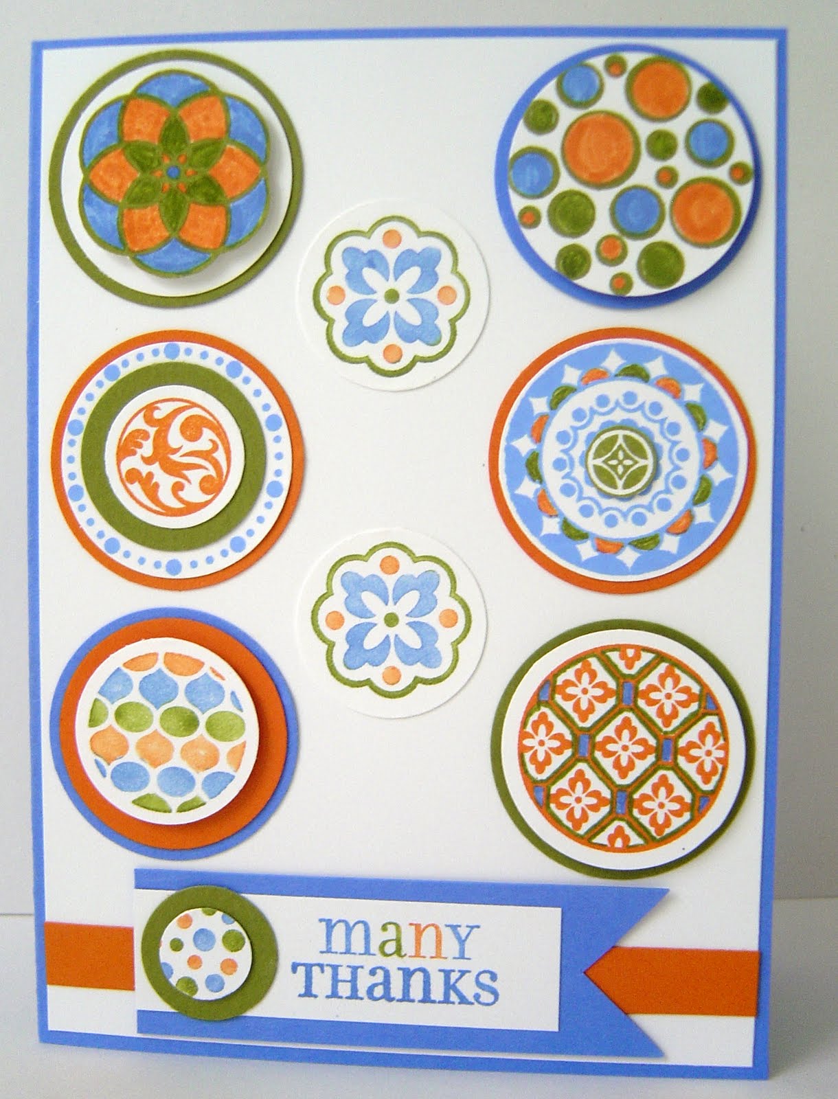
A guy Bob has served as a volunteer under at church is leaving to "spread his wings" and try new opportunities. I thought it would be nice to thank him for the way he has led with humility and sincerity, and wish him all the best as he ventures out into the wide wide world. Besides this, Brian is one guy I know appreciates a good card; he sent out beautiful handmade Christmas cards with his roommates while he was in college.

As this was another time when I had need of a masculine card, I returned to Circle Circus. I was inspired by a color combination of Bashful Blue, Pumpkin Pie (retiring June 30), and Old Olive by Monika Davis that also utilized the stamp set. I also had this card by Mary Fish in my Google Reader saved category for quite some time, and that helped with the layout.

I end up getting carried away with this and it took much longer than I anticipated. But, that's what made it fun too! I stamped several of the circles and began adding color combinations with layers and with markers, and the final result is quite the piece of eye candy!

There are parts of circles popped up on Stampin' Dimensionals, parts cut out by hand, and others punched with various circle punches. I think I used 1 3/8", 1.25", 1", and .5"!

The message is from retired Lots of Thoughts, which pairs with retiring Mark the Date, and I colored direct to rubber to get the look I wanted.

Don't forget that there are many stamps and accessories retiring at the end of this month. Don't wait to peruse the lists and make your purchases. When they're gone, they're gone!

Thursday, May 27, 2010

How Can It Be?

Where has this week gone? My days have been full; I've been doing exciting things like laundry and grocery shopping, but I didn't think it could be Thursday already! I lost an hour of my life yesterday trying to clean the grout in the shower. Any suggestions on how to defeat that stuff without so much elbow grease? UGH. And my folks arrive on Monday for a visit. That's not even a room they're going to see! You're not here to read a rant on cleaning or lost time, but thanks for letting me share. Let's get down to business.

Last night I was prepping materials for my Stamp-A-Stack this weekend, and it dawned on me at 7:30 that I had yet to make my brother-in-law's birthday card. His birthday is May 28, so that meant I had to get the card to the post office this morning on my way to work in order for it to have a prayer of getting there on time.

I've known for over a week what card I wanted to make. I'd seen this one by Stasia Sloma and wanted to put my own spin on it. But I had procrastinated and needed to work fast before I lost the ability to form a coherent thought, let alone a creative one. So I chose Bordering Blue because it's masculine and because it's retiring, paired it with Sahara Sand and Whisper White and got down to making a quick and easy card.

Sorry for the less than fantastic photo, but you get the idea. Disregard the semi-cockeyed WW layer too. It was stuck on too well for me to peel it off and I was beyond caring at that point. Besides Circle Circus, I also used a retired set from SAB called Congrats. I like how it turned out.

Now here's the rest of the story. I drove to work early (remember that I get up at 3:45a most mornings) to stick this and another birthday card in the mailbox. I worked my shift at Starbucks. On the way home, I call my sister to catch up and chat a bit. I ask her if she's doing anything special for him, since his birthday is this weekend. She paused and said, "It's not 'til JUNE 28, Jenn."

Nice.

Monday, March 29, 2010

A Niggle Usually Means Something

Yesterday I got a niggle to make a card. Not just any card, but a pink card. If you're new to this blog, I'll let you in on a secret: I don't EVER choose pink. I'm just not that kind of girl. But, for some reason, I felt the urge to create a card, inspired by Carol's Ink Spot, using pink. The set that came to mind when I saw this card a few weeks ago was Friendly Flowers, a retired set that I've not used much. I set it beside the bubble gum Pink Passion card stock and ink (again, the niggle), and white craft ink, and set to work.

Carol used vellum as her stamping surface, mounted on top of colored card stock, so I pulled out a 4" x 5.25" piece and began stamping. It take a LONG time for ink to dry on vellum, so I sped the process along by using my heat tool. You have to be careful not to warp this thin paper when heating it, and fate smiled on me and I was successful.

Once I was done stamping, I mounted the vellum on the card using regular adhesive. I didn't want it to show, so i placed it strategically underneath the strip of card stock that would go over it that has the "they say it's your birthday!" Not a unique idea, but one that lets the images be the attention, not the adhesive.

I liked the button that Carol used, but I didn't have any pink buttons (see above for reasons why). I did have some small clear buttons and some thin light pink ribbon that had been gifted to me. That would work, right? I tied that into the button and mounted it on the card, but something was still missing. When I went hunting in my drawers again, I stumbled across a baggie of flat small rhinestones. Again, in the spirit of full disclosure, you must know that I am also SO NOT a rhinestone girl. Not a flashy bone in my body, friends. But I felt like they belonged on this card (nigggle niggle). Who am I to argue with the creative muse? So I went with it. They're a pain in the you-know-what to mount because I didn't have the right size glue dots, but I used some glue and persevered until I'd used the entire package.

I stamped the coordinating message and decorated the inside of the card--this is all the rage right now--and went looking for my digital camera. While searching for it, I got sidetracked by my laptop and spent a little time on Facebook. While cruising through my notifications, I saw a little message in the right column: Mikayla's birthday is Wednesday. NO--really? I didn't believe FB and went to her page to confirm it.

THAT'S WHY I'D HAD THE URGE TO USE PINK! THAT'S WHY I'D HAD THE NIGGLE! Mikayla is my niece, and tomorrow she'll be 10. Double digits. That's a special birthday that needs to be celebrated, even if your auntie, uncle, cousin, and doggie relatives live 800 miles away. So the card will be a bit late, but that doesn't mean we won't be thinking of her.

Lesson learned? PAY ATTENTION TO THE NIGGLES.

Wednesday, February 10, 2010

Clear Mount Whimsical Words

Hey! Happy Wednesday! It's feeling like Chicago here today and it's all due to the WIND. The temperature is in the 32, but with the wind chill it feels like 21. At least it's sunny!

Speaking of sunny, this bright and cheery card will be on its way next week to my father-in-law. I CASE'd this from Jill Hilliard and added my own little touches.

The base is Bermuda Bay. I'm growing more fond of this color by the day. Such a rich, unique shade of blue! The striped strip is actual Bridal Specialty Paper on which I used a brayer inked with Summer Sun to change the color to match the scheme. The stamps used are from Circle Circus, a go-to set for me. The mat for the main image is Crushed Curry, a very close cousin of SS. I kept this very free of embellishments, since this is a card for a man.

I love love love that I can see EXACTLY where I'm going to place my sentiment with the clear mount stamps! It was straight and positioned where I wanted it the first time. Fantastic!

Saturday, July 25, 2009

Mambo, Anyone?

As in Melon Mambo...This is one of the new InColors, and it's growing on me. I'm SO not a pink person, and this color reminds me of my sister's bridesmaids' dresses (as in watermelon), but still. Paired with Chocolate Chip and some retired felt ribbon (with the cream stitching colored MM, thanks to the new InColor Stampin' Write Marker in the same hue), it's stylin'.

I used Circle Circus and the sentiment from Great Friend, as well as the Scallop Circle Punch, the 1 3/8" Circle Punch, and the 1.25" Circle Punch. Alright, that's enough capitalization.

Thanks to Brooke for the inspiration. She's part of a 12-blog tour, all featuring stamps and accessories from the new 2009-2010 Big Idea Book & Catalog. Check it out!

Tuesday, June 23, 2009

A Circle Tagged and Something Scrunchy

If that doesn't make you pop over from your Google Reader or RSS feed, I don't know what will! Yesterday my Stampin' Success magazine came, and it featured a 3" x 3" card using Circle Circus. The unique embellishment, accessory, element, whatever you want to call it that it included was a metal edge circle tag. A light went on in my head--"I have some of those!"

I went to my craft room, played for awhile, and this is the result. I made myself use the new InColors because I knew if I didn't, I probably wouldn't, and I want to like them. I made it easy on myself and chose the three Earth Elements colors of Crushed Curry, Soft Suede, and Dusty Durango. The CC is really good in small doses, I think, because it's a pretty green yellow. The SS is yummy, and also has a bit of a green tinge to it. I think it's my favorite so far. DD looks like Really Rust to me.

I stamped the largest circle with the flowers directly onto the tag, which has a vellum center just for this purpose. It didn't jazz me, though. So I repeated the inking with DD and stamped it on Whisper White card stock this time. Then I stamped the largest flower on the circle again and colored it with CC and colored another flower on the circle in SS. I cut out the CC flower and popped it up on stampin' dimensionals.

Then I looked around my desk for something to coordinate with this focal image. I have some dotted printed window sheets--which are carrying over from the Occasions Mini to the new catalog!--and thought that that would do nicely! The card size is 2 7/8" x 11", so although I could've used an entire sheet, I just didn't want to overwhelm the design with this element. I cut it in half, and that was just the right amount of visual interest that didn't compete with the focal image.

One of the newest fads in ribbon use is a sort of shabby chic look that's a messy pleat that's sewn onto the card. I don't have the InColor ribbon yet--it's a cool thing this time around; dotted on one side and solid on the other!--so I tried my hand at replicating the look using card stock. It was a little trickier than I anticipated and came out looking more scrunchy than pleated, but I'm pleased with how it turned out, and it's fun to look at AND fun to feel! The card stock used was CC, and the strip was just .25" wide. I achieved this look by folding, very randomly and not all that successfully, and then going back and putting mono adhesive on the back to make the pleats stick to each other. I secured the strip with glue dots.

The sentiment is stamped in SS on DD, a second strip only .25" wide. It's from God's Blessings, and I used the Stamp-A-Ma-Jig to create the sentence and to selectively edit the original message (to fit the space constraints).

What do you think of these new colors? I know you're probably getting tired of this set, but it's all I have from the new catalog, and I also want you to see how many ways you can make one set work! Am I succeeding? Hope so...

Sunday, June 21, 2009

New Stamps, Soon-To-Be Old Colors


The 2008-2009 InColor Collection is about to be history, and I still have plenty of card stock and ink. I was asked to make a card for a friend who is under a lot of stress because of the care she's providing to her mother who's dying of lung cancer and is living with her and her family.

The card is supposed to be encouraging, so I went with Pacific Point card stock and the bolder colors of Riding Hood Red and Tangerine Tango to create a cheerful look, and supplemented those with Kiwi Kiss and Baja Breeze. I've really enjoyed working with this palette, and I know already that the new InColors are going to have to grow on me before I'll use them as readily as I've used these.

The layout for this card was inspired by a card I saw by Lorri Heiling. She was kind enough to send me the measurements so I could craft something of my own instead of just admire hers! She calls it a "gate fold" and here they the specs: 4.25" x 11". Score at 2", 3.75", 7.25" and 9". Thanks, Lorri!

The sentiment is on the outside of this card because the friend who requested it wants it to be signed by a group. To me, that meant I needed to leave lots of interior white space for messages. There are two panels that are not shown in the photo, besides the center square, so I think this will be sufficient space.

Just for the record, this sentiment is from Gratitude, a set I picked up 3 years ago and is my "go to" message for encouraging someone. It's stamped in RHR.

Hope you're enjoying a quiet Sunday. Since my husband and Dad read my blog from time to time, I want to say "Happy Father's Day" and sorry for forgetting to post a card in time!

Tuesday, June 16, 2009

Continuing Creations with Circle Circus


Remember those 6 circles of In Colors that I showed you yesterday? Well, I couldn't just leave them to languish on my desk! I wanted to play with my only set from the forthcoming 2009-2010 Idea Book & Catalog, so I gathered those circles and began to think.

As I shared, there are a variety of sizes of patterned circles in this set, so I went back to the one I used yesterday. No dice. It doesn't fit inside the dotted circle. The next one I grabbed worked, so I stamped it 6 times and cut it out. The pattern on this stamp reminds me of a pattern in Kristina Werner's now-retired DSP Haiku, and there's a second stamp in the set with this icon in smaller relief.

I thought about creating a background using the second stamp, so that the icon that's in the focal images would be repeated, subtly, on the card base. I seem to be stuck in this mode of wanting to use this set in non-traditional ways! When I finished stamping the base, there were holes, so I cut out four circles and used them as masks to fill in those gaps.

Once that was done, I needed to figure out a sentiment. I inked only a portion of the focal image stamp in Basic Black so that I could fit something in the center. It was too small on its own, so I created a black circle to mimic the others.

The new catalog is coming July 1, and I'm looking for interested hostesses to have classes with friends, neighbors, work colleagues...Be the first to see and use what's new!

Monday, June 15, 2009

Creating with Circles...a Sneak Peek!

I have a thing for circles. I like the patterns they create, and I like combining different sizes of them--just look at my blog header if you need any confirmation of this fact.

So it should be no surprise that I chose a set called Circle Circus from the 2009-2010 Idea Book & Catalog preorder that was made available to demonstrators on the 1st. The circles above are of the new In Color Collection, and here are the names of the six (from top left): Rich Razzleberry, Bermuda Bay, Soft Suede, Melon Mambo, Crushed Curry, and Dusty Durango. These will be available, ALONG WITH COORDINATING STAMPIN' WRITE MARKERS, July 1. Woot!

Circle Circus has 10 different circle patterns in a variety of sizes, but there were two I was drawn to immediately. The interlocking circle was the one I inked first; I wanted to see if I could make a pattern with it. It turned out I couldn't--at least not without a lot of work with the Stamp-A-Ma-Jig (SAMJ). I was too antsy to do all that, so I started just stamping and cutting. This one can be punched out with the 1.25" circle punch, and I did that. But I was wanting to see what more this set could offer than strictly circles...and I found a flower among these circles. You'll see it in a minute if you don't already.

This is the other circle I found intriguing. I created a circular background pattern using a Papertrey Ink (PTI) set awhile back, and I wanted to see if I could produce something similar. I did a practice run using retiring Tangerine Tango, and I liked it! So I pulled out my Basic Black classic ink pad and the SAMJ and recreated what I'd just made. I colored the eye-shaped spot created by the intersecting circles with the new markers. What a treat! Such an improvement from reinkers and blender pens.

Combine these two, and this is the result. I love the modern look, and the circle "flowers" really pop when placed with Stampin' Dimensionals. The sentiment is from Flight of the Butterfly.

As fast as this month is going by, July 1 will be here before you know it, and you'll be able to see the whole catalog and its goodies! Let me know what you think of this set and the new colors.